> ## Documentation Index
> Fetch the complete documentation index at: https://cometchat-22654f5b-feature-react-native-sdk-quotedmessage-a.mintlify.site/llms.txt
> Use this file to discover all available pages before exploring further.
# Custom CSS
Passing custom CSS allows you to personalize and enhance the user interface of the call screen.
## Common CSS Classes
There are a few common classes used for different modes in the call screen
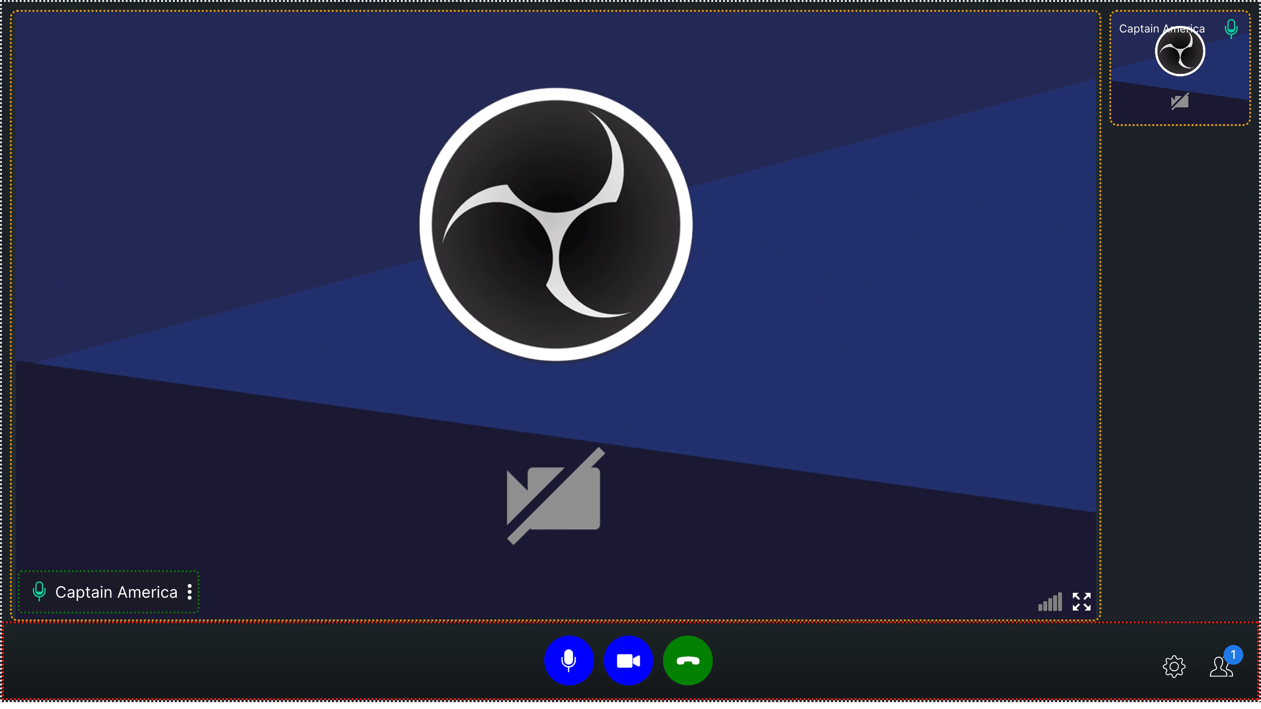
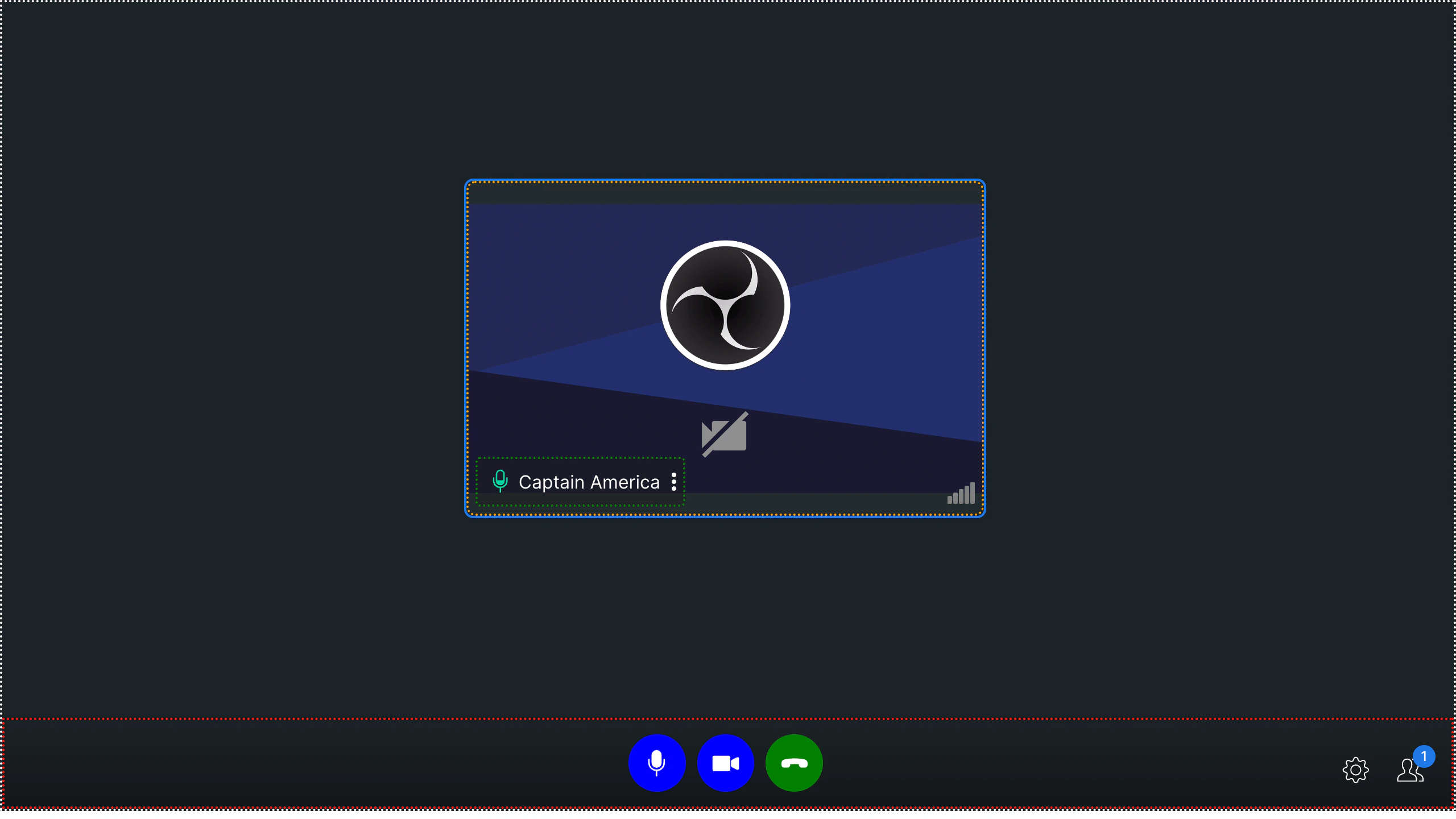
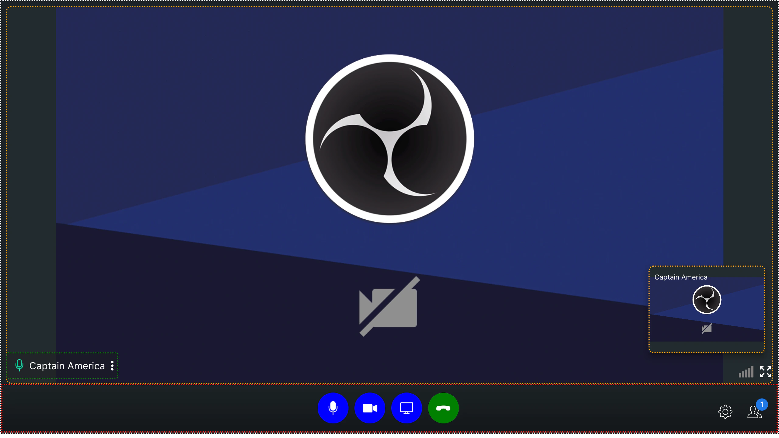
1. **cc-main-container** - The outermost component of the calling component is represented by a white border in the screenshots above, indicating that it acts as a container for other components.
2. **cc-bottom-buttons-container** - The container located at the very bottom of the interface houses various action buttons, such as the mute/unmute audio and video, end call, settings icon, and participants icon, among others. It is represented by the red border in above screenshot.
3. **cc-name-label** - This class is passed in user name text container in all modes. It is represented by green border in the above screenshots.
4. **cc-video-container** - This class is passed to the video container in all modes. It is represented by orange border in the above screenshots.
## Bottom Buttons
1. **cc-bottom-buttons-container** - This is the container of all the buttons in calling.
2. **cc-bottom-buttons-icon-container** - This is the div of every button in the button bar.
### Individual bottom buttons CSS classes
* `cc-audio-icon-container`
* `cc-audio-icon-container-muted`
* `cc-video-icon-container`
* `cc-video-icon-container-muted`
* `cc-screen-share-icon-container`
* `cc-switch-video-icon-container`
* `cc-end-call-icon-container`
### **Example**
```css theme={null}
.cc-end-call-icon-container {
background-color: green;
}
.cc-audio-icon-container {
background-color: blue;
}
.cc-video-icon-container {
background-color: blue;
}
.cc-audio-icon-container-muted {
background-color: orange;
}
.cc-video-icon-container-muted {
background-color: orange;
}
.cc-switch-video-icon-container {
background-color: blue;
}
.cc-screen-share-icon-container {
background-color: blue;
}
.cc-main-container {
border: 2px dotted white;
}
.cc-video-container {
border: 2px dotted orange;
}
.cc-bottom-buttons-container {
border: 2px dotted red;
}
.cc-name-label {
border: 2px dotted green;
}
```
The above example results in the below output:-
**Mode: `DEFAULT`**
 **Mode: `TILE`**
 **Mode: `SPOTLIGHT`**
 ```css theme={null}
.cc-bottom-buttons-icon-container {
height: 50px !important;
width: 50px !important;
}
.cc-audio-icon-container {
background-color: #0073ff !important;
border-radius: 4px !important;
}
.cc-video-icon-container {
background-color: #0073ff !important;
border-radius: 4px !important;
}
.cc-screen-share-icon-container {
background-color: #0073ff !important;
border-radius: 4px !important;
}
.cc-end-call-icon-container {
background-color: #ab0090 !important;
border-radius: 4px !important;
margin-left: 50px !important;
}
.cc-bottom-buttons.cc-bottom-buttons-container {
gap: 25px !important;
}
.side-bar-main-user-video video {
background-color: black !important;
background-image: repeating-conic-gradient(
#0073ff2a 0% 25%,
#00000031 0% 50%
) !important;
background-position: 0 0, 10px 10px !important;
background-size: 20px 20px !important;
}
.cc-name-label {
background-color: #0073ff !important;
}
.bottom-buttons-other-options {
gap: 20px !important;
}
```
The above example results in the below output:-
```css theme={null}
.cc-bottom-buttons-icon-container {
height: 50px !important;
width: 50px !important;
}
.cc-audio-icon-container {
background-color: #0073ff !important;
border-radius: 4px !important;
}
.cc-video-icon-container {
background-color: #0073ff !important;
border-radius: 4px !important;
}
.cc-screen-share-icon-container {
background-color: #0073ff !important;
border-radius: 4px !important;
}
.cc-end-call-icon-container {
background-color: #ab0090 !important;
border-radius: 4px !important;
margin-left: 50px !important;
}
.cc-bottom-buttons.cc-bottom-buttons-container {
gap: 25px !important;
}
.side-bar-main-user-video video {
background-color: black !important;
background-image: repeating-conic-gradient(
#0073ff2a 0% 25%,
#00000031 0% 50%
) !important;
background-position: 0 0, 10px 10px !important;
background-size: 20px 20px !important;
}
.cc-name-label {
background-color: #0073ff !important;
}
.bottom-buttons-other-options {
gap: 20px !important;
}
```
The above example results in the below output:-
 ### Guidelines for Customizing the Grid Layout
* **CSS Classes:**
* Please ensure that you only apply CSS classes specified in this documentation. Introducing CSS classes not covered here may cause unexpected UI issues.
* **Grid Container Resizing:**
* Avoid resizing the grid container. Altering the grid container’s dimensions can negatively impact the grid layout, leading to undesirable visual distortions.
By following these recommendations, you can maintain a stable and visually consistent grid layout.
### Guidelines for Customizing the Grid Layout
* **CSS Classes:**
* Please ensure that you only apply CSS classes specified in this documentation. Introducing CSS classes not covered here may cause unexpected UI issues.
* **Grid Container Resizing:**
* Avoid resizing the grid container. Altering the grid container’s dimensions can negatively impact the grid layout, leading to undesirable visual distortions.
By following these recommendations, you can maintain a stable and visually consistent grid layout.