 ***
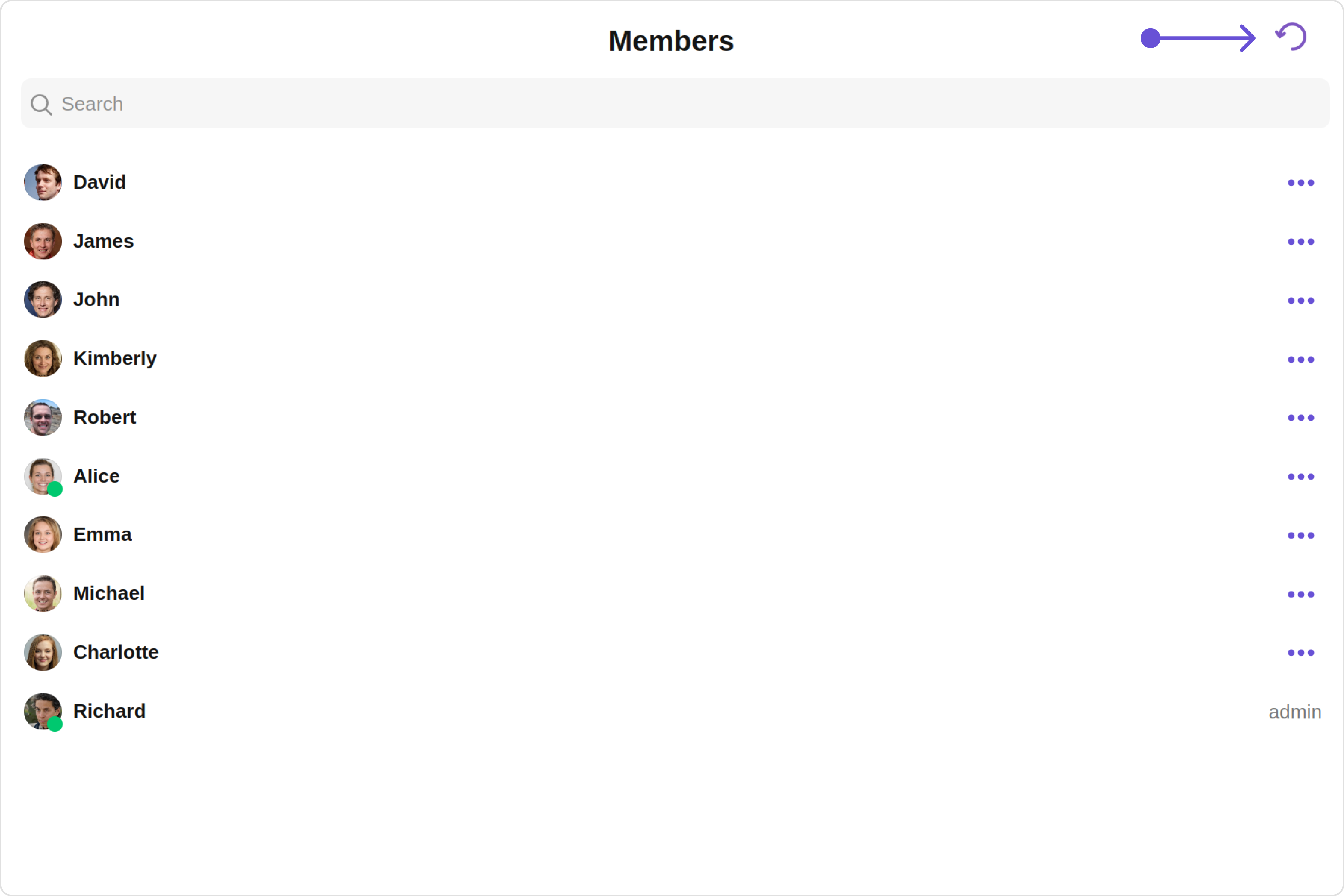
## Usage
### Integration
The following code snippet illustrates how you can directly incorporate the Group Members component into your Application.
***
## Usage
### Integration
The following code snippet illustrates how you can directly incorporate the Group Members component into your Application.
 Custom:
 Below is a list of customizations along with corresponding code snippets
| Property | Description | Code |
| ------------------------------------------------------------------- | ----------------------------------------------------------------------------------------------------------------------------------------------------------------------------------------------------------- | --------------------------------------------------- |
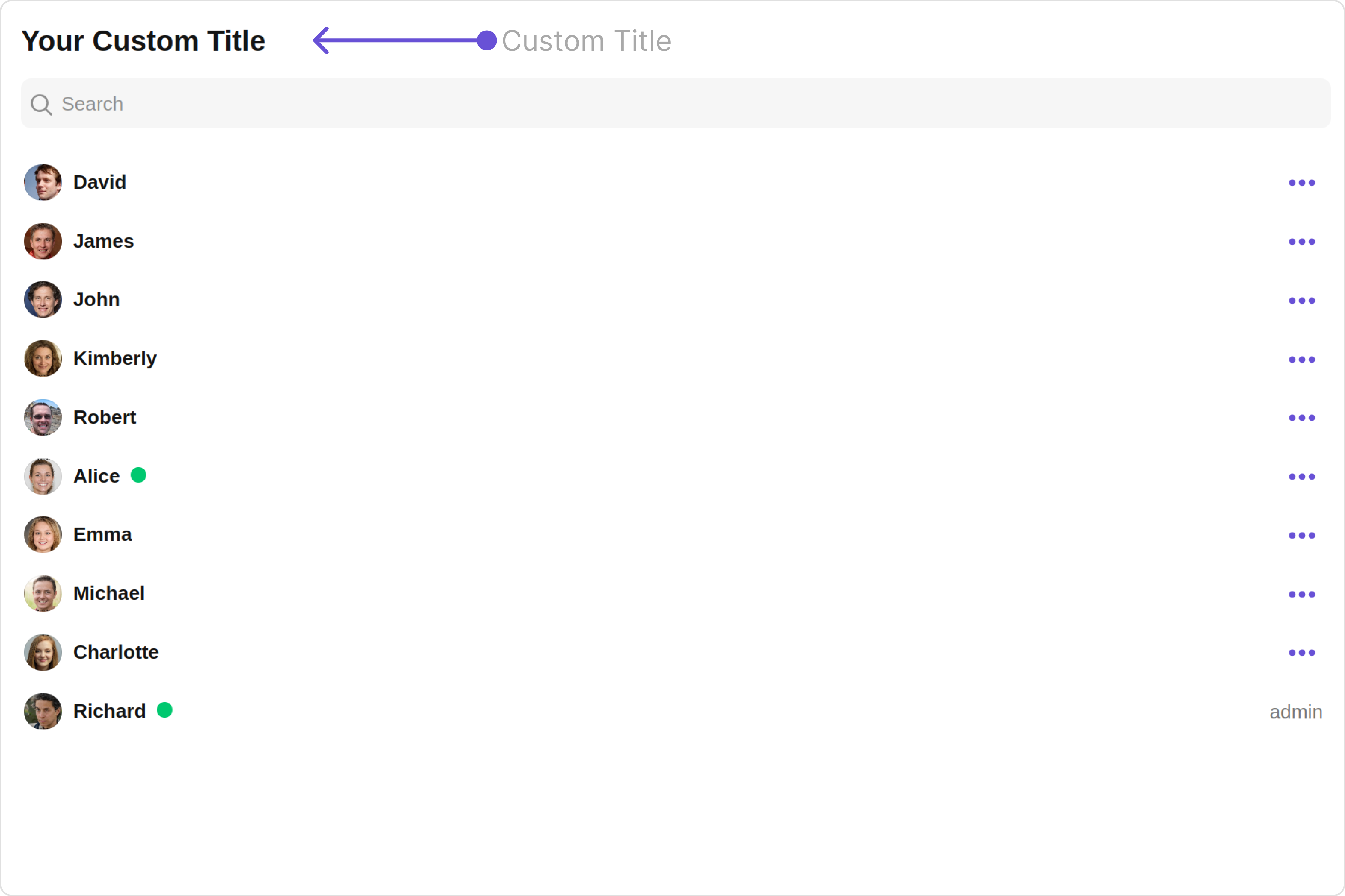
| **title**
Below is a list of customizations along with corresponding code snippets
| Property | Description | Code |
| ------------------------------------------------------------------- | ----------------------------------------------------------------------------------------------------------------------------------------------------------------------------------------------------------- | --------------------------------------------------- |
| **title** 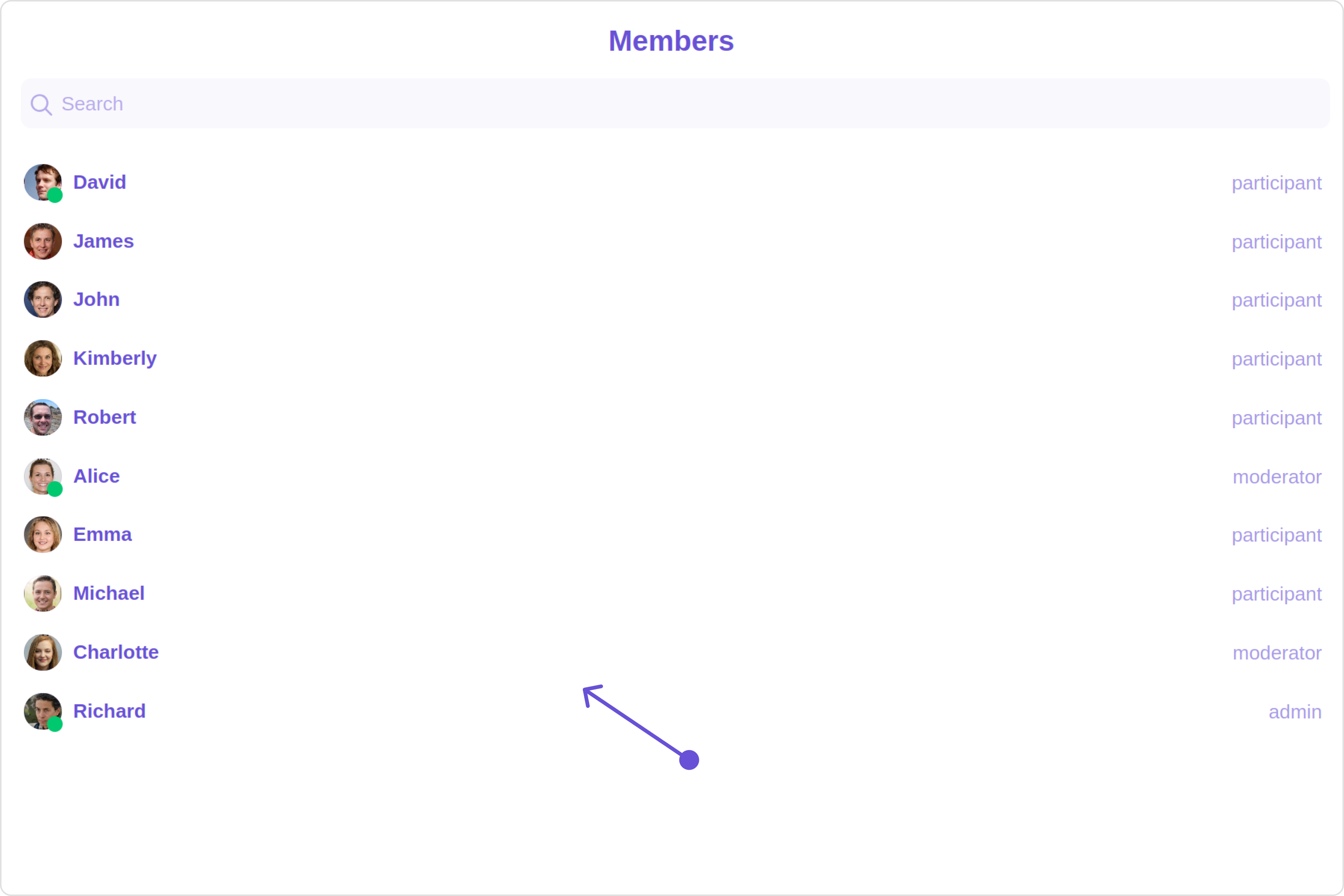 Custom:
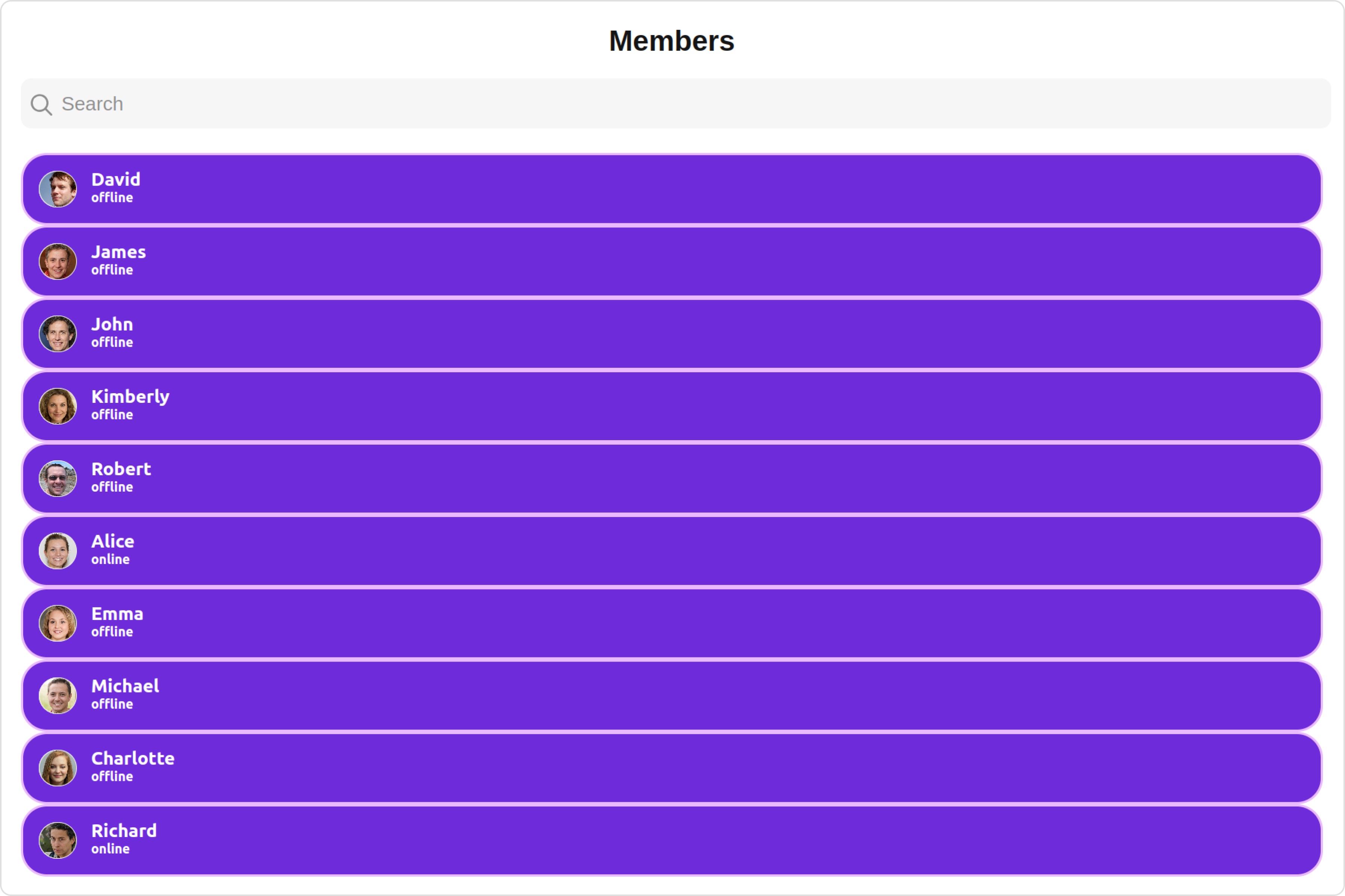
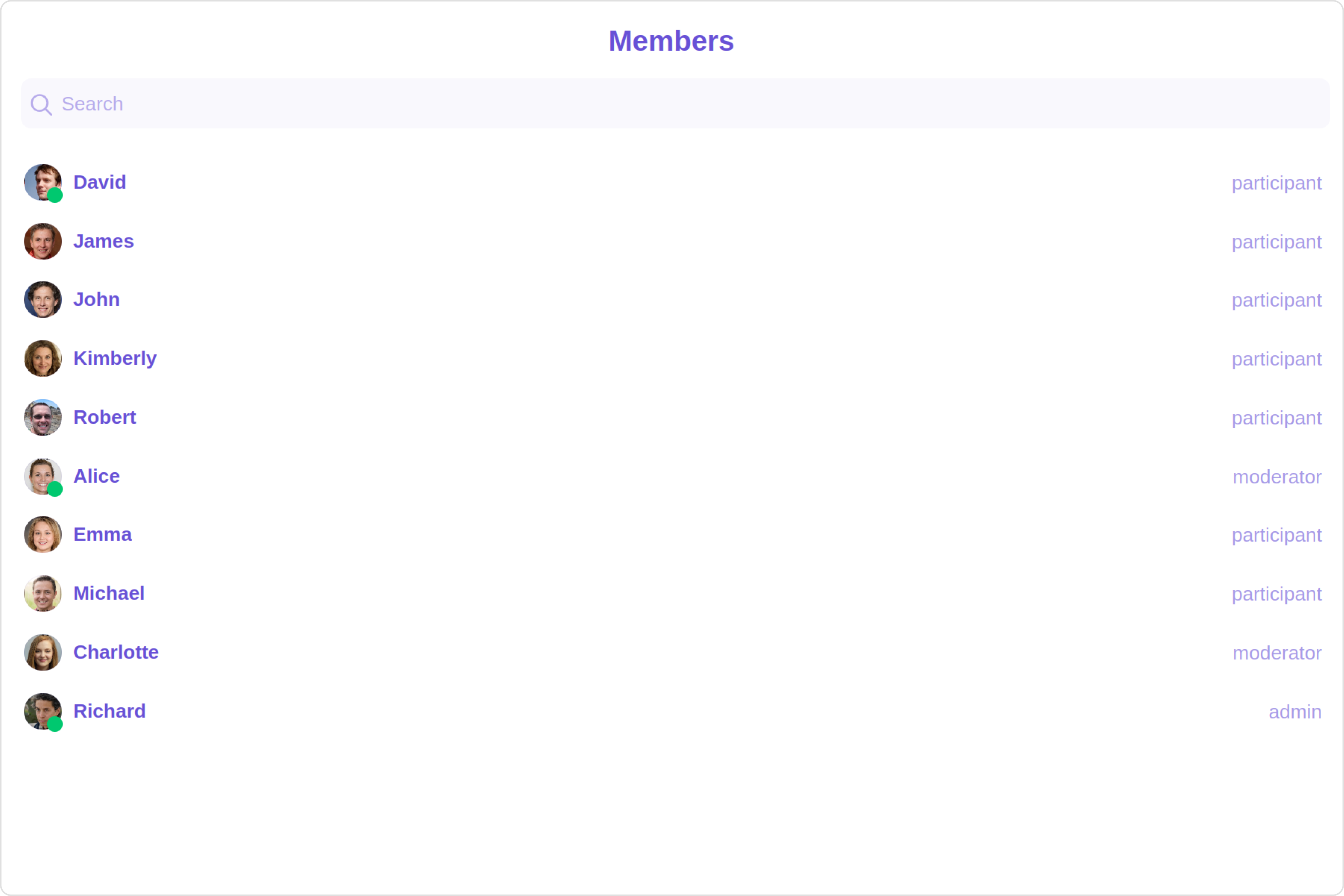
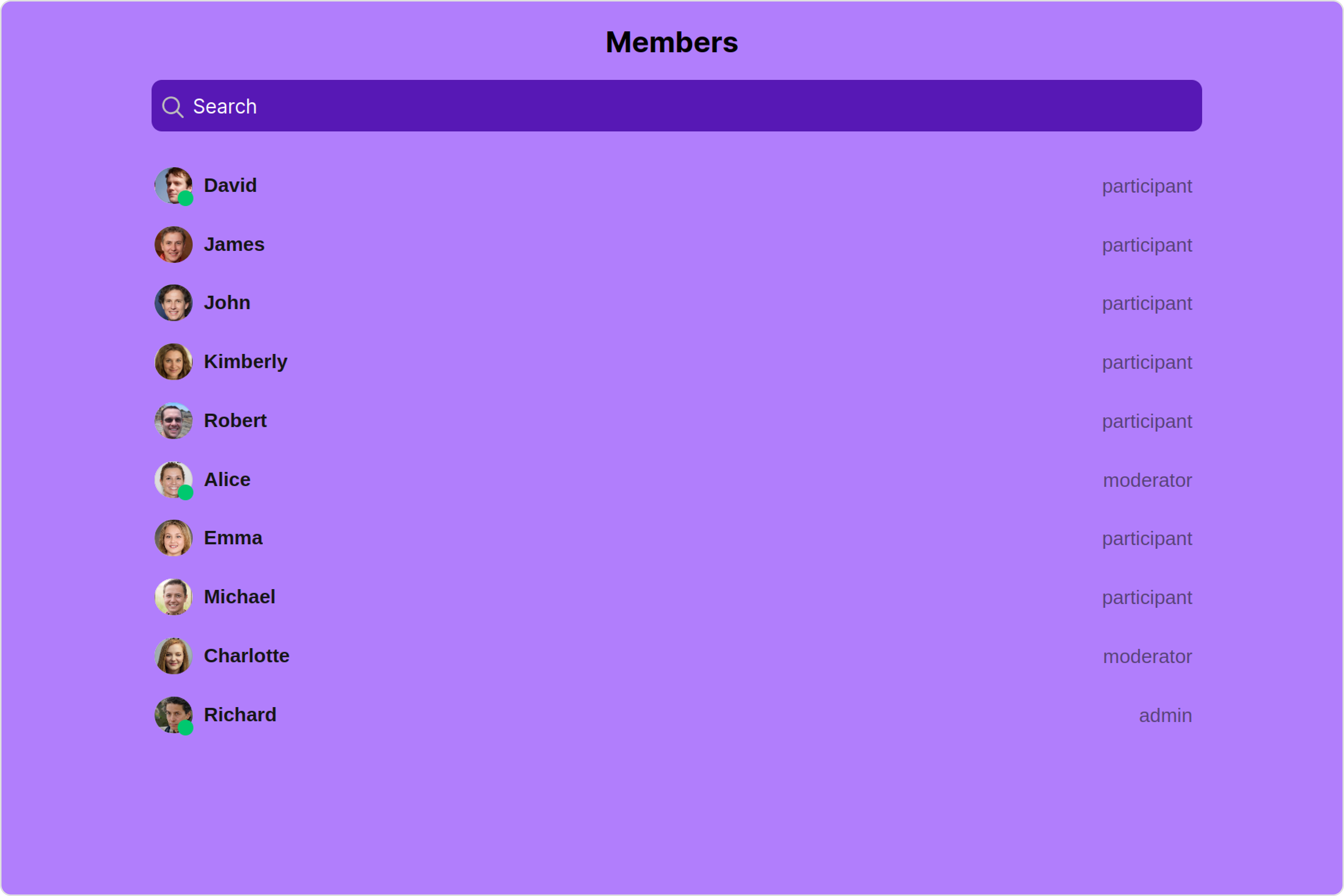
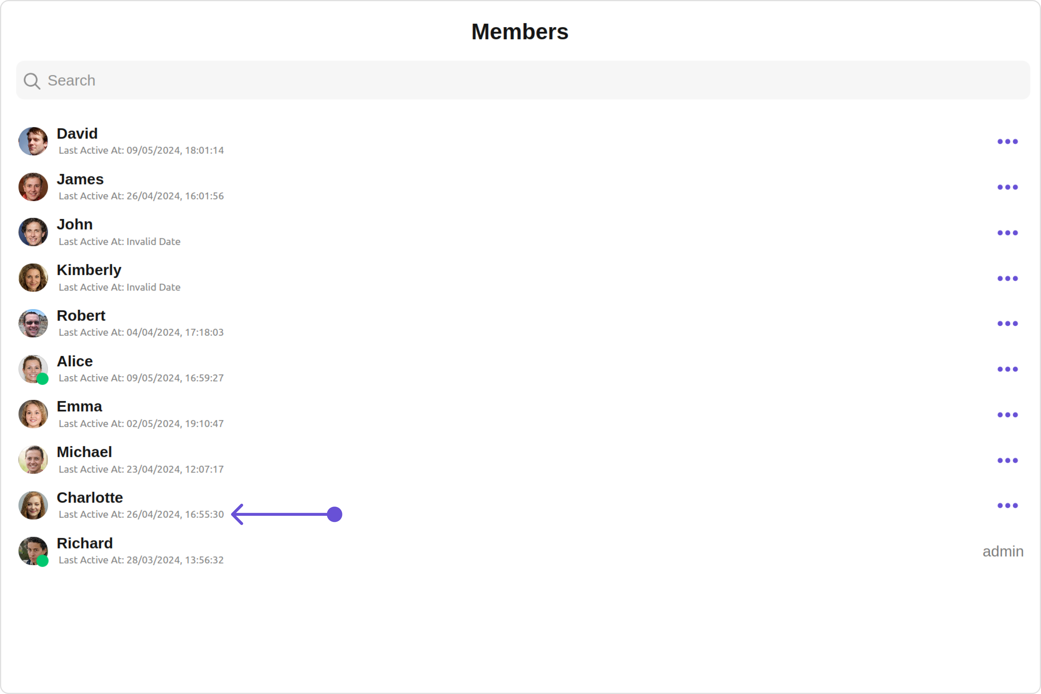
{{ groupMember.getName() }}
{{ groupMember.getStatus() }}
 Custom:
your custom subtitle view
 Custom:

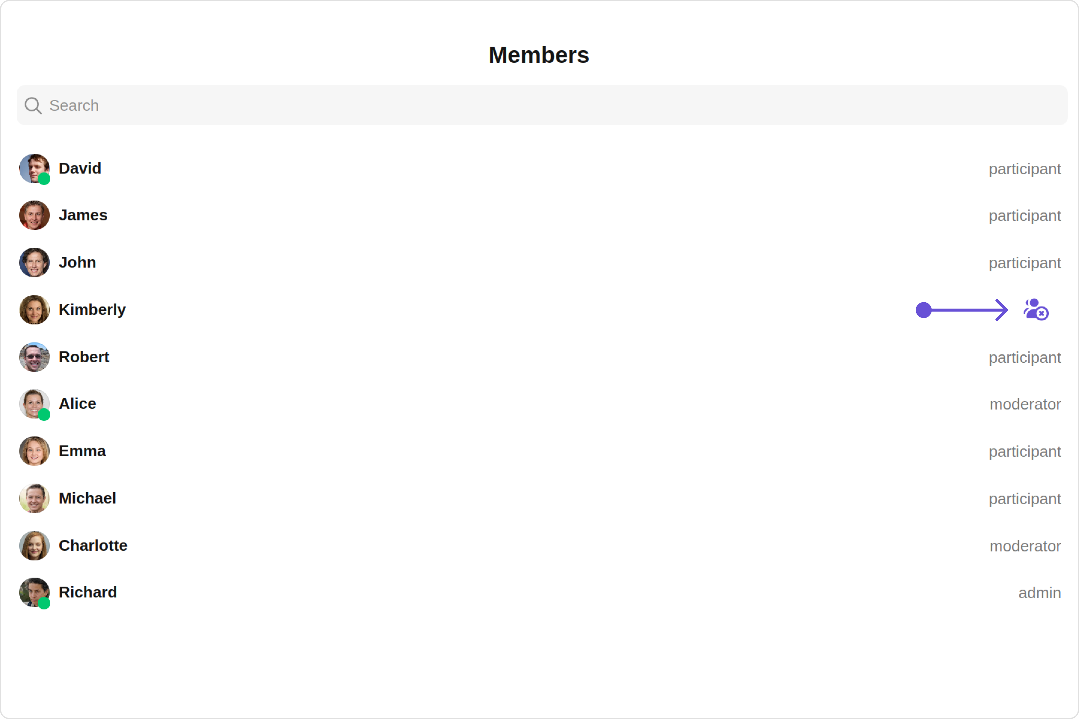
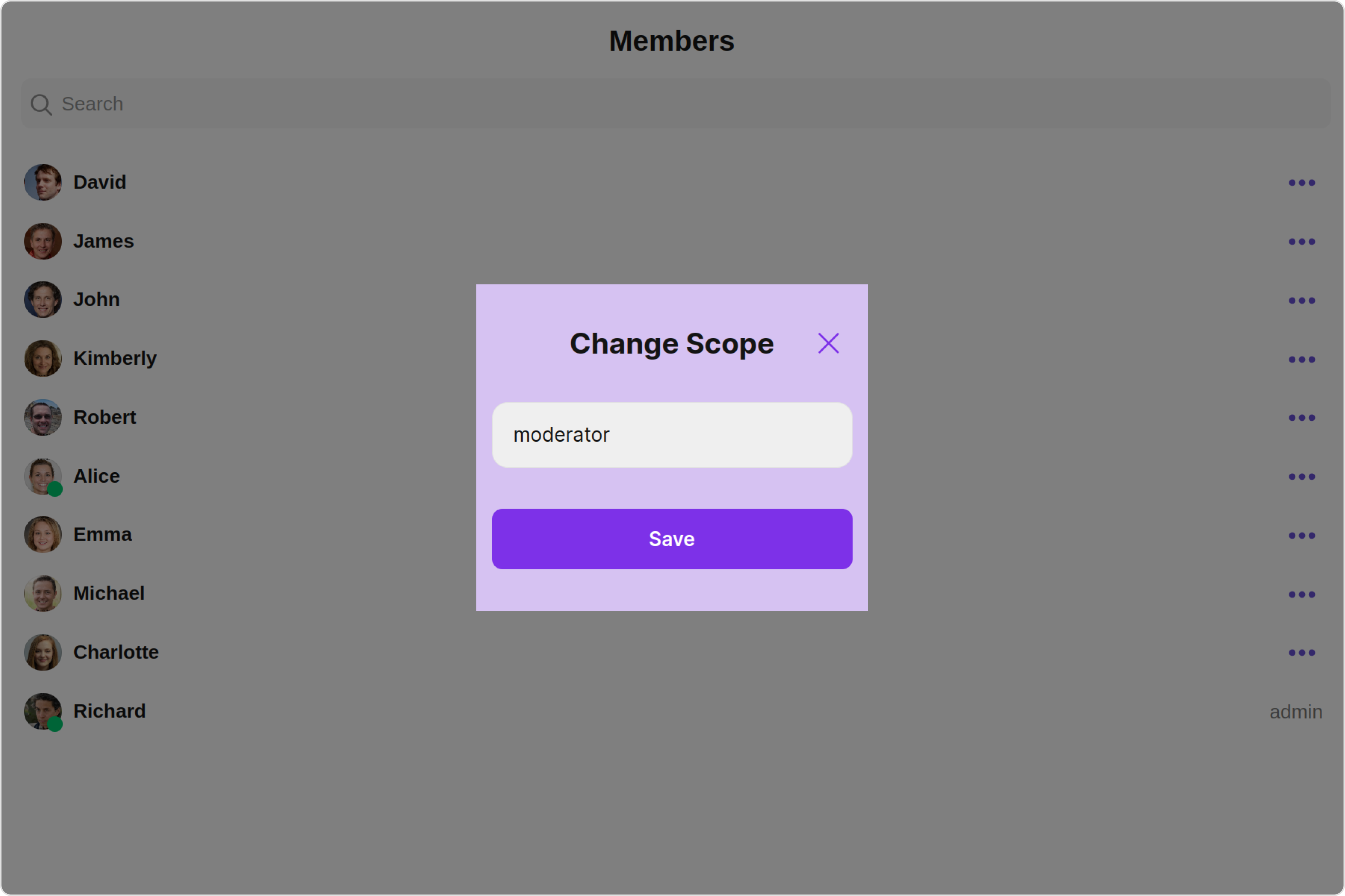
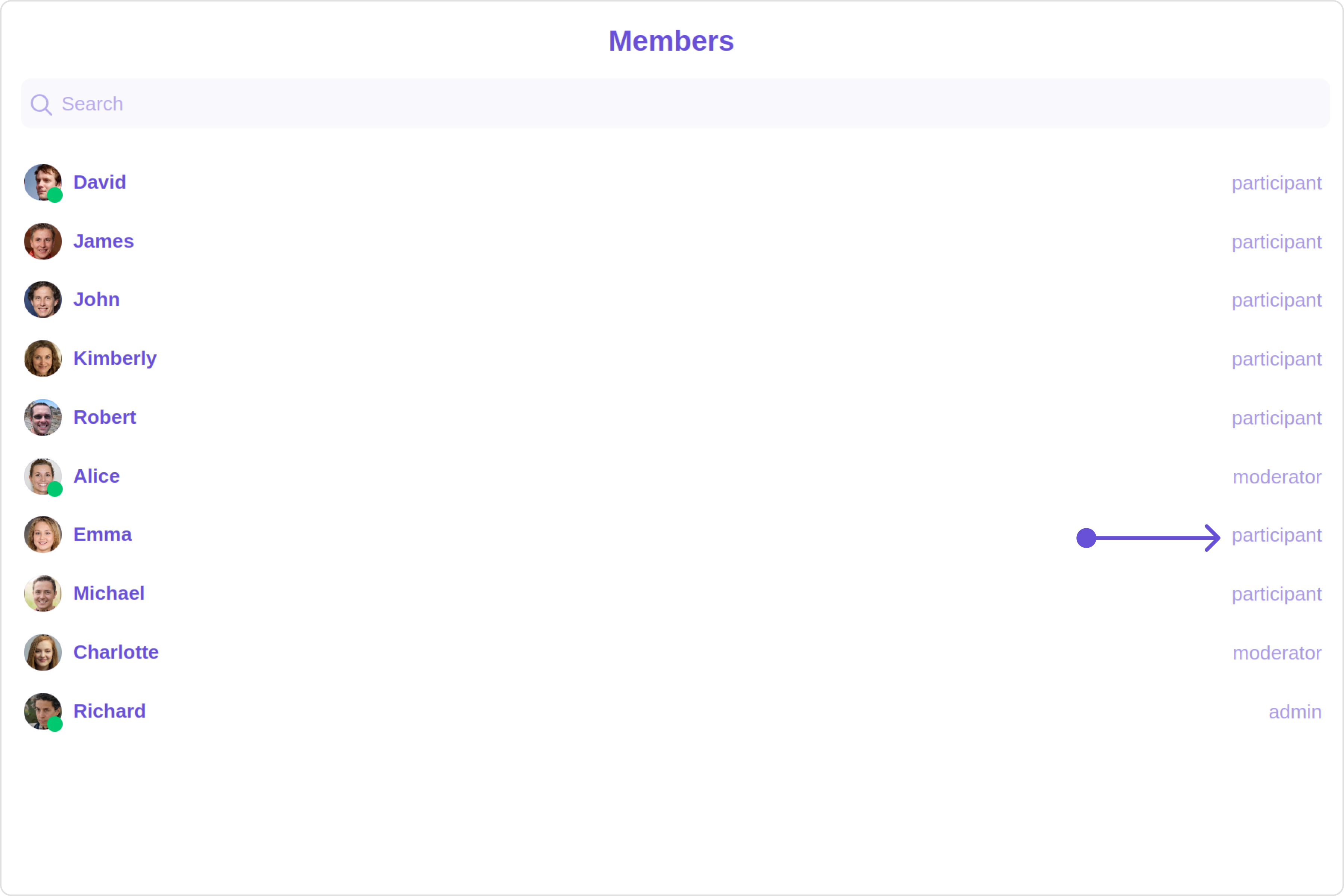
{{ groupMember.getScope() }}
 Custom:
Your Custom Empty State
 Custom: