> ## Documentation Index
> Fetch the complete documentation index at: https://cometchat-22654f5b-feature-react-native-sdk-quotedmessage-a.mintlify.site/llms.txt
> Use this file to discover all available pages before exploring further.
# Group Members
## Overview
`CometChatGroupMembers` is a versatile [Component](/ui-kit/ios/components-overview#components) designed to showcase all users who are either added to or invited to a group, thereby enabling them to participate in group discussions, access shared content, and engage in collaborative activities. Group members have the capability to communicate in real-time through messaging, voice and video calls, and various other interactions. Additionally, they can interact with each other, share files, and join calls based on the permissions established by the group administrator or owner.
 The `CometChatGroupMembers` component is composed of the following BaseComponents:
| Components | Description |
| ------------------------------------------ | ------------------------------------------------------------------------------------------------------------------------------------------------------------------------------------------------------------------------------- |
| [CometChatListBase](/ui-kit/ios/list-base) | `CometChatListBase` serves as a container component equipped with a title (navigationBar), search functionality (search-bar), background settings, and a container for embedding a list view. |
| [CometChatListItem](/ui-kit/ios/list-item) | This component renders information extracted from a `User` object onto a tile, featuring a title, subtitle, leading view, and trailing view. experience, facilitating seamless navigation and interaction within the component. |
***
## Usage
### Integration
`CometChatGroupMembers`, as a custom **view controller**, offers flexible integration options, allowing it to be launched directly via button clicks or any user-triggered action. Additionally, it seamlessly integrates into tab view controllers. With group members, users gain access to a wide range of parameters and methods for effortless customization of its user interface.
The following code snippet exemplifies how you can seamlessly integrate the GroupMembers component into your application.
```swift theme={null}
let group = Group(guid: <#T##String#>, name: <#T##String#>, groupType: <#T##CometChat.groupType#>, password: <#T##String?#>)
let cometChatGroupMembers = CometChatGroupMembers(group: group)
let naviVC = UINavigationController(rootViewController: cometChatGroupMembers)
self.present(naviVC, animated: true)
```
If you are already using a navigation controller, you can use the pushViewController function instead of presenting the view controller.
***
### Actions
[Actions](/ui-kit/ios/components-overview#actions) dictate how a component functions. They are divided into two types: Predefined and User-defined. You can override either type, allowing you to tailor the behavior of the component to fit your specific needs.
1. ##### set(onItemClick:)
`set(OnItemClick:)` is triggered when you click on a ListItem of the groups component. This `set(OnItemClick:)` method proves beneficial when a user intends to customize the on-click behavior in CometChatGroupMembers.
```swift theme={null}
cometChatGroupMembers.set(onItemClick: { user, indexPath in
// Override on item click
})
```
***
2. ##### set(OnItemLongClick:)
`set(OnItemLongClick:)` is triggered when you long press on a ListItem of the group members component. This `set(OnItemLongClick:)` method proves beneficial when a user intends to additional functionality on long press on list item in CometChatGroupMembers.
```swift theme={null}
cometChatGroupMembers.set(onItemLongClick: { groupMember, indexPath in
// Override on item click
})
```
***
##### 3. set(onBack:)
This `set(onBack:)` method becomes valuable when a user needs to override the action triggered upon pressing the back button in CometChatGroupMembers.
```swift theme={null}
cometChatGroupMembers.set(onBack: {
// Override on back
})
```
***
##### 4. set(onSelection:)
The `set(onSelection:)` only gets trigger when selection mode is set to multiple of single. And this gets trigger on every selection, and returns the list of selected group members.
```swift theme={null}
cometChatGroupMembers.set(onSelection: { groupMembers in
//Handle action
})
```
***
##### 5. set(onError:)
This method proves helpful when a user needs to customize the action taken upon encountering an error in CometChatGroupMembers.
```swift theme={null}
cometChatGroupMembers.set(onError: { error in
// Override on error
})
```
***
##### 6. set(onEmpty:)
This `set(onEmpty:)` method is triggered when the groups list is empty in CometChatGroupMembers.
```swift theme={null}
cometChatGroupMembers.set(onEmpty: {
// Handle empty state
})
```
***
##### 7. setOnLoad
This set(onLoad:) gets triggered when a group members list is fully fetched and going to displayed on the screen, this return the list of group members to get displayed on the screen.
```swift theme={null}
cometChatGroupMembers.set(onLoad: { groups in
// Handle loaded users
})
```
***
### Filters
**Filters** allow you to customize the data displayed in a list within a `Component`. You can filter the list based on your specific criteria, allowing for a more customized. Filters can be applied using `RequestBuilders` of Chat SDK.
##### 1. GroupsRequestBuilder
The [GroupsRequestBuilder](/sdk/ios/retrieve-groups) enables you to filter and customize the group list based on available parameters in GroupsRequestBuilder. This feature allows you to create more specific and targeted queries when fetching groups. The following are the parameters available in [GroupsRequestBuilder](/sdk/ios/retrieve-groups)
| Methods | Type | Description |
| -------------------- | --------- | ------------------------------------------------------------------------------------------------------------------- |
| **setLimit** | Int | Configure the maximum number of groups to fetch in a single request, optimizing pagination for smoother navigation. |
| **setSearchKeyword** | String | Employed to retrieve groups that match the provided string, facilitating precise searches. |
| **scopes** | \[String] | used for fetching group members based on multiple scopes |
**Example**
In the example below, we are applying a filter to the Group List based on limit and scope.
```swift theme={null}
let group = Group(guid: "mrc-uid", name: "", groupType: .public, password: .none)
let groupMembersRequestBuilder = GroupMembersRequest.GroupMembersRequestBuilder(guid: group.guid).set(limit: 2).set(scopes: ["admin"])
let cometChatGroupMembers = CometChatGroupMembers(group: group, groupMembersRequestBuilder: groupMembersRequestBuilder)
let naviVC = UINavigationController(rootViewController: cometChatGroupMembers)
self.present(naviVC, animated: true)
```
##### 2. SearchRequestBuilder
The SearchRequestBuilder uses [GroupsRequestBuilder](/sdk/ios/retrieve-groups) enables you to filter and customize the search list based on available parameters in GroupsRequestBuilder. This feature allows you to keep uniformity between the displayed Groups List and searched Group List.
**Example**
```swift theme={null}
let group = Group(guid: "mrc-uid", name: "", groupType: .public, password: .none)
let groupMembersRequestBuilder = GroupMembersRequest.GroupMembersRequestBuilder(guid: group.guid)
.set(searchKeyword: "")
let cometChatGroupMembers = CometChatGroupMembers(group: group, groupMembersRequestBuilder: groupMembersRequestBuilder)
let naviVC = UINavigationController(rootViewController: cometChatGroupMembers)
self.present(naviVC, animated: true)
```
***
### Events
[Events](/ui-kit/ios/components-overview#events) are emitted by a `Component`. By using event you can extend existing functionality. Being global events, they can be applied in Multiple Locations and are capable of being Added or Removed.
Events emitted by the Join Group component is as follows.
| Event | Description |
| ---------------------------- | ----------------------------------------------------------------- |
| **onGroupMemberBan** | Triggers when the group member banned from the group successfully |
| **onGroupMemberKick** | Triggers when the group member kicked from the group successfully |
| **onGroupMemberChangeScope** | Triggers when the group member scope is changed in the group |
```swift theme={null}
// View controller from your project where you want to listen events.
public class ViewController: UIViewController {
public override func viewDidLoad() {
super.viewDidLoad()
// Subscribing for the listener to listen events from user module
CometChatGroupEvents.addListener("UNIQUE_ID", self as CometChatGroupEventListener)
}
}
// Listener events from groups module
extension ViewController: CometChatGroupEventListener {
public func onGroupMemberBan(bannedUser: User, bannedGroup: Group) {
// Do Stuff
}
public func onGroupMemberKick(kickedUser: User, kickedGroup: Group) {
// Do Stuff
}
public func onGroupMemberChangeScope(updatedBy: User, updatedUser: User, scopeChangedTo: CometChat.MemberScope, scopeChangedFrom: CometChat.MemberScope, group: Group) {
// Do Stuff
}
}
```
```swift Emitting Group Events theme={null}
///emit this when group member is banned from the group by logged in user.
CometChatGroupEvents.emitOnGroupMemberBan(bannedUser: User, bannedGroup: Group, bannedBy: User)
///emit this when group member is kicked from the group by logged in user.
CometChatGroupEvents.emitOnGroupMemberKick(kickedUser: User, kickedGroup: Group, kickedBy: User)
///emit this when group member's scope is changed by logged in user.
CometChatGroupEvents.emitOnGroupMemberChangeScope(updatedBy: User , updatedUser: User , scopeChangedTo: CometChat.MemberScope , scopeChangedFrom: CometChat.MemberScope, group: Group)
```
***
```swift View Controller theme={null}
public override func viewWillDisappear(_ animated: Bool) {
// Uncubscribing for the listener to listen events from user module
CometChatGroupEvents.removeListener("LISTENER_ID_USED_FOR_ADDING_THIS_LISTENER")
}
```
## Customization
To fit your app's design requirements, you can customize the appearance of the Groups component. We provide exposed methods that allow you to modify the experience and behavior according to your specific needs.
### Style
Using **Style** you can **customize** the look and feel of the component in your app, These parameters typically control elements such as the **color**, **size**, **shape**, and **fonts** used within the component.
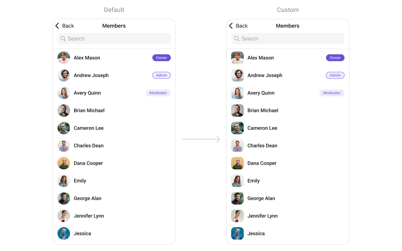
##### 1. GroupMembers Style
You can set the `GroupMembersStyle` to the `Group Memebers` Component to customize the styling.
**Global level styling**
```swift theme={null}
let customAvatarStyle = AvatarStyle()
customAvatarStyle.backgroundColor = UIColor(hex: "#FBAA75")
customAvatarStyle.cornerRadius = CometChatCornerStyle(cornerRadius: 8)
CometChatGroupMembers.style.titleColor = UIColor(hex: "#F76808")
CometChatGroupMembers.style.titleFont = UIFont(name: "Times-New-Roman", size: 34)
CometChatGroupMembers.avatarStyle = customAvatarStyle
```
**Instance level styling**
```swift theme={null}
let customAvatarStyle = AvatarStyle()
customAvatarStyle.backgroundColor = UIColor(hex: "#FBAA75")
customAvatarStyle.cornerRadius = CometChatCornerStyle(cornerRadius: 20)
let groupMembersStyle = GroupMembersStyle()
groupMembersStyle.titleColor = UIColor(hex: "#F76808")
groupMembersStyle.titleFont = UIFont(name: "Times-New-Roman", size: 34)
let groupMember = CometChatGroupMembers()
groupMember.style = groupMembersStyle
groupMember.avatarStyle = customAvatarStyle
```
The `CometChatGroupMembers` component is composed of the following BaseComponents:
| Components | Description |
| ------------------------------------------ | ------------------------------------------------------------------------------------------------------------------------------------------------------------------------------------------------------------------------------- |
| [CometChatListBase](/ui-kit/ios/list-base) | `CometChatListBase` serves as a container component equipped with a title (navigationBar), search functionality (search-bar), background settings, and a container for embedding a list view. |
| [CometChatListItem](/ui-kit/ios/list-item) | This component renders information extracted from a `User` object onto a tile, featuring a title, subtitle, leading view, and trailing view. experience, facilitating seamless navigation and interaction within the component. |
***
## Usage
### Integration
`CometChatGroupMembers`, as a custom **view controller**, offers flexible integration options, allowing it to be launched directly via button clicks or any user-triggered action. Additionally, it seamlessly integrates into tab view controllers. With group members, users gain access to a wide range of parameters and methods for effortless customization of its user interface.
The following code snippet exemplifies how you can seamlessly integrate the GroupMembers component into your application.
```swift theme={null}
let group = Group(guid: <#T##String#>, name: <#T##String#>, groupType: <#T##CometChat.groupType#>, password: <#T##String?#>)
let cometChatGroupMembers = CometChatGroupMembers(group: group)
let naviVC = UINavigationController(rootViewController: cometChatGroupMembers)
self.present(naviVC, animated: true)
```
If you are already using a navigation controller, you can use the pushViewController function instead of presenting the view controller.
***
### Actions
[Actions](/ui-kit/ios/components-overview#actions) dictate how a component functions. They are divided into two types: Predefined and User-defined. You can override either type, allowing you to tailor the behavior of the component to fit your specific needs.
1. ##### set(onItemClick:)
`set(OnItemClick:)` is triggered when you click on a ListItem of the groups component. This `set(OnItemClick:)` method proves beneficial when a user intends to customize the on-click behavior in CometChatGroupMembers.
```swift theme={null}
cometChatGroupMembers.set(onItemClick: { user, indexPath in
// Override on item click
})
```
***
2. ##### set(OnItemLongClick:)
`set(OnItemLongClick:)` is triggered when you long press on a ListItem of the group members component. This `set(OnItemLongClick:)` method proves beneficial when a user intends to additional functionality on long press on list item in CometChatGroupMembers.
```swift theme={null}
cometChatGroupMembers.set(onItemLongClick: { groupMember, indexPath in
// Override on item click
})
```
***
##### 3. set(onBack:)
This `set(onBack:)` method becomes valuable when a user needs to override the action triggered upon pressing the back button in CometChatGroupMembers.
```swift theme={null}
cometChatGroupMembers.set(onBack: {
// Override on back
})
```
***
##### 4. set(onSelection:)
The `set(onSelection:)` only gets trigger when selection mode is set to multiple of single. And this gets trigger on every selection, and returns the list of selected group members.
```swift theme={null}
cometChatGroupMembers.set(onSelection: { groupMembers in
//Handle action
})
```
***
##### 5. set(onError:)
This method proves helpful when a user needs to customize the action taken upon encountering an error in CometChatGroupMembers.
```swift theme={null}
cometChatGroupMembers.set(onError: { error in
// Override on error
})
```
***
##### 6. set(onEmpty:)
This `set(onEmpty:)` method is triggered when the groups list is empty in CometChatGroupMembers.
```swift theme={null}
cometChatGroupMembers.set(onEmpty: {
// Handle empty state
})
```
***
##### 7. setOnLoad
This set(onLoad:) gets triggered when a group members list is fully fetched and going to displayed on the screen, this return the list of group members to get displayed on the screen.
```swift theme={null}
cometChatGroupMembers.set(onLoad: { groups in
// Handle loaded users
})
```
***
### Filters
**Filters** allow you to customize the data displayed in a list within a `Component`. You can filter the list based on your specific criteria, allowing for a more customized. Filters can be applied using `RequestBuilders` of Chat SDK.
##### 1. GroupsRequestBuilder
The [GroupsRequestBuilder](/sdk/ios/retrieve-groups) enables you to filter and customize the group list based on available parameters in GroupsRequestBuilder. This feature allows you to create more specific and targeted queries when fetching groups. The following are the parameters available in [GroupsRequestBuilder](/sdk/ios/retrieve-groups)
| Methods | Type | Description |
| -------------------- | --------- | ------------------------------------------------------------------------------------------------------------------- |
| **setLimit** | Int | Configure the maximum number of groups to fetch in a single request, optimizing pagination for smoother navigation. |
| **setSearchKeyword** | String | Employed to retrieve groups that match the provided string, facilitating precise searches. |
| **scopes** | \[String] | used for fetching group members based on multiple scopes |
**Example**
In the example below, we are applying a filter to the Group List based on limit and scope.
```swift theme={null}
let group = Group(guid: "mrc-uid", name: "", groupType: .public, password: .none)
let groupMembersRequestBuilder = GroupMembersRequest.GroupMembersRequestBuilder(guid: group.guid).set(limit: 2).set(scopes: ["admin"])
let cometChatGroupMembers = CometChatGroupMembers(group: group, groupMembersRequestBuilder: groupMembersRequestBuilder)
let naviVC = UINavigationController(rootViewController: cometChatGroupMembers)
self.present(naviVC, animated: true)
```
##### 2. SearchRequestBuilder
The SearchRequestBuilder uses [GroupsRequestBuilder](/sdk/ios/retrieve-groups) enables you to filter and customize the search list based on available parameters in GroupsRequestBuilder. This feature allows you to keep uniformity between the displayed Groups List and searched Group List.
**Example**
```swift theme={null}
let group = Group(guid: "mrc-uid", name: "", groupType: .public, password: .none)
let groupMembersRequestBuilder = GroupMembersRequest.GroupMembersRequestBuilder(guid: group.guid)
.set(searchKeyword: "")
let cometChatGroupMembers = CometChatGroupMembers(group: group, groupMembersRequestBuilder: groupMembersRequestBuilder)
let naviVC = UINavigationController(rootViewController: cometChatGroupMembers)
self.present(naviVC, animated: true)
```
***
### Events
[Events](/ui-kit/ios/components-overview#events) are emitted by a `Component`. By using event you can extend existing functionality. Being global events, they can be applied in Multiple Locations and are capable of being Added or Removed.
Events emitted by the Join Group component is as follows.
| Event | Description |
| ---------------------------- | ----------------------------------------------------------------- |
| **onGroupMemberBan** | Triggers when the group member banned from the group successfully |
| **onGroupMemberKick** | Triggers when the group member kicked from the group successfully |
| **onGroupMemberChangeScope** | Triggers when the group member scope is changed in the group |
```swift theme={null}
// View controller from your project where you want to listen events.
public class ViewController: UIViewController {
public override func viewDidLoad() {
super.viewDidLoad()
// Subscribing for the listener to listen events from user module
CometChatGroupEvents.addListener("UNIQUE_ID", self as CometChatGroupEventListener)
}
}
// Listener events from groups module
extension ViewController: CometChatGroupEventListener {
public func onGroupMemberBan(bannedUser: User, bannedGroup: Group) {
// Do Stuff
}
public func onGroupMemberKick(kickedUser: User, kickedGroup: Group) {
// Do Stuff
}
public func onGroupMemberChangeScope(updatedBy: User, updatedUser: User, scopeChangedTo: CometChat.MemberScope, scopeChangedFrom: CometChat.MemberScope, group: Group) {
// Do Stuff
}
}
```
```swift Emitting Group Events theme={null}
///emit this when group member is banned from the group by logged in user.
CometChatGroupEvents.emitOnGroupMemberBan(bannedUser: User, bannedGroup: Group, bannedBy: User)
///emit this when group member is kicked from the group by logged in user.
CometChatGroupEvents.emitOnGroupMemberKick(kickedUser: User, kickedGroup: Group, kickedBy: User)
///emit this when group member's scope is changed by logged in user.
CometChatGroupEvents.emitOnGroupMemberChangeScope(updatedBy: User , updatedUser: User , scopeChangedTo: CometChat.MemberScope , scopeChangedFrom: CometChat.MemberScope, group: Group)
```
***
```swift View Controller theme={null}
public override func viewWillDisappear(_ animated: Bool) {
// Uncubscribing for the listener to listen events from user module
CometChatGroupEvents.removeListener("LISTENER_ID_USED_FOR_ADDING_THIS_LISTENER")
}
```
## Customization
To fit your app's design requirements, you can customize the appearance of the Groups component. We provide exposed methods that allow you to modify the experience and behavior according to your specific needs.
### Style
Using **Style** you can **customize** the look and feel of the component in your app, These parameters typically control elements such as the **color**, **size**, **shape**, and **fonts** used within the component.
##### 1. GroupMembers Style
You can set the `GroupMembersStyle` to the `Group Memebers` Component to customize the styling.
**Global level styling**
```swift theme={null}
let customAvatarStyle = AvatarStyle()
customAvatarStyle.backgroundColor = UIColor(hex: "#FBAA75")
customAvatarStyle.cornerRadius = CometChatCornerStyle(cornerRadius: 8)
CometChatGroupMembers.style.titleColor = UIColor(hex: "#F76808")
CometChatGroupMembers.style.titleFont = UIFont(name: "Times-New-Roman", size: 34)
CometChatGroupMembers.avatarStyle = customAvatarStyle
```
**Instance level styling**
```swift theme={null}
let customAvatarStyle = AvatarStyle()
customAvatarStyle.backgroundColor = UIColor(hex: "#FBAA75")
customAvatarStyle.cornerRadius = CometChatCornerStyle(cornerRadius: 20)
let groupMembersStyle = GroupMembersStyle()
groupMembersStyle.titleColor = UIColor(hex: "#F76808")
groupMembersStyle.titleFont = UIFont(name: "Times-New-Roman", size: 34)
let groupMember = CometChatGroupMembers()
groupMember.style = groupMembersStyle
groupMember.avatarStyle = customAvatarStyle
```
 List of properties exposed by GroupMemberStyle
| Property | Description | Code |
| --------------------------------- | ---------------------------------------------------- | ------------------------------------------------ |
| retryButtonTextColor | Sets the text color for the retry button. | `.retryButtonTextColor: UIColor` |
| retryButtonTextFont | Sets the text font for the retry button. | `.retryButtonTextFont: UIFont` |
| retryButtonBackgroundColor | Sets the background color for the retry button. | `.retryButtonBackgroundColor: UIColor` |
| retryButtonBorderColor | Sets the border color for the retry button. | `.retryButtonBorderColor: UIColor` |
| retryButtonBorderWidth | Sets the border width for the retry button. | `.retryButtonBorderWidth: CGFloat` |
| retryButtonCornerRadius | Sets the corner radius for the retry button. | `.retryButtonCornerRadius: CometChatCornerStyle` |
| listItemSelectedBackground | Sets the background color for selected list items. | `.listItemSelectedBackground: UIColor` |
| listItemDeSelectedImageTint | Sets the tint color for deselected list item images. | `.listItemDeSelectedImageTint: UIColor` |
| listItemSelectionImageTint | Sets the tint color for selected list item images. | `.listItemSelectionImageTint: UIColor` |
| listItemSelectedImage | Sets the image for selected list items. | `.listItemSelectedImage: UIImage` |
| listItemDeSelectedImage | Sets the image for deselected list items. | `.listItemDeSelectedImage: UIImage` |
| backgroundColor | Sets the background color. | `.backgroundColor: UIColor` |
| borderWidth | Sets the border width. | `.borderWidth: CGFloat` |
| borderColor | Sets the border color. | `.borderColor: UIColor` |
| cornerRadius | Sets the corner radius style. | `.cornerRadius: CometChatCornerStyle` |
| titleFont | Sets the font for the title. | `.titleFont: UIFont?` |
| largeTitleFont | Sets the font for the large title. | `.largeTitleFont: UIFont?` |
| titleColor | Sets the color for the title text. | `.titleColor: UIColor?` |
| largeTitleColor | Sets the color for the large title text. | `.largeTitleColor: UIColor?` |
| navigationBarTintColor | Sets the tint color for the navigation bar. | `.navigationBarTintColor: UIColor?` |
| navigationBarItemsTintColor | Sets the tint color for navigation bar items. | `.navigationBarItemsTintColor: UIColor?` |
| errorTitleTextFont | Sets the font for the error title text. | `.errorTitleTextFont: UIFont` |
| errorTitleTextColor | Sets the color for the error title text. | `.errorTitleTextColor: UIColor` |
| errorSubTitleFont | Sets the font for the error subtitle text. | `.errorSubTitleFont: UIFont` |
| errorSubTitleTextColor | Sets the color for the error subtitle text. | `.errorSubTitleTextColor: UIColor` |
| emptyTitleTextFont | Sets the font for the empty state title text. | `.emptyTitleTextFont: UIFont` |
| emptyTitleTextColor | Sets the color for the empty state title text. | `.emptyTitleTextColor: UIColor` |
| emptySubTitleFont | Sets the font for the empty state subtitle text. | `.emptySubTitleFont: UIFont` |
| emptySubTitleTextColor | Sets the color for the empty state subtitle text. | `.emptySubTitleTextColor: UIColor` |
| tableViewSeparator | Sets the color for the table view separator. | `.tableViewSeparator: UIColor` |
| listItemTitleTextColor | Sets the text color for list item titles. | `.listItemTitleTextColor: UIColor` |
| listItemTitleFont | Sets the font for list item titles. | `.listItemTitleFont: UIFont` |
| listItemSubTitleTextColor | Sets the text color for list item subtitles. | `.listItemSubTitleTextColor: UIColor` |
| listItemSubTitleFont | Sets the font for list item subtitles. | `.listItemSubTitleFont: UIFont` |
| listItemBackground | Sets the background color for list items. | `.listItemBackground: UIColor` |
| listItemBorderWidth | Sets the border width for list items. | `.listItemBorderWidth: CGFloat` |
| listItemBorderColor | Sets the border color for list items. | `.listItemBorderColor: UIColor` |
| listItemCornerRadius | Sets the corner radius for list items. | `.listItemCornerRadius: CometChatCornerStyle` |
| messageTypeImageTint | Sets the tint color for message type icons. | `.messageTypeImageTint: UIColor` |
| passwordGroupImageTintColor | Sets the tint color for password group icons. | `.passwordGroupImageTintColor: UIColor` |
| passwordGroupImageBackgroundColor | Sets the background color for password group icons. | `.passwordGroupImageBackgroundColor: UIColor` |
| privateGroupImageTintColor | Sets the tint color for private group icons. | `.privateGroupImageTintColor: UIColor` |
| privateGroupImageBackgroundColor | Sets the background color for private group icons. | `.privateGroupImageBackgroundColor: UIColor` |
***
### Functionality
These are a set of small functional customizations that allow you to fine-tune the overall experience of the component. With these, you can change text, set custom icons, and toggle the visibility of UI elements.
```swift theme={null}
let cometChatGroupMembers = CometChatGroupMembers(group: group)
cometChatGroupMembers.set(title: "Cc", mode: .automatic)
cometChatGroupMembers.disable(usersPresence: true)
```
| Method | Description | Code |
| -------------------------------- | ----------------------------------------------------- | --------------------------------------------------------------------------------- |
| set(groupMembersRequestBuilder:) | Sets the request builder for fetching group members. | `set(groupMembersRequestBuilder: GroupMembersRequest.GroupMembersRequestBuilder)` |
| set(searchRequestBuilder:) | Sets the request builder for searching group members. | `set(searchRequestBuilder: searchRequestBuilder)` |
| set(searchKeyword:) | Sets the search keyword to filter group members. | `set(searchKeyword: "group_name")` |
| hideError | Hides the error state view. | `hideError = true` |
| hideUserStatus | Hides the online/offline status of users. | `hideUserStatus = true` |
| hideNavigationBar | Hides or shows the navigation bar. | `hideNavigationBar = true` |
| hideLoadingState | Hides the loading state indicator. | `hideLoadingState = true` |
| hideBackIcon | Hides the back button/icon. | `hideBackIcon = true` |
| hideKickMemberOption | Hides the option to kick a member from the group. | `hideKickMemberOption = true` |
| hideBanMemberOption | Hides the option to ban a member from the group. | `hideBanMemberOption = true` |
| hideScopeChangeOption | Hides the option to change a member’s scope (role). | `hideScopeChangeOption = true` |
| hideSearch | Hides the search bar. | `hideSearch = true` |
### Advanced
For advanced-level customization, you can set custom views to the component. This lets you tailor each aspect of the component to fit your exact needs and application aesthetics. You can create and define your own views, layouts, and UI elements and then incorporate those into the component.
The `Join Group` component does not provide additional functionalities beyond this level of customization.
#### SetListItemView
Utilize this property to assign a custom ListItem to the GroupMembers Component, allowing for enhanced customization and flexibility in its rendering.
```swift theme={null}
let cometChatGroupMembers = CometChatGroupMembers(group: group)
cometChatGroupMembers.set(listItemView:{ groupMember in
let customListItemGroupView = CustomListItemGroupView()
customListItemGroupView.configure(with: groupMember!) // pass group member here
return customListItemGroupView
})
```
**Example**
List of properties exposed by GroupMemberStyle
| Property | Description | Code |
| --------------------------------- | ---------------------------------------------------- | ------------------------------------------------ |
| retryButtonTextColor | Sets the text color for the retry button. | `.retryButtonTextColor: UIColor` |
| retryButtonTextFont | Sets the text font for the retry button. | `.retryButtonTextFont: UIFont` |
| retryButtonBackgroundColor | Sets the background color for the retry button. | `.retryButtonBackgroundColor: UIColor` |
| retryButtonBorderColor | Sets the border color for the retry button. | `.retryButtonBorderColor: UIColor` |
| retryButtonBorderWidth | Sets the border width for the retry button. | `.retryButtonBorderWidth: CGFloat` |
| retryButtonCornerRadius | Sets the corner radius for the retry button. | `.retryButtonCornerRadius: CometChatCornerStyle` |
| listItemSelectedBackground | Sets the background color for selected list items. | `.listItemSelectedBackground: UIColor` |
| listItemDeSelectedImageTint | Sets the tint color for deselected list item images. | `.listItemDeSelectedImageTint: UIColor` |
| listItemSelectionImageTint | Sets the tint color for selected list item images. | `.listItemSelectionImageTint: UIColor` |
| listItemSelectedImage | Sets the image for selected list items. | `.listItemSelectedImage: UIImage` |
| listItemDeSelectedImage | Sets the image for deselected list items. | `.listItemDeSelectedImage: UIImage` |
| backgroundColor | Sets the background color. | `.backgroundColor: UIColor` |
| borderWidth | Sets the border width. | `.borderWidth: CGFloat` |
| borderColor | Sets the border color. | `.borderColor: UIColor` |
| cornerRadius | Sets the corner radius style. | `.cornerRadius: CometChatCornerStyle` |
| titleFont | Sets the font for the title. | `.titleFont: UIFont?` |
| largeTitleFont | Sets the font for the large title. | `.largeTitleFont: UIFont?` |
| titleColor | Sets the color for the title text. | `.titleColor: UIColor?` |
| largeTitleColor | Sets the color for the large title text. | `.largeTitleColor: UIColor?` |
| navigationBarTintColor | Sets the tint color for the navigation bar. | `.navigationBarTintColor: UIColor?` |
| navigationBarItemsTintColor | Sets the tint color for navigation bar items. | `.navigationBarItemsTintColor: UIColor?` |
| errorTitleTextFont | Sets the font for the error title text. | `.errorTitleTextFont: UIFont` |
| errorTitleTextColor | Sets the color for the error title text. | `.errorTitleTextColor: UIColor` |
| errorSubTitleFont | Sets the font for the error subtitle text. | `.errorSubTitleFont: UIFont` |
| errorSubTitleTextColor | Sets the color for the error subtitle text. | `.errorSubTitleTextColor: UIColor` |
| emptyTitleTextFont | Sets the font for the empty state title text. | `.emptyTitleTextFont: UIFont` |
| emptyTitleTextColor | Sets the color for the empty state title text. | `.emptyTitleTextColor: UIColor` |
| emptySubTitleFont | Sets the font for the empty state subtitle text. | `.emptySubTitleFont: UIFont` |
| emptySubTitleTextColor | Sets the color for the empty state subtitle text. | `.emptySubTitleTextColor: UIColor` |
| tableViewSeparator | Sets the color for the table view separator. | `.tableViewSeparator: UIColor` |
| listItemTitleTextColor | Sets the text color for list item titles. | `.listItemTitleTextColor: UIColor` |
| listItemTitleFont | Sets the font for list item titles. | `.listItemTitleFont: UIFont` |
| listItemSubTitleTextColor | Sets the text color for list item subtitles. | `.listItemSubTitleTextColor: UIColor` |
| listItemSubTitleFont | Sets the font for list item subtitles. | `.listItemSubTitleFont: UIFont` |
| listItemBackground | Sets the background color for list items. | `.listItemBackground: UIColor` |
| listItemBorderWidth | Sets the border width for list items. | `.listItemBorderWidth: CGFloat` |
| listItemBorderColor | Sets the border color for list items. | `.listItemBorderColor: UIColor` |
| listItemCornerRadius | Sets the corner radius for list items. | `.listItemCornerRadius: CometChatCornerStyle` |
| messageTypeImageTint | Sets the tint color for message type icons. | `.messageTypeImageTint: UIColor` |
| passwordGroupImageTintColor | Sets the tint color for password group icons. | `.passwordGroupImageTintColor: UIColor` |
| passwordGroupImageBackgroundColor | Sets the background color for password group icons. | `.passwordGroupImageBackgroundColor: UIColor` |
| privateGroupImageTintColor | Sets the tint color for private group icons. | `.privateGroupImageTintColor: UIColor` |
| privateGroupImageBackgroundColor | Sets the background color for private group icons. | `.privateGroupImageBackgroundColor: UIColor` |
***
### Functionality
These are a set of small functional customizations that allow you to fine-tune the overall experience of the component. With these, you can change text, set custom icons, and toggle the visibility of UI elements.
```swift theme={null}
let cometChatGroupMembers = CometChatGroupMembers(group: group)
cometChatGroupMembers.set(title: "Cc", mode: .automatic)
cometChatGroupMembers.disable(usersPresence: true)
```
| Method | Description | Code |
| -------------------------------- | ----------------------------------------------------- | --------------------------------------------------------------------------------- |
| set(groupMembersRequestBuilder:) | Sets the request builder for fetching group members. | `set(groupMembersRequestBuilder: GroupMembersRequest.GroupMembersRequestBuilder)` |
| set(searchRequestBuilder:) | Sets the request builder for searching group members. | `set(searchRequestBuilder: searchRequestBuilder)` |
| set(searchKeyword:) | Sets the search keyword to filter group members. | `set(searchKeyword: "group_name")` |
| hideError | Hides the error state view. | `hideError = true` |
| hideUserStatus | Hides the online/offline status of users. | `hideUserStatus = true` |
| hideNavigationBar | Hides or shows the navigation bar. | `hideNavigationBar = true` |
| hideLoadingState | Hides the loading state indicator. | `hideLoadingState = true` |
| hideBackIcon | Hides the back button/icon. | `hideBackIcon = true` |
| hideKickMemberOption | Hides the option to kick a member from the group. | `hideKickMemberOption = true` |
| hideBanMemberOption | Hides the option to ban a member from the group. | `hideBanMemberOption = true` |
| hideScopeChangeOption | Hides the option to change a member’s scope (role). | `hideScopeChangeOption = true` |
| hideSearch | Hides the search bar. | `hideSearch = true` |
### Advanced
For advanced-level customization, you can set custom views to the component. This lets you tailor each aspect of the component to fit your exact needs and application aesthetics. You can create and define your own views, layouts, and UI elements and then incorporate those into the component.
The `Join Group` component does not provide additional functionalities beyond this level of customization.
#### SetListItemView
Utilize this property to assign a custom ListItem to the GroupMembers Component, allowing for enhanced customization and flexibility in its rendering.
```swift theme={null}
let cometChatGroupMembers = CometChatGroupMembers(group: group)
cometChatGroupMembers.set(listItemView:{ groupMember in
let customListItemGroupView = CustomListItemGroupView()
customListItemGroupView.configure(with: groupMember!) // pass group member here
return customListItemGroupView
})
```
**Example**
 In this example, we will create a UIView file `CustomListItemGroupView` and pass it inside the `setListItemView()` method.
```swift CustomListItemGroupView theme={null}
import UIKit
import CometChatSDK
import CometChatUIKitSwift
class CustomListItemView: UIView {
private let profileImageView: CometChatAvatar = {
let imageView = CometChatAvatar()
imageView.layer.cornerRadius = 12 // Rounded corners
imageView.translatesAutoresizingMaskIntoConstraints = false
return imageView
}()
private let nameLabel: UILabel = {
let label = UILabel()
label.textColor = .black
label.font = UIFont.boldSystemFont(ofSize: 18)
label.translatesAutoresizingMaskIntoConstraints = false
return label
}()
private let roleBadgeButton: UIButton = {
let button = UIButton(type: .system)
button.setTitle("Owner", for: .normal)
button.setTitleColor(.white, for: .normal)
button.backgroundColor = UIColor.purple
button.titleLabel?.font = UIFont.systemFont(ofSize: 14, weight: .medium)
button.layer.cornerRadius = 12
button.translatesAutoresizingMaskIntoConstraints = false
return button
}()
override init(frame: CGRect) {
super.init(frame: frame)
setupView()
}
required init?(coder: NSCoder) {
super.init(coder: coder)
setupView()
}
private func setupView() {
addSubview(profileImageView)
addSubview(nameLabel)
addSubview(roleBadgeButton)
NSLayoutConstraint.activate([
// Profile Image Constraints
profileImageView.leadingAnchor.constraint(equalTo: leadingAnchor),
profileImageView.centerYAnchor.constraint(equalTo: centerYAnchor),
profileImageView.widthAnchor.constraint(equalToConstant: 50),
profileImageView.heightAnchor.constraint(equalToConstant: 50),
// Name Label Constraints
nameLabel.leadingAnchor.constraint(equalTo: profileImageView.trailingAnchor, constant: 12),
nameLabel.centerYAnchor.constraint(equalTo: profileImageView.centerYAnchor),
// Role Badge Button Constraints
roleBadgeButton.leadingAnchor.constraint(greaterThanOrEqualTo: nameLabel.trailingAnchor, constant: 12),
roleBadgeButton.trailingAnchor.constraint(equalTo: trailingAnchor),
roleBadgeButton.centerYAnchor.constraint(equalTo: profileImageView.centerYAnchor),
roleBadgeButton.heightAnchor.constraint(equalToConstant: 24),
roleBadgeButton.widthAnchor.constraint(equalToConstant: 70)
])
}
// Method to configure the view with data
func configure(with groupMember: GroupMember) {
nameLabel.text = groupMember.name ?? ""
profileImageView.setAvatar(avatarUrl: groupMember.avatar ?? "")
roleBadgeButton.setTitle("\(groupMember.scope)", for: .normal)
}
}
```
***
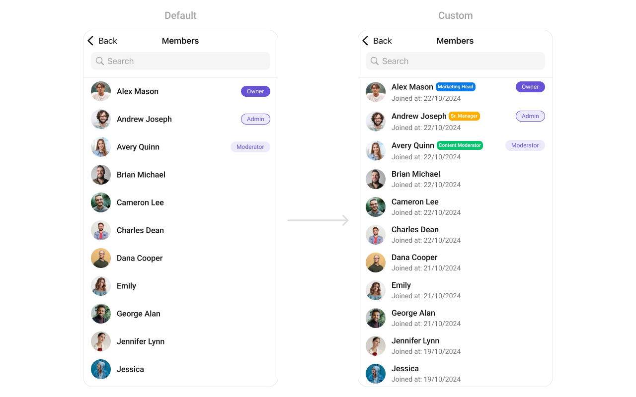
#### SetLeadingView
You can modify the leading view of a group member cell using .set(leadingView:).
```swift theme={null}
cometChatGroupMember.set(leadingView: { groupMember in
let view = CustomLeadingView()
view.configure(with groupMember: groupMember)
return view
})
```
Demonstration
In this example, we will create a UIView file `CustomListItemGroupView` and pass it inside the `setListItemView()` method.
```swift CustomListItemGroupView theme={null}
import UIKit
import CometChatSDK
import CometChatUIKitSwift
class CustomListItemView: UIView {
private let profileImageView: CometChatAvatar = {
let imageView = CometChatAvatar()
imageView.layer.cornerRadius = 12 // Rounded corners
imageView.translatesAutoresizingMaskIntoConstraints = false
return imageView
}()
private let nameLabel: UILabel = {
let label = UILabel()
label.textColor = .black
label.font = UIFont.boldSystemFont(ofSize: 18)
label.translatesAutoresizingMaskIntoConstraints = false
return label
}()
private let roleBadgeButton: UIButton = {
let button = UIButton(type: .system)
button.setTitle("Owner", for: .normal)
button.setTitleColor(.white, for: .normal)
button.backgroundColor = UIColor.purple
button.titleLabel?.font = UIFont.systemFont(ofSize: 14, weight: .medium)
button.layer.cornerRadius = 12
button.translatesAutoresizingMaskIntoConstraints = false
return button
}()
override init(frame: CGRect) {
super.init(frame: frame)
setupView()
}
required init?(coder: NSCoder) {
super.init(coder: coder)
setupView()
}
private func setupView() {
addSubview(profileImageView)
addSubview(nameLabel)
addSubview(roleBadgeButton)
NSLayoutConstraint.activate([
// Profile Image Constraints
profileImageView.leadingAnchor.constraint(equalTo: leadingAnchor),
profileImageView.centerYAnchor.constraint(equalTo: centerYAnchor),
profileImageView.widthAnchor.constraint(equalToConstant: 50),
profileImageView.heightAnchor.constraint(equalToConstant: 50),
// Name Label Constraints
nameLabel.leadingAnchor.constraint(equalTo: profileImageView.trailingAnchor, constant: 12),
nameLabel.centerYAnchor.constraint(equalTo: profileImageView.centerYAnchor),
// Role Badge Button Constraints
roleBadgeButton.leadingAnchor.constraint(greaterThanOrEqualTo: nameLabel.trailingAnchor, constant: 12),
roleBadgeButton.trailingAnchor.constraint(equalTo: trailingAnchor),
roleBadgeButton.centerYAnchor.constraint(equalTo: profileImageView.centerYAnchor),
roleBadgeButton.heightAnchor.constraint(equalToConstant: 24),
roleBadgeButton.widthAnchor.constraint(equalToConstant: 70)
])
}
// Method to configure the view with data
func configure(with groupMember: GroupMember) {
nameLabel.text = groupMember.name ?? ""
profileImageView.setAvatar(avatarUrl: groupMember.avatar ?? "")
roleBadgeButton.setTitle("\(groupMember.scope)", for: .normal)
}
}
```
***
#### SetLeadingView
You can modify the leading view of a group member cell using .set(leadingView:).
```swift theme={null}
cometChatGroupMember.set(leadingView: { groupMember in
let view = CustomLeadingView()
view.configure(with groupMember: groupMember)
return view
})
```
Demonstration
 You can create a `CustomLeadingView` as a custom `UIView`. Which we will inflate in `setLeadingView()`
```swift theme={null}
import UIKit
class CustomLeadingView: UIView {
private let profileImageView: CometChatAvatar = {
let imageView = CometChatAvatar()
imageView.layer.cornerRadius = 12 // Rounded corners
imageView.translatesAutoresizingMaskIntoConstraints = false
return imageView
}()
private let badgeContainer: UIView = {
let view = UIView()
view.backgroundColor = UIColor.blue
view.layer.cornerRadius = 8
view.translatesAutoresizingMaskIntoConstraints = false
return view
}()
private let starIcon: UIImageView = {
let imageView = UIImageView()
imageView.image = UIImage(systemName: "star.fill") // SF Symbol for star
imageView.tintColor = .yellow
imageView.translatesAutoresizingMaskIntoConstraints = false
return imageView
}()
private let roleLabel: UILabel = {
let label = UILabel()
label.textColor = .white
label.font = UIFont.boldSystemFont(ofSize: 16)
label.translatesAutoresizingMaskIntoConstraints = false
return label
}()
override init(frame: CGRect) {
super.init(frame: frame)
setupView()
}
required init?(coder: NSCoder) {
super.init(coder: coder)
setupView()
}
private func setupView() {
addSubview(profileImageView)
addSubview(badgeContainer)
badgeContainer.addSubview(starIcon)
badgeContainer.addSubview(roleLabel)
NSLayoutConstraint.activate([
profileImageView.topAnchor.constraint(equalTo: topAnchor),
profileImageView.leadingAnchor.constraint(equalTo: leadingAnchor),
profileImageView.trailingAnchor.constraint(equalTo: trailingAnchor),
profileImageView.heightAnchor.constraint(equalTo: profileImageView.widthAnchor), // Square shape
badgeContainer.leadingAnchor.constraint(equalTo: profileImageView.leadingAnchor),
badgeContainer.trailingAnchor.constraint(equalTo: profileImageView.trailingAnchor),
badgeContainer.bottomAnchor.constraint(equalTo: profileImageView.bottomAnchor),
badgeContainer.heightAnchor.constraint(equalToConstant: 40),
starIcon.leadingAnchor.constraint(equalTo: badgeContainer.leadingAnchor, constant: 10),
starIcon.centerYAnchor.constraint(equalTo: badgeContainer.centerYAnchor),
starIcon.widthAnchor.constraint(equalToConstant: 20),
starIcon.heightAnchor.constraint(equalToConstant: 20),
roleLabel.leadingAnchor.constraint(equalTo: starIcon.trailingAnchor, constant: 5),
roleLabel.centerYAnchor.constraint(equalTo: badgeContainer.centerYAnchor)
])
}
func configure(with groupMember: GroupMember) {
if let avatarUrl = groupMember.avatar {
groupImageView.setAvatar(avatarUrl: avatarUrl, with: groupMember.name ?? "")
}
roleLabel.text = "\(groupMember.scope)"
}
}
```
***
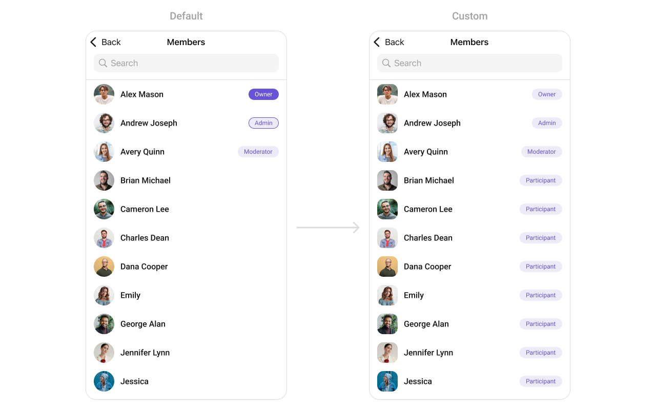
#### SetTitleView
You can customize the title view of a group member cell using .set(titleView:).
```swift theme={null}
cometChatGroupMember.set(titleView: { groupMember in
let view = CustomTitleView()
view.configure(with groupMember: groupMember)
return view
})
```
Demonstration
You can create a `CustomLeadingView` as a custom `UIView`. Which we will inflate in `setLeadingView()`
```swift theme={null}
import UIKit
class CustomLeadingView: UIView {
private let profileImageView: CometChatAvatar = {
let imageView = CometChatAvatar()
imageView.layer.cornerRadius = 12 // Rounded corners
imageView.translatesAutoresizingMaskIntoConstraints = false
return imageView
}()
private let badgeContainer: UIView = {
let view = UIView()
view.backgroundColor = UIColor.blue
view.layer.cornerRadius = 8
view.translatesAutoresizingMaskIntoConstraints = false
return view
}()
private let starIcon: UIImageView = {
let imageView = UIImageView()
imageView.image = UIImage(systemName: "star.fill") // SF Symbol for star
imageView.tintColor = .yellow
imageView.translatesAutoresizingMaskIntoConstraints = false
return imageView
}()
private let roleLabel: UILabel = {
let label = UILabel()
label.textColor = .white
label.font = UIFont.boldSystemFont(ofSize: 16)
label.translatesAutoresizingMaskIntoConstraints = false
return label
}()
override init(frame: CGRect) {
super.init(frame: frame)
setupView()
}
required init?(coder: NSCoder) {
super.init(coder: coder)
setupView()
}
private func setupView() {
addSubview(profileImageView)
addSubview(badgeContainer)
badgeContainer.addSubview(starIcon)
badgeContainer.addSubview(roleLabel)
NSLayoutConstraint.activate([
profileImageView.topAnchor.constraint(equalTo: topAnchor),
profileImageView.leadingAnchor.constraint(equalTo: leadingAnchor),
profileImageView.trailingAnchor.constraint(equalTo: trailingAnchor),
profileImageView.heightAnchor.constraint(equalTo: profileImageView.widthAnchor), // Square shape
badgeContainer.leadingAnchor.constraint(equalTo: profileImageView.leadingAnchor),
badgeContainer.trailingAnchor.constraint(equalTo: profileImageView.trailingAnchor),
badgeContainer.bottomAnchor.constraint(equalTo: profileImageView.bottomAnchor),
badgeContainer.heightAnchor.constraint(equalToConstant: 40),
starIcon.leadingAnchor.constraint(equalTo: badgeContainer.leadingAnchor, constant: 10),
starIcon.centerYAnchor.constraint(equalTo: badgeContainer.centerYAnchor),
starIcon.widthAnchor.constraint(equalToConstant: 20),
starIcon.heightAnchor.constraint(equalToConstant: 20),
roleLabel.leadingAnchor.constraint(equalTo: starIcon.trailingAnchor, constant: 5),
roleLabel.centerYAnchor.constraint(equalTo: badgeContainer.centerYAnchor)
])
}
func configure(with groupMember: GroupMember) {
if let avatarUrl = groupMember.avatar {
groupImageView.setAvatar(avatarUrl: avatarUrl, with: groupMember.name ?? "")
}
roleLabel.text = "\(groupMember.scope)"
}
}
```
***
#### SetTitleView
You can customize the title view of a group member cell using .set(titleView:).
```swift theme={null}
cometChatGroupMember.set(titleView: { groupMember in
let view = CustomTitleView()
view.configure(with groupMember: groupMember)
return view
})
```
Demonstration
 You can create a `CustomTitleView` as a custom `UIView`. Which we will inflate in `setTitleView()`
```swift theme={null}
import UIKit
class CustomTitleView: UIView {
private let nameLabel: UILabel = {
let label = UILabel()
label.font = UIFont.boldSystemFont(ofSize: 20)
label.textColor = .black
label.translatesAutoresizingMaskIntoConstraints = false
return label
}()
private let roleButton: UIButton = {
let button = UIButton()
button.setTitleColor(.white, for: .normal)
button.titleLabel?.font = UIFont.boldSystemFont(ofSize: 14)
button.backgroundColor = .blue
button.contentEdgeInsets = UIEdgeInsets(top: 5, left: 10, bottom: 5, right: 10)
button.layer.cornerRadius = 12
button.translatesAutoresizingMaskIntoConstraints = false
return button
}()
override init(frame: CGRect) {
super.init(frame: frame)
setupView()
}
required init?(coder: NSCoder) {
super.init(coder: coder)
setupView()
}
private func setupView() {
addSubview(nameLabel)
addSubview(roleButton)
NSLayoutConstraint.activate([
nameLabel.leadingAnchor.constraint(equalTo: leadingAnchor),
nameLabel.centerYAnchor.constraint(equalTo: centerYAnchor),
roleButton.leadingAnchor.constraint(equalTo: nameLabel.trailingAnchor, constant: 8),
roleButton.centerYAnchor.constraint(equalTo: centerYAnchor),
roleButton.trailingAnchor.constraint(lessThanOrEqualTo: trailingAnchor)
])
}
func configure(with groupMember: GroupMember) {
nameLabel.text = groupMember.name ?? ""
roleButton.setTitle("\(groupMember.scope)", for: .normal)
}
}
```
***
#### SetTrailView
You can set a custom Tailview using `.setTailView()` to match the `TailView` view of your app.
```swift theme={null}
let cometChatGroupMembers = CometChatGroupMembers(group: group)
cometChatGroupMembers.setTailView(tailView: { groupMember in
let customTailGroupView = CustomTailGroupView()
customTailGroupView.configure(with: groupMember!)
return customTailGroupView
})
```
**Example**
You can create a `CustomTitleView` as a custom `UIView`. Which we will inflate in `setTitleView()`
```swift theme={null}
import UIKit
class CustomTitleView: UIView {
private let nameLabel: UILabel = {
let label = UILabel()
label.font = UIFont.boldSystemFont(ofSize: 20)
label.textColor = .black
label.translatesAutoresizingMaskIntoConstraints = false
return label
}()
private let roleButton: UIButton = {
let button = UIButton()
button.setTitleColor(.white, for: .normal)
button.titleLabel?.font = UIFont.boldSystemFont(ofSize: 14)
button.backgroundColor = .blue
button.contentEdgeInsets = UIEdgeInsets(top: 5, left: 10, bottom: 5, right: 10)
button.layer.cornerRadius = 12
button.translatesAutoresizingMaskIntoConstraints = false
return button
}()
override init(frame: CGRect) {
super.init(frame: frame)
setupView()
}
required init?(coder: NSCoder) {
super.init(coder: coder)
setupView()
}
private func setupView() {
addSubview(nameLabel)
addSubview(roleButton)
NSLayoutConstraint.activate([
nameLabel.leadingAnchor.constraint(equalTo: leadingAnchor),
nameLabel.centerYAnchor.constraint(equalTo: centerYAnchor),
roleButton.leadingAnchor.constraint(equalTo: nameLabel.trailingAnchor, constant: 8),
roleButton.centerYAnchor.constraint(equalTo: centerYAnchor),
roleButton.trailingAnchor.constraint(lessThanOrEqualTo: trailingAnchor)
])
}
func configure(with groupMember: GroupMember) {
nameLabel.text = groupMember.name ?? ""
roleButton.setTitle("\(groupMember.scope)", for: .normal)
}
}
```
***
#### SetTrailView
You can set a custom Tailview using `.setTailView()` to match the `TailView` view of your app.
```swift theme={null}
let cometChatGroupMembers = CometChatGroupMembers(group: group)
cometChatGroupMembers.setTailView(tailView: { groupMember in
let customTailGroupView = CustomTailGroupView()
customTailGroupView.configure(with: groupMember!)
return customTailGroupView
})
```
**Example**
 In this example, we will create a UIView file `Custom_Tail_GroupView` and pass it inside the `.setTailView()` method.
```swift Custom_Tail_GroupView theme={null}
import UIKit
import CometChatSDK
import CometChatUIKitSwift
class CustomTailGroupView: UIView {
let tailLabel: UILabel = {
let label = UILabel()
label.translatesAutoresizingMaskIntoConstraints = false
label.font = UIFont.systemFont(ofSize: 10, weight: .semibold)
label.textColor = UIColor(hex: "#6852D6")
return label
}()
override init(frame: CGRect) {
super.init(frame: frame)
addSubview(tailLabel)
NSLayoutConstraint.activate([
tailLabel.centerXAnchor.constraint(equalTo: centerXAnchor),
tailLabel.centerYAnchor.constraint(equalTo: centerYAnchor),
self.heightAnchor.constraint(equalToConstant: 22),
self.layer.cornerRadius = 11
])
self.backgroundColor = UIColor(hex: "#EDEAFA")
}
required init?(coder: NSCoder) {
fatalError("init(coder:) has not been implemented")
}
// Configure the view with a group member
func configure(with groupMember: GroupMember) {
tailLabel.text = "\(groupMember.name!.description )"
}
}
```
***
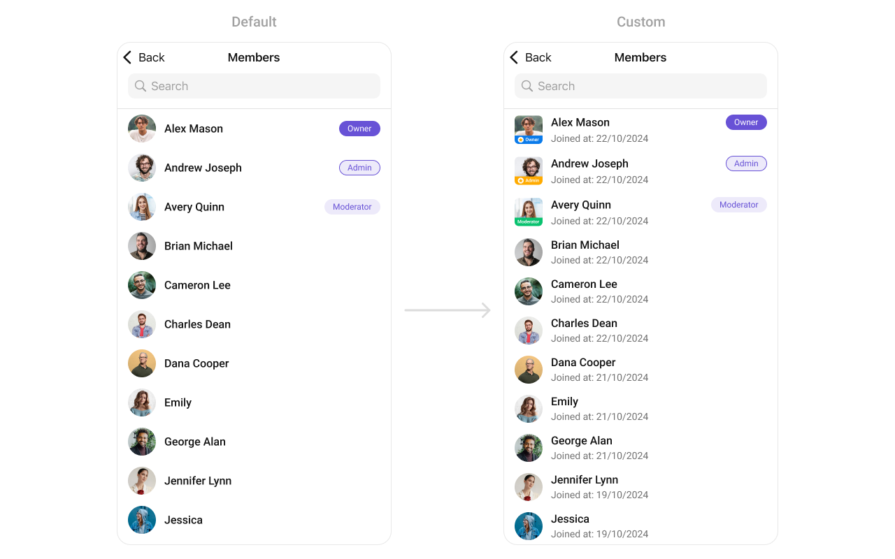
#### SubtitleView
You can set your custom Subtitle view using the `.setSubtitleView()` method. But keep in mind, by using this you will override the default Subtitle view functionality.
```swift theme={null}
let cometChatGroupMembers = CometChatGroupMembers(group: group)
cometChatGroupMembers.setSubtitleView(subtitleView: { groupMember in
let customSubtitleGroupMemberView = CustomSubtitleGroupMemberView()
customSubtitleGroupMemberView.configure(with: groupMember!)
return customSubtitleGroupMemberView
})
```
* You can customize the subtitle view for each GroupMembers item to meet your requirements
**Example**
In this example, we will create a UIView file `Custom_Tail_GroupView` and pass it inside the `.setTailView()` method.
```swift Custom_Tail_GroupView theme={null}
import UIKit
import CometChatSDK
import CometChatUIKitSwift
class CustomTailGroupView: UIView {
let tailLabel: UILabel = {
let label = UILabel()
label.translatesAutoresizingMaskIntoConstraints = false
label.font = UIFont.systemFont(ofSize: 10, weight: .semibold)
label.textColor = UIColor(hex: "#6852D6")
return label
}()
override init(frame: CGRect) {
super.init(frame: frame)
addSubview(tailLabel)
NSLayoutConstraint.activate([
tailLabel.centerXAnchor.constraint(equalTo: centerXAnchor),
tailLabel.centerYAnchor.constraint(equalTo: centerYAnchor),
self.heightAnchor.constraint(equalToConstant: 22),
self.layer.cornerRadius = 11
])
self.backgroundColor = UIColor(hex: "#EDEAFA")
}
required init?(coder: NSCoder) {
fatalError("init(coder:) has not been implemented")
}
// Configure the view with a group member
func configure(with groupMember: GroupMember) {
tailLabel.text = "\(groupMember.name!.description )"
}
}
```
***
#### SubtitleView
You can set your custom Subtitle view using the `.setSubtitleView()` method. But keep in mind, by using this you will override the default Subtitle view functionality.
```swift theme={null}
let cometChatGroupMembers = CometChatGroupMembers(group: group)
cometChatGroupMembers.setSubtitleView(subtitleView: { groupMember in
let customSubtitleGroupMemberView = CustomSubtitleGroupMemberView()
customSubtitleGroupMemberView.configure(with: groupMember!)
return customSubtitleGroupMemberView
})
```
* You can customize the subtitle view for each GroupMembers item to meet your requirements
**Example**
 In this example, we will create a `Custom_Subtitle_GroupMember_View`a UIView file.
```swift Custom_Subtitle_GroupMember_View theme={null}
import UIKit
import CometChatSDK
import CometChatUIKitSwift
class CustomSubtitleGroupMemberView: UIView {
let memberNameLabel: UILabel = {
let label = UILabel()
label.translatesAutoresizingMaskIntoConstraints = false
label.textColor = .init(red: 0.42, green: 0.01, blue: 0.84, alpha: 1.00)
label.font = UIFont.systemFont(ofSize: 15, weight: .bold)
return label
}()
let joinedAtLabel: UILabel = {
let label = UILabel()
label.translatesAutoresizingMaskIntoConstraints = false
label.textColor = .systemBrown
label.font = UIFont.systemFont(ofSize: 10, weight: .medium)
return label
}()
override init(frame: CGRect) {
super.init(frame: frame)
addSubview(memberNameLabel)
addSubview(joinedAtLabel)
NSLayoutConstraint.activate([
memberNameLabel.topAnchor.constraint(equalTo: topAnchor),
memberNameLabel.leadingAnchor.constraint(equalTo: leadingAnchor),
memberNameLabel.trailingAnchor.constraint(equalTo: trailingAnchor),
joinedAtLabel.topAnchor.constraint(equalTo: memberNameLabel.bottomAnchor, constant: 2),
joinedAtLabel.leadingAnchor.constraint(equalTo: leadingAnchor),
joinedAtLabel.trailingAnchor.constraint(equalTo: trailingAnchor),
joinedAtLabel.bottomAnchor.constraint(equalTo: bottomAnchor)
])
}
required init?(coder: NSCoder) {
fatalError("init(coder:) has not been implemented")
}
func configure(with groupMember: GroupMember) {
memberNameLabel.text = "Member: \(groupMember.name ?? "")"
let date = Date(timeIntervalSince1970: Double(groupMember.joinedAt))
let dateFormatter = DateFormatter()
dateFormatter.dateStyle = .medium
joinedAtLabel.text = "Joined at: \(dateFormatter.string(from: date))"
}
}
```
***
#### Options
Enhance your GroupsMembers component by setting Custom Options to incorporate additional functionalities when swiping
```swift theme={null}
let cometChatGroupMembers = CometChatGroupMembers(group: group)
cometChatGroupMembers.setOptions (options:{ group, groupMember in
//Perform Your Action
})
```
* You can customize the options for group members to meet your requirements
**Example**
In this example, we will create a `Custom_Subtitle_GroupMember_View`a UIView file.
```swift Custom_Subtitle_GroupMember_View theme={null}
import UIKit
import CometChatSDK
import CometChatUIKitSwift
class CustomSubtitleGroupMemberView: UIView {
let memberNameLabel: UILabel = {
let label = UILabel()
label.translatesAutoresizingMaskIntoConstraints = false
label.textColor = .init(red: 0.42, green: 0.01, blue: 0.84, alpha: 1.00)
label.font = UIFont.systemFont(ofSize: 15, weight: .bold)
return label
}()
let joinedAtLabel: UILabel = {
let label = UILabel()
label.translatesAutoresizingMaskIntoConstraints = false
label.textColor = .systemBrown
label.font = UIFont.systemFont(ofSize: 10, weight: .medium)
return label
}()
override init(frame: CGRect) {
super.init(frame: frame)
addSubview(memberNameLabel)
addSubview(joinedAtLabel)
NSLayoutConstraint.activate([
memberNameLabel.topAnchor.constraint(equalTo: topAnchor),
memberNameLabel.leadingAnchor.constraint(equalTo: leadingAnchor),
memberNameLabel.trailingAnchor.constraint(equalTo: trailingAnchor),
joinedAtLabel.topAnchor.constraint(equalTo: memberNameLabel.bottomAnchor, constant: 2),
joinedAtLabel.leadingAnchor.constraint(equalTo: leadingAnchor),
joinedAtLabel.trailingAnchor.constraint(equalTo: trailingAnchor),
joinedAtLabel.bottomAnchor.constraint(equalTo: bottomAnchor)
])
}
required init?(coder: NSCoder) {
fatalError("init(coder:) has not been implemented")
}
func configure(with groupMember: GroupMember) {
memberNameLabel.text = "Member: \(groupMember.name ?? "")"
let date = Date(timeIntervalSince1970: Double(groupMember.joinedAt))
let dateFormatter = DateFormatter()
dateFormatter.dateStyle = .medium
joinedAtLabel.text = "Joined at: \(dateFormatter.string(from: date))"
}
}
```
***
#### Options
Enhance your GroupsMembers component by setting Custom Options to incorporate additional functionalities when swiping
```swift theme={null}
let cometChatGroupMembers = CometChatGroupMembers(group: group)
cometChatGroupMembers.setOptions (options:{ group, groupMember in
//Perform Your Action
})
```
* You can customize the options for group members to meet your requirements
**Example**
 In this example, we've enhanced the interface of `CometChatGroupMembers` by introducing a tailored feature. By adding a custom option, such as "Delete" with a corresponding trash icon, users can now enjoy a more interactive and user-friendly experience.
```swift theme={null}
let customOption = CometChatGroupMemberOption(id: "custom_option_1",
title: "Delete",
icon: UIImage(systemName: "trash.square"),
backgroundColor: .red,
onClick: { groupMember, group, section, option, controller in
print("Custom option clicked!")
})
let cometChatGroupMembers = CometChatGroupMembers(group: group)
cometChatGroupMembers.setOptions(options: { group, groupMember in
return [customOption]
})
```
***
#### Menus
You can set the Custom Menus to add more options to the Group members component.
```swift theme={null}
let cometChatGroupMembers = CometChatGroupMembers(group: group)
cometChatGroupMembers.set(menus: [UIBarButtonItem])
```
* You can customize the menus for groups to meet your requirements
**Example**
In this example, we've enhanced the interface of `CometChatGroupMembers` by introducing a tailored feature. By adding a custom option, such as "Delete" with a corresponding trash icon, users can now enjoy a more interactive and user-friendly experience.
```swift theme={null}
let customOption = CometChatGroupMemberOption(id: "custom_option_1",
title: "Delete",
icon: UIImage(systemName: "trash.square"),
backgroundColor: .red,
onClick: { groupMember, group, section, option, controller in
print("Custom option clicked!")
})
let cometChatGroupMembers = CometChatGroupMembers(group: group)
cometChatGroupMembers.setOptions(options: { group, groupMember in
return [customOption]
})
```
***
#### Menus
You can set the Custom Menus to add more options to the Group members component.
```swift theme={null}
let cometChatGroupMembers = CometChatGroupMembers(group: group)
cometChatGroupMembers.set(menus: [UIBarButtonItem])
```
* You can customize the menus for groups to meet your requirements
**Example**
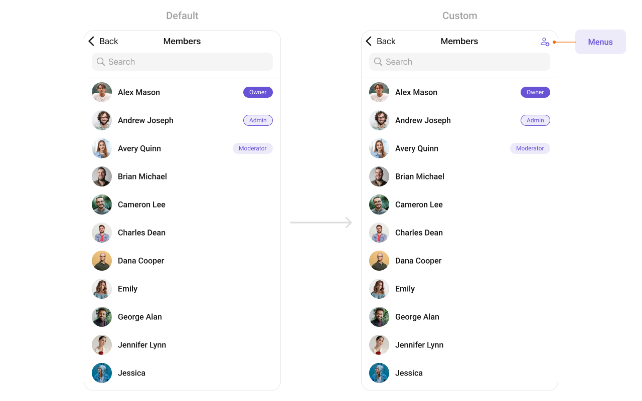 In this example, we'll craft a custom button tailored for `CometChatGroupMembers`, enhancing its interface with a personalized `menu` for a more user-friendly experience.
```swift theme={null}
let customMenuButton: UIBarButtonItem = {
let button = UIButton(type: .system)
button.setImage(UIImage(systemName: "person.badge.plus"), for: .normal)
button.setTitle("", for: .normal)
button.addTarget(self, action: #selector(handleCustomMenu), for: .touchUpInside)
let barButtonItem = UIBarButtonItem(customView: button)
return barButtonItem
}()
let cometChatGroupMembers = CometChatGroupMembers(group: group)
cometChatGroupMembers.set(menus: [customMenuButton])
```
***
#### SetLoadingView
You can set a custom loading view using .set(loadingView:). This method accepts a UIView to display while data is being fetched.
```swift theme={null}
let loadingIndicator = UIActivityIndicatorView(style: .medium)
loadingIndicator.startAnimating()
cometChatGroupMember.set(loadingView: loadingIndicator)
```
***
#### SetErrorView
You can customize the error view using .set(errorView:). This method accepts a UIView that appears when an error occurs.
```swift theme={null}
let errorLabel = UILabel()
errorLabel.text = "Something went wrong!"
errorLabel.textColor = .red
cometChatGroupMember.set(errorView: errorLabel)
```
***
#### SetEmptyView
You can customize the empty state view using .set(emptyView:). This method accepts a UIView that appears when no group members are available.
```swift theme={null}
let emptyLabel = UILabel()
emptyLabel.text = "No groups found"
emptyLabel.textColor = .gray
emptyLabel.textAlignment = .center
cometChatGroupMember.set(emptyView: emptyLabel)
```
***
Ensure to pass and present `CometChatGroupMembers`. If a navigation controller is already in use, utilize the pushViewController function instead of directly presenting the view controller.
***
In this example, we'll craft a custom button tailored for `CometChatGroupMembers`, enhancing its interface with a personalized `menu` for a more user-friendly experience.
```swift theme={null}
let customMenuButton: UIBarButtonItem = {
let button = UIButton(type: .system)
button.setImage(UIImage(systemName: "person.badge.plus"), for: .normal)
button.setTitle("", for: .normal)
button.addTarget(self, action: #selector(handleCustomMenu), for: .touchUpInside)
let barButtonItem = UIBarButtonItem(customView: button)
return barButtonItem
}()
let cometChatGroupMembers = CometChatGroupMembers(group: group)
cometChatGroupMembers.set(menus: [customMenuButton])
```
***
#### SetLoadingView
You can set a custom loading view using .set(loadingView:). This method accepts a UIView to display while data is being fetched.
```swift theme={null}
let loadingIndicator = UIActivityIndicatorView(style: .medium)
loadingIndicator.startAnimating()
cometChatGroupMember.set(loadingView: loadingIndicator)
```
***
#### SetErrorView
You can customize the error view using .set(errorView:). This method accepts a UIView that appears when an error occurs.
```swift theme={null}
let errorLabel = UILabel()
errorLabel.text = "Something went wrong!"
errorLabel.textColor = .red
cometChatGroupMember.set(errorView: errorLabel)
```
***
#### SetEmptyView
You can customize the empty state view using .set(emptyView:). This method accepts a UIView that appears when no group members are available.
```swift theme={null}
let emptyLabel = UILabel()
emptyLabel.text = "No groups found"
emptyLabel.textColor = .gray
emptyLabel.textAlignment = .center
cometChatGroupMember.set(emptyView: emptyLabel)
```
***
Ensure to pass and present `CometChatGroupMembers`. If a navigation controller is already in use, utilize the pushViewController function instead of directly presenting the view controller.
***