> ## Documentation Index
> Fetch the complete documentation index at: https://cometchat-22654f5b-feature-react-native-sdk-quotedmessage-a.mintlify.site/llms.txt
> Use this file to discover all available pages before exploring further.
# Message List
## Overview
`MessageList` is a [Composite Component](/ui-kit/ios/components-overview#composite-components) that displays a list of messages and effectively manages real-time operations. It includes various types of messages such as Text Messages, Media Messages, Stickers, and more.
`MessageList` is primarily a list of the base component [MessageBubble](/ui-kit/ios/message-bubble-styling). The MessageBubble Component is utilized to create different types of chat bubbles depending on the message type.
 ***
## Usage
### Integration
The following code snippet illustrates how you can directly incorporate the MessageList component.
```swift theme={null}
// syntax for set(user: User)
messageList.set(user: user)
// syntax for set(user: User, parentMessage: BaseMessage? = nil)
messageList.set(user: user, parentMessage: textMessage)
```
To retrieve messages for a specific entity, you must associate it with either a `User` or `Group` object.
***
### Actions
[Actions](/ui-kit/ios/components-overview#actions) dictate how a component functions. They are divided into two types: Predefined and User-defined. You can override either type, allowing you to tailor the behavior of the component to fit your specific needs.
##### 1. onThreadRepliesClick
`onThreadRepliesClick` is triggered when you click on the thread indicator of message bubble. The `onThreadRepliesClick` action doesn't have a predefined behavior. You can override this action using the following code snippet.
```swift theme={null}
let messageListView = CometChatMessageList()
messageListView.set(onThreadRepliesClick: { message, template in
// Your action onclick
})
```
***
##### 2. onReactionClick
`onReactionClick` is triggered when you click on a reaction on a message bubble.
```swift theme={null}
let messageListView = CometChatMessageList()
messageListView.set(onReactionClick: { reactionCount, baseMessage in
// Your action onclick
})
```
***
##### 3. onReactionListItemClick
`onReactionListItemClick` is triggered when you click on the list item of CometChatReactionList on a message bubble.
```swift theme={null}
let messageListView = CometChatMessageList()
messageListView.set(onReactionListItemClick: { messageReaction, baseMessage in
// Your action onclick
})
```
***
##### 4. set(onError:)
This method proves helpful when a user needs to customize the action taken upon encountering an error in CometChatMessageList.
```swift theme={null}
cometChatGroupMembers.set(onError: { error in
// Override on error
})
```
***
##### 5. set(onEmpty:)
This `set(onEmpty:)` method is triggered when the message list is empty in CometChatMessageList.
```swift theme={null}
cometChatMessageList.set(onEmpty: {
// Handle empty state
})
```
***
##### 6. setOnLoad
This set(onLoad:) method is triggered when messages are successfully loaded in CometChatMessageList.
```swift theme={null}
cometChatMessageList.set(onLoad: { messages in
// Handle loaded messages
})
```
***
### Filters
You can adjust the `MessagesRequestBuilder` in the MessageList Component to customize your message list. Numerous options are available to alter the builder to meet your specific needs. For additional details on `MessagesRequestBuilder`, please visit [MessagesRequestBuilder](/sdk/ios/additional-message-filtering).
In the example below, we are applying a filter to the messages based on a search substring and for a specific user. This means that only messages that contain the search term and are associated with the specified user will be displayed
```swift theme={null}
let messageRequestBuilder = MessagesRequest.MessageRequestBuilder()
.set(uid: "YOUR_UID")
.set(types: ["Text"])
.set(searchKeyword: "sure")
let cometChatMessages = CometChatMessages()
cometChatMessages.set(user: user)
cometChatMessages.set(messagesRequestBuilder:messageRequestBuilder)
```
The following parameters in messageRequestBuilder will always be altered inside the message list
1. UID
2. GUID
3. types
4. categories
Ensure to include the `uid` and `name` of the User in the implementation.
***
### Events
[Events](/ui-kit/ios/components-overview#events) are emitted by a `Component`. By using event you can extend existing functionality. Being global events, they can be applied in Multiple Locations and are capable of being Added or Removed.
The MessageList Component does not emit any events of its own.
***
## Customization
To fit your app's design requirements, you can customize the appearance of the conversation component. We provide exposed methods that allow you to modify the experience and behavior according to your specific needs.
### Style
Using Style you can customize the look and feel of the component in your app, These parameters typically control elements such as the color, size, shape, and fonts used within the component.
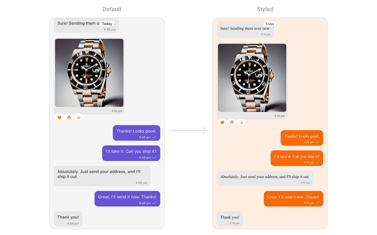
##### 1. MessageList Style
To customize the appearance, you can assign a `MessageListStyle` object to the `MessageList` component
**Global level styling**
```swift theme={null}
CometChatMessageList.style.backgroundColor = UIColor(hex: "#FBAA75")
CometChatMessageList.messageBubbleStyle.outgoing.backgroundColor = UIColor(hex: "#F76808")
```
**Instance level styling**
```swift theme={null}
let messageListStyle = MessageListStyle()
messageListStyle.backgroundColor = UIColor(hex: "#FBAA75")
let messageList = CometChatMessageList()
messageList.messageBubbleStyle.outgoing.backgroundColor = UIColor(hex: "#F76808")
messageList.style = messageListStyle
```
***
## Usage
### Integration
The following code snippet illustrates how you can directly incorporate the MessageList component.
```swift theme={null}
// syntax for set(user: User)
messageList.set(user: user)
// syntax for set(user: User, parentMessage: BaseMessage? = nil)
messageList.set(user: user, parentMessage: textMessage)
```
To retrieve messages for a specific entity, you must associate it with either a `User` or `Group` object.
***
### Actions
[Actions](/ui-kit/ios/components-overview#actions) dictate how a component functions. They are divided into two types: Predefined and User-defined. You can override either type, allowing you to tailor the behavior of the component to fit your specific needs.
##### 1. onThreadRepliesClick
`onThreadRepliesClick` is triggered when you click on the thread indicator of message bubble. The `onThreadRepliesClick` action doesn't have a predefined behavior. You can override this action using the following code snippet.
```swift theme={null}
let messageListView = CometChatMessageList()
messageListView.set(onThreadRepliesClick: { message, template in
// Your action onclick
})
```
***
##### 2. onReactionClick
`onReactionClick` is triggered when you click on a reaction on a message bubble.
```swift theme={null}
let messageListView = CometChatMessageList()
messageListView.set(onReactionClick: { reactionCount, baseMessage in
// Your action onclick
})
```
***
##### 3. onReactionListItemClick
`onReactionListItemClick` is triggered when you click on the list item of CometChatReactionList on a message bubble.
```swift theme={null}
let messageListView = CometChatMessageList()
messageListView.set(onReactionListItemClick: { messageReaction, baseMessage in
// Your action onclick
})
```
***
##### 4. set(onError:)
This method proves helpful when a user needs to customize the action taken upon encountering an error in CometChatMessageList.
```swift theme={null}
cometChatGroupMembers.set(onError: { error in
// Override on error
})
```
***
##### 5. set(onEmpty:)
This `set(onEmpty:)` method is triggered when the message list is empty in CometChatMessageList.
```swift theme={null}
cometChatMessageList.set(onEmpty: {
// Handle empty state
})
```
***
##### 6. setOnLoad
This set(onLoad:) method is triggered when messages are successfully loaded in CometChatMessageList.
```swift theme={null}
cometChatMessageList.set(onLoad: { messages in
// Handle loaded messages
})
```
***
### Filters
You can adjust the `MessagesRequestBuilder` in the MessageList Component to customize your message list. Numerous options are available to alter the builder to meet your specific needs. For additional details on `MessagesRequestBuilder`, please visit [MessagesRequestBuilder](/sdk/ios/additional-message-filtering).
In the example below, we are applying a filter to the messages based on a search substring and for a specific user. This means that only messages that contain the search term and are associated with the specified user will be displayed
```swift theme={null}
let messageRequestBuilder = MessagesRequest.MessageRequestBuilder()
.set(uid: "YOUR_UID")
.set(types: ["Text"])
.set(searchKeyword: "sure")
let cometChatMessages = CometChatMessages()
cometChatMessages.set(user: user)
cometChatMessages.set(messagesRequestBuilder:messageRequestBuilder)
```
The following parameters in messageRequestBuilder will always be altered inside the message list
1. UID
2. GUID
3. types
4. categories
Ensure to include the `uid` and `name` of the User in the implementation.
***
### Events
[Events](/ui-kit/ios/components-overview#events) are emitted by a `Component`. By using event you can extend existing functionality. Being global events, they can be applied in Multiple Locations and are capable of being Added or Removed.
The MessageList Component does not emit any events of its own.
***
## Customization
To fit your app's design requirements, you can customize the appearance of the conversation component. We provide exposed methods that allow you to modify the experience and behavior according to your specific needs.
### Style
Using Style you can customize the look and feel of the component in your app, These parameters typically control elements such as the color, size, shape, and fonts used within the component.
##### 1. MessageList Style
To customize the appearance, you can assign a `MessageListStyle` object to the `MessageList` component
**Global level styling**
```swift theme={null}
CometChatMessageList.style.backgroundColor = UIColor(hex: "#FBAA75")
CometChatMessageList.messageBubbleStyle.outgoing.backgroundColor = UIColor(hex: "#F76808")
```
**Instance level styling**
```swift theme={null}
let messageListStyle = MessageListStyle()
messageListStyle.backgroundColor = UIColor(hex: "#FBAA75")
let messageList = CometChatMessageList()
messageList.messageBubbleStyle.outgoing.backgroundColor = UIColor(hex: "#F76808")
messageList.style = messageListStyle
```
 List of properties exposed by MessageListStyle
| **Property** | **Description** | **Code** |
| ------------------------------- | -------------------------------------------------------------- | ------------------------------------------------------------------------------------------------------------ |
| **Background Color** | Background color with dynamic support for light and dark mode. | `CometChatMessageList.style.backgroundColor = UIColor.dynamicColor(lightModeColor: ..., darkModeColor: ...)` |
| **Border Width** | Border width for the component. | `CometChatMessageList.style.borderWidth = 0` |
| **Border Color** | Border color for the component. | `CometChatMessageList.style.borderColor = .clear` |
| **Corner Radius** | Corner radius for the component. | `CometChatMessageList.style.cornerRadius = CometChatCornerStyle?` |
| **Shimmer Gradient Color 1** | First color of the shimmer gradient. | `CometChatMessageList.style.shimmerGradientColor1 = CometChatTheme.backgroundColor04` |
| **Shimmer Gradient Color 2** | Second color of the shimmer gradient. | `CometChatMessageList.style.shimmerGradientColor2 = CometChatTheme.backgroundColor03` |
| **Empty State Title Color** | Text color for the title in the empty state. | `CometChatMessageList.style.emptyStateTitleColor = CometChatTheme.textColorPrimary` |
| **Empty State Title Font** | Font for the title in the empty state. | `CometChatMessageList.style.emptyStateTitleFont = CometChatTypography.Heading3.bold` |
| **Empty State Subtitle Color** | Text color for the subtitle in the empty state. | `CometChatMessageList.style.emptyStateSubtitleColor = CometChatTheme.textColorSecondary` |
| **Empty State Subtitle Font** | Font for the subtitle in the empty state. | `CometChatMessageList.style.emptyStateSubtitleFont = CometChatTypography.Body.regular` |
| **Error State Title Color** | Text color for the title in the error state. | `CometChatMessageList.style.errorStateTitleColor = CometChatTheme.textColorPrimary` |
| **Error State Title Font** | Font for the title in the error state. | `CometChatMessageList.style.errorStateTitleFont = CometChatTypography.Heading3.bold` |
| **Error State Subtitle Color** | Text color for the subtitle in the error state. | `CometChatMessageList.style.errorStateSubtitleColor = CometChatTheme.textColorSecondary` |
| **Error State Subtitle Font** | Font for the subtitle in the error state. | `CometChatMessageList.style.errorStateSubtitleFont = CometChatTypography.Body.regular` |
| **Threaded Message Image** | Icon image for threaded messages. | `CometChatMessageList.style.threadedMessageImage = UIImage(systemName: "arrow.turn.down.right")` |
| **Error Image** | Icon image for error state. | `CometChatMessageList.style.errorImage = UIImage(named: "error-icon")` |
| **Empty Image** | Icon image for empty state. | `CometChatMessageList.style.emptyImage = UIImage(named: "empty-icon")` |
| **New Message Indicator Image** | Icon image for new message indicator. | `CometChatMessageList.style.newMessageIndicatorImage = UIImage?` |
| **Background Image** | Background image for the component. | `CometChatMessageList.style.backgroundImage = UIImage?` |
***
### Functionality
These are a set of small functional customizations that allow you to fine-tune the overall experience of the component. With these, you can change text, set custom icons, and toggle the visibility of UI elements.
Below is a list of customizations along with corresponding code snippets
| Property | Description | Code |
| ------------------------------- | ------------------------------------------------------------ | ----------------------------------------------- |
| hideAvatar | Hides the avatar of the sender. | `hideAvatar = true` |
| hideGroupActionMessages | Hides group action messages (like join/leave notifications). | `hideGroupActionMessages = true` |
| hideReplyInThreadOption | Hides the reply in thread option. | `hideReplyInThreadOption = true` |
| hideTranslateMessageOption | Hides the message translation option. | `hideTranslateMessageOption = true` |
| hideEditMessageOption | Hides the edit message option. | `hideEditMessageOption = true` |
| hideDeleteMessageOption | Hides the delete message option. | `hideDeleteMessageOption = true` |
| hideReactionOption | Hides the reaction option on messages. | `hideReactionOption = true` |
| hideMessagePrivatelyOption | Hides the option to message privately. | `hideMessagePrivatelyOption = true` |
| hideCopyMessageOption | Hides the option to copy a message. | `hideCopyMessageOption = true` |
| hideMessageInfoOption | Hides the message info option. | `hideMessageInfoOption = true` |
| hideHeaderView | Hides the header view of the message list. | `hideHeaderView = true` |
| hideFooterView | Hides the footer view of the message list. | `hideFooterView = true` |
| hideDateSeparator | Hides the date separator between messages. | `hideDateSeparator = true` |
| scrollToBottomOnNewMessages | Scrolls to the bottom when new messages arrive. | `scrollToBottomOnNewMessages = true` |
| hideReceipts | Hides the message read receipts (ticks). | `hideReceipts = true` |
| disableSoundForMessages | Disables the sound when a new message arrives. | `disableSoundForMessages = true` |
| hideEmptyView | Hides the empty state view when no messages are available. | `hideEmptyView = true` |
| hideErrorView | Hides the error view when an error occurs. | `hideErrorView = true` |
| hideLoadingView | Hides the loading view when fetching messages. | `hideLoadingView = true` |
| hideNewMessageIndicator | Hides the "new message" indicator. | `hideNewMessageIndicator = true` |
| scrollToBottom(isAnimated:) | Scrolls to the bottom of the message list. | `scrollToBottom(isAnimated: true)` |
| set(messageAlignment:) | Sets the alignment of messages in the list. | `set(messageAlignment: .left)` |
| set(smartRepliesKeywords:) | Sets keywords for smart replies. | `set(smartRepliesKeywords: ["Hi", "Bye"])` |
| set(smartRepliesDelayDuration:) | Sets the delay duration for smart replies. | `set(smartRepliesDelayDuration: 2)` |
| set(user:parentMessage:) | Sets the user and an optional parent message. | `set(user: user, parentMessage: message)` |
| set(group:parentMessage:) | Sets the group and an optional parent message. | `set(group: group, parentMessage: message)` |
| set(messagesRequestBuilder:) | Sets the message request builder. | `set(messagesRequestBuilder: builder)` |
| set(reactionsRequestBuilder:) | Sets the reactions request builder. | `set(reactionsRequestBuilder: builder)` |
| set(parentMessageId:) | Sets the parent message ID. | `set(parentMessageId: 12345)` |
| hideModerationView | Hides the moderation view in the AI assistant chat. | `hideModerationView = true` |
| hideThreadView | Hides the thread view in the AI assistant chat. | `hideThreadView = true` |
| set(suggestedMessages:) | List of predefined replies shown in the AI assistant. | `suggestedMessages = ["Hello", "Hi"]` |
| hideSuggestedMessages | Hides the suggested message replies. | `hideSuggestedMessages = true` |
| set(emptyChatGreetingView:) | Custom view displayed when the AI assistant chat is empty. | `emptyChatGreetingView = { /* custom view */ }` |
| set(streamingSpeed:) | Sets the speed of streaming for AI assistant messages. | `streamingSpeed = 50` |
***
### Advance
For advanced-level customization, you can set custom views to the component. This lets you tailor each aspect of the component to fit your exact needs and application aesthetics. You can create and define your views, layouts, and UI elements and then incorporate those into the component.
#### Date Time Formatter
The **CometChatMessageList** component supports full customization of how date and time are displayed using the [CometChatDateTimeFormatter](/ui-kit/ios/localize#datetimeformatter).
This enables developers to localize, format, or personalize the date and time strings shown next to each message such as “Today”, “Yesterday”, “12:45 PM”, etc.
1. Component-Level (Global)
```swift theme={null}
CometChatMessageList.dateTimeFormatter.time = { timestamp in
return "at " + DateFormatter.localizedString(from: Date(timeIntervalSince1970: TimeInterval(timestamp)), dateStyle: .none, timeStyle: .short)
}
CometChatMessageList.dateTimeFormatter.today = { timestamp in
return "Today • \(formattedTime(from: timestamp))"
}
CometChatMessageList.dateTimeFormatter.otherDay = { timestamp in // This will display older dates as "24 Apr 2025" instead of the default relative format.
let formatter = DateFormatter()
formatter.dateFormat = "dd MMM yyyy"
return formatter.string(from: Date(timeIntervalSince1970: TimeInterval(timestamp)))
}
```
2. Instance-Level (Local)
```swift theme={null}
let messageList = CometChatMessageList()
messageList.dateTimeFormatter.yesterday = { timestamp in
return "Yesterday at " + formattedTime(from: timestamp)
}
```
##### Available closures
| Property | Description | Code |
| --------- | ------------------------------------------------------------------- | ------------------------------------------------------------ |
| time | Called to format a timestamp as a standard time (e.g., "12:30 PM"). | `CometChatMessageList.dateTimeFormatter.time = { ... }` |
| today | Called when rendering messages sent today. | `CometChatMessageList.dateTimeFormatter.today = { ... }` |
| yesterday | Called for yesterday's messages. | `CometChatMessageList.dateTimeFormatter.yesterday = { ... }` |
| lastweek | Called for messages within the last week. | `CometChatMessageList.dateTimeFormatter.lastweek = { ... }` |
| otherDay | Called for dates older than last week. | `CometChatMessageList.dateTimeFormatter.otherDay = { ... }` |
| minute | Called when referring to "a minute ago". | `CometChatMessageList.dateTimeFormatter.minute = { ... }` |
| minutes | Called for "x minutes ago". | `CometChatMessageList.dateTimeFormatter.minutes = { ... }` |
| hour | Called for "an hour ago". | `CometChatMessageList.dateTimeFormatter.hour = { ... }` |
| hours | Called for "x hours ago". | `CometChatMessageList.dateTimeFormatter.hours = { ... }` |
Each closure receives a timestamp (Int, representing UNIX time) and must return a String representing the formatted time.
***
#### Set HeaderView
You can set custom headerView to the Message List component using the following method.
```swift theme={null}
let messageListView = CometChatMessageList()
messageListView.set(headerView: CustomHeaderView)
```
List of properties exposed by MessageListStyle
| **Property** | **Description** | **Code** |
| ------------------------------- | -------------------------------------------------------------- | ------------------------------------------------------------------------------------------------------------ |
| **Background Color** | Background color with dynamic support for light and dark mode. | `CometChatMessageList.style.backgroundColor = UIColor.dynamicColor(lightModeColor: ..., darkModeColor: ...)` |
| **Border Width** | Border width for the component. | `CometChatMessageList.style.borderWidth = 0` |
| **Border Color** | Border color for the component. | `CometChatMessageList.style.borderColor = .clear` |
| **Corner Radius** | Corner radius for the component. | `CometChatMessageList.style.cornerRadius = CometChatCornerStyle?` |
| **Shimmer Gradient Color 1** | First color of the shimmer gradient. | `CometChatMessageList.style.shimmerGradientColor1 = CometChatTheme.backgroundColor04` |
| **Shimmer Gradient Color 2** | Second color of the shimmer gradient. | `CometChatMessageList.style.shimmerGradientColor2 = CometChatTheme.backgroundColor03` |
| **Empty State Title Color** | Text color for the title in the empty state. | `CometChatMessageList.style.emptyStateTitleColor = CometChatTheme.textColorPrimary` |
| **Empty State Title Font** | Font for the title in the empty state. | `CometChatMessageList.style.emptyStateTitleFont = CometChatTypography.Heading3.bold` |
| **Empty State Subtitle Color** | Text color for the subtitle in the empty state. | `CometChatMessageList.style.emptyStateSubtitleColor = CometChatTheme.textColorSecondary` |
| **Empty State Subtitle Font** | Font for the subtitle in the empty state. | `CometChatMessageList.style.emptyStateSubtitleFont = CometChatTypography.Body.regular` |
| **Error State Title Color** | Text color for the title in the error state. | `CometChatMessageList.style.errorStateTitleColor = CometChatTheme.textColorPrimary` |
| **Error State Title Font** | Font for the title in the error state. | `CometChatMessageList.style.errorStateTitleFont = CometChatTypography.Heading3.bold` |
| **Error State Subtitle Color** | Text color for the subtitle in the error state. | `CometChatMessageList.style.errorStateSubtitleColor = CometChatTheme.textColorSecondary` |
| **Error State Subtitle Font** | Font for the subtitle in the error state. | `CometChatMessageList.style.errorStateSubtitleFont = CometChatTypography.Body.regular` |
| **Threaded Message Image** | Icon image for threaded messages. | `CometChatMessageList.style.threadedMessageImage = UIImage(systemName: "arrow.turn.down.right")` |
| **Error Image** | Icon image for error state. | `CometChatMessageList.style.errorImage = UIImage(named: "error-icon")` |
| **Empty Image** | Icon image for empty state. | `CometChatMessageList.style.emptyImage = UIImage(named: "empty-icon")` |
| **New Message Indicator Image** | Icon image for new message indicator. | `CometChatMessageList.style.newMessageIndicatorImage = UIImage?` |
| **Background Image** | Background image for the component. | `CometChatMessageList.style.backgroundImage = UIImage?` |
***
### Functionality
These are a set of small functional customizations that allow you to fine-tune the overall experience of the component. With these, you can change text, set custom icons, and toggle the visibility of UI elements.
Below is a list of customizations along with corresponding code snippets
| Property | Description | Code |
| ------------------------------- | ------------------------------------------------------------ | ----------------------------------------------- |
| hideAvatar | Hides the avatar of the sender. | `hideAvatar = true` |
| hideGroupActionMessages | Hides group action messages (like join/leave notifications). | `hideGroupActionMessages = true` |
| hideReplyInThreadOption | Hides the reply in thread option. | `hideReplyInThreadOption = true` |
| hideTranslateMessageOption | Hides the message translation option. | `hideTranslateMessageOption = true` |
| hideEditMessageOption | Hides the edit message option. | `hideEditMessageOption = true` |
| hideDeleteMessageOption | Hides the delete message option. | `hideDeleteMessageOption = true` |
| hideReactionOption | Hides the reaction option on messages. | `hideReactionOption = true` |
| hideMessagePrivatelyOption | Hides the option to message privately. | `hideMessagePrivatelyOption = true` |
| hideCopyMessageOption | Hides the option to copy a message. | `hideCopyMessageOption = true` |
| hideMessageInfoOption | Hides the message info option. | `hideMessageInfoOption = true` |
| hideHeaderView | Hides the header view of the message list. | `hideHeaderView = true` |
| hideFooterView | Hides the footer view of the message list. | `hideFooterView = true` |
| hideDateSeparator | Hides the date separator between messages. | `hideDateSeparator = true` |
| scrollToBottomOnNewMessages | Scrolls to the bottom when new messages arrive. | `scrollToBottomOnNewMessages = true` |
| hideReceipts | Hides the message read receipts (ticks). | `hideReceipts = true` |
| disableSoundForMessages | Disables the sound when a new message arrives. | `disableSoundForMessages = true` |
| hideEmptyView | Hides the empty state view when no messages are available. | `hideEmptyView = true` |
| hideErrorView | Hides the error view when an error occurs. | `hideErrorView = true` |
| hideLoadingView | Hides the loading view when fetching messages. | `hideLoadingView = true` |
| hideNewMessageIndicator | Hides the "new message" indicator. | `hideNewMessageIndicator = true` |
| scrollToBottom(isAnimated:) | Scrolls to the bottom of the message list. | `scrollToBottom(isAnimated: true)` |
| set(messageAlignment:) | Sets the alignment of messages in the list. | `set(messageAlignment: .left)` |
| set(smartRepliesKeywords:) | Sets keywords for smart replies. | `set(smartRepliesKeywords: ["Hi", "Bye"])` |
| set(smartRepliesDelayDuration:) | Sets the delay duration for smart replies. | `set(smartRepliesDelayDuration: 2)` |
| set(user:parentMessage:) | Sets the user and an optional parent message. | `set(user: user, parentMessage: message)` |
| set(group:parentMessage:) | Sets the group and an optional parent message. | `set(group: group, parentMessage: message)` |
| set(messagesRequestBuilder:) | Sets the message request builder. | `set(messagesRequestBuilder: builder)` |
| set(reactionsRequestBuilder:) | Sets the reactions request builder. | `set(reactionsRequestBuilder: builder)` |
| set(parentMessageId:) | Sets the parent message ID. | `set(parentMessageId: 12345)` |
| hideModerationView | Hides the moderation view in the AI assistant chat. | `hideModerationView = true` |
| hideThreadView | Hides the thread view in the AI assistant chat. | `hideThreadView = true` |
| set(suggestedMessages:) | List of predefined replies shown in the AI assistant. | `suggestedMessages = ["Hello", "Hi"]` |
| hideSuggestedMessages | Hides the suggested message replies. | `hideSuggestedMessages = true` |
| set(emptyChatGreetingView:) | Custom view displayed when the AI assistant chat is empty. | `emptyChatGreetingView = { /* custom view */ }` |
| set(streamingSpeed:) | Sets the speed of streaming for AI assistant messages. | `streamingSpeed = 50` |
***
### Advance
For advanced-level customization, you can set custom views to the component. This lets you tailor each aspect of the component to fit your exact needs and application aesthetics. You can create and define your views, layouts, and UI elements and then incorporate those into the component.
#### Date Time Formatter
The **CometChatMessageList** component supports full customization of how date and time are displayed using the [CometChatDateTimeFormatter](/ui-kit/ios/localize#datetimeformatter).
This enables developers to localize, format, or personalize the date and time strings shown next to each message such as “Today”, “Yesterday”, “12:45 PM”, etc.
1. Component-Level (Global)
```swift theme={null}
CometChatMessageList.dateTimeFormatter.time = { timestamp in
return "at " + DateFormatter.localizedString(from: Date(timeIntervalSince1970: TimeInterval(timestamp)), dateStyle: .none, timeStyle: .short)
}
CometChatMessageList.dateTimeFormatter.today = { timestamp in
return "Today • \(formattedTime(from: timestamp))"
}
CometChatMessageList.dateTimeFormatter.otherDay = { timestamp in // This will display older dates as "24 Apr 2025" instead of the default relative format.
let formatter = DateFormatter()
formatter.dateFormat = "dd MMM yyyy"
return formatter.string(from: Date(timeIntervalSince1970: TimeInterval(timestamp)))
}
```
2. Instance-Level (Local)
```swift theme={null}
let messageList = CometChatMessageList()
messageList.dateTimeFormatter.yesterday = { timestamp in
return "Yesterday at " + formattedTime(from: timestamp)
}
```
##### Available closures
| Property | Description | Code |
| --------- | ------------------------------------------------------------------- | ------------------------------------------------------------ |
| time | Called to format a timestamp as a standard time (e.g., "12:30 PM"). | `CometChatMessageList.dateTimeFormatter.time = { ... }` |
| today | Called when rendering messages sent today. | `CometChatMessageList.dateTimeFormatter.today = { ... }` |
| yesterday | Called for yesterday's messages. | `CometChatMessageList.dateTimeFormatter.yesterday = { ... }` |
| lastweek | Called for messages within the last week. | `CometChatMessageList.dateTimeFormatter.lastweek = { ... }` |
| otherDay | Called for dates older than last week. | `CometChatMessageList.dateTimeFormatter.otherDay = { ... }` |
| minute | Called when referring to "a minute ago". | `CometChatMessageList.dateTimeFormatter.minute = { ... }` |
| minutes | Called for "x minutes ago". | `CometChatMessageList.dateTimeFormatter.minutes = { ... }` |
| hour | Called for "an hour ago". | `CometChatMessageList.dateTimeFormatter.hour = { ... }` |
| hours | Called for "x hours ago". | `CometChatMessageList.dateTimeFormatter.hours = { ... }` |
Each closure receives a timestamp (Int, representing UNIX time) and must return a String representing the formatted time.
***
#### Set HeaderView
You can set custom headerView to the Message List component using the following method.
```swift theme={null}
let messageListView = CometChatMessageList()
messageListView.set(headerView: CustomHeaderView)
```
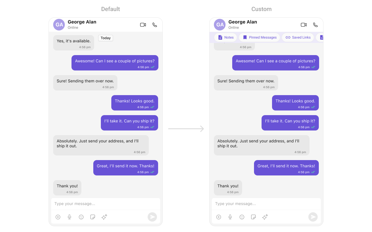 Following is the code of CustomHeaderView - UIView Class
```swift theme={null}
import UIKit
class CustomHeaderView: UIViewController, UICollectionViewDelegate, UICollectionViewDataSource, UICollectionViewDelegateFlowLayout {
private var collectionData: [CollectionItem] = [
CollectionItem(title: "Notes", icon: UIImage(systemName: "doc.text.fill")),
CollectionItem(title: "Pinned Messages", icon: UIImage(systemName: "bookmark.fill")),
CollectionItem(title: "Saved Links", icon: UIImage(systemName: "link"))
]
private lazy var collectionView: UICollectionView = {
let layout = UICollectionViewFlowLayout()
layout.scrollDirection = .horizontal
layout.minimumInteritemSpacing = 10
layout.sectionInset = UIEdgeInsets(top: 0, left: 10, bottom: 0, right: 10)
let collectionView = UICollectionView(frame: .zero, collectionViewLayout: layout)
collectionView.register(CustomHeaderViewCell.self, forCellWithReuseIdentifier: CustomHeaderViewCell.identifier)
collectionView.backgroundColor = .clear
collectionView.showsHorizontalScrollIndicator = false
collectionView.delegate = self
collectionView.dataSource = self
collectionView.tag = 1
return collectionView
}()
override func viewDidLoad() {
super.viewDidLoad()
view.backgroundColor = UIColor(white: 0.95, alpha: 1)
setupUI()
}
private func setupUI() {
view.addSubview(collectionView)
collectionView.translatesAutoresizingMaskIntoConstraints = false
NSLayoutConstraint.activate([
collectionView.topAnchor.constraint(equalTo: view.safeAreaLayoutGuide.topAnchor, constant: 10),
collectionView.leadingAnchor.constraint(equalTo: view.leadingAnchor),
collectionView.trailingAnchor.constraint(equalTo: view.trailingAnchor),
collectionView.bottomAnchor.constraint(equalTo: view.safeAreaLayoutGuide.bottomAnchor, constant: 10)
])
}
// MARK: - UICollectionView DataSource & Delegate
func collectionView(_ collectionView: UICollectionView, numberOfItemsInSection section: Int) -> Int {
return collectionData.count
}
func collectionView(_ collectionView: UICollectionView, cellForItemAt indexPath: IndexPath) -> UICollectionViewCell {
guard let cell = collectionView.dequeueReusableCell(withReuseIdentifier: CustomHeaderViewCell.identifier, for: indexPath) as? CustomHeaderViewCell else {
return UICollectionViewCell()
}
cell.configure(with: collectionData[indexPath.row])
return cell
}
func collectionView(_ collectionView: UICollectionView, layout collectionViewLayout: UICollectionViewLayout, sizeForItemAt indexPath: IndexPath) -> CGSize {
return CGSize(width: 150, height: 40)
}
}
struct CollectionItem {
let title: String
let icon: UIImage?
}
class CustomHeaderViewCell: UICollectionViewCell {
static let identifier = "CustomCollectionViewCell"
private let iconImageView: UIImageView = {
let imageView = UIImageView()
imageView.contentMode = .scaleAspectFit
imageView.translatesAutoresizingMaskIntoConstraints = false
return imageView
}()
private let titleLabel: UILabel = {
let label = UILabel()
label.font = UIFont.systemFont(ofSize: 14, weight: .medium)
label.textColor = UIColor.purple
label.translatesAutoresizingMaskIntoConstraints = false
return label
}()
override init(frame: CGRect) {
super.init(frame: frame)
setupUI()
}
required init?(coder: NSCoder) {
fatalError("init(coder:) has not been implemented")
}
private func setupUI() {
backgroundColor = UIColor(white: 0.95, alpha: 1) // Light purple background
layer.cornerRadius = 18
clipsToBounds = true
addSubview(iconImageView)
addSubview(titleLabel)
NSLayoutConstraint.activate([
iconImageView.leadingAnchor.constraint(equalTo: leadingAnchor, constant: 8),
iconImageView.centerYAnchor.constraint(equalTo: centerYAnchor),
iconImageView.widthAnchor.constraint(equalToConstant: 20),
iconImageView.heightAnchor.constraint(equalToConstant: 20),
titleLabel.leadingAnchor.constraint(equalTo: iconImageView.trailingAnchor, constant: 5),
titleLabel.trailingAnchor.constraint(equalTo: trailingAnchor, constant: -8),
titleLabel.centerYAnchor.constraint(equalTo: centerYAnchor)
])
}
func configure(with model: CollectionItem) {
iconImageView.image = model.icon
titleLabel.text = model.title
}
}
```
***
#### Set FooterView
You can set custom footerView to the Message List component using the following method.
Example
```swift theme={null}
let messageListView = CometChatMessageList(frame: .null)
messageListView.set(footerView: CustomFooterView)
```
Following is the code of CustomHeaderView - UIView Class
```swift theme={null}
import UIKit
class CustomHeaderView: UIViewController, UICollectionViewDelegate, UICollectionViewDataSource, UICollectionViewDelegateFlowLayout {
private var collectionData: [CollectionItem] = [
CollectionItem(title: "Notes", icon: UIImage(systemName: "doc.text.fill")),
CollectionItem(title: "Pinned Messages", icon: UIImage(systemName: "bookmark.fill")),
CollectionItem(title: "Saved Links", icon: UIImage(systemName: "link"))
]
private lazy var collectionView: UICollectionView = {
let layout = UICollectionViewFlowLayout()
layout.scrollDirection = .horizontal
layout.minimumInteritemSpacing = 10
layout.sectionInset = UIEdgeInsets(top: 0, left: 10, bottom: 0, right: 10)
let collectionView = UICollectionView(frame: .zero, collectionViewLayout: layout)
collectionView.register(CustomHeaderViewCell.self, forCellWithReuseIdentifier: CustomHeaderViewCell.identifier)
collectionView.backgroundColor = .clear
collectionView.showsHorizontalScrollIndicator = false
collectionView.delegate = self
collectionView.dataSource = self
collectionView.tag = 1
return collectionView
}()
override func viewDidLoad() {
super.viewDidLoad()
view.backgroundColor = UIColor(white: 0.95, alpha: 1)
setupUI()
}
private func setupUI() {
view.addSubview(collectionView)
collectionView.translatesAutoresizingMaskIntoConstraints = false
NSLayoutConstraint.activate([
collectionView.topAnchor.constraint(equalTo: view.safeAreaLayoutGuide.topAnchor, constant: 10),
collectionView.leadingAnchor.constraint(equalTo: view.leadingAnchor),
collectionView.trailingAnchor.constraint(equalTo: view.trailingAnchor),
collectionView.bottomAnchor.constraint(equalTo: view.safeAreaLayoutGuide.bottomAnchor, constant: 10)
])
}
// MARK: - UICollectionView DataSource & Delegate
func collectionView(_ collectionView: UICollectionView, numberOfItemsInSection section: Int) -> Int {
return collectionData.count
}
func collectionView(_ collectionView: UICollectionView, cellForItemAt indexPath: IndexPath) -> UICollectionViewCell {
guard let cell = collectionView.dequeueReusableCell(withReuseIdentifier: CustomHeaderViewCell.identifier, for: indexPath) as? CustomHeaderViewCell else {
return UICollectionViewCell()
}
cell.configure(with: collectionData[indexPath.row])
return cell
}
func collectionView(_ collectionView: UICollectionView, layout collectionViewLayout: UICollectionViewLayout, sizeForItemAt indexPath: IndexPath) -> CGSize {
return CGSize(width: 150, height: 40)
}
}
struct CollectionItem {
let title: String
let icon: UIImage?
}
class CustomHeaderViewCell: UICollectionViewCell {
static let identifier = "CustomCollectionViewCell"
private let iconImageView: UIImageView = {
let imageView = UIImageView()
imageView.contentMode = .scaleAspectFit
imageView.translatesAutoresizingMaskIntoConstraints = false
return imageView
}()
private let titleLabel: UILabel = {
let label = UILabel()
label.font = UIFont.systemFont(ofSize: 14, weight: .medium)
label.textColor = UIColor.purple
label.translatesAutoresizingMaskIntoConstraints = false
return label
}()
override init(frame: CGRect) {
super.init(frame: frame)
setupUI()
}
required init?(coder: NSCoder) {
fatalError("init(coder:) has not been implemented")
}
private func setupUI() {
backgroundColor = UIColor(white: 0.95, alpha: 1) // Light purple background
layer.cornerRadius = 18
clipsToBounds = true
addSubview(iconImageView)
addSubview(titleLabel)
NSLayoutConstraint.activate([
iconImageView.leadingAnchor.constraint(equalTo: leadingAnchor, constant: 8),
iconImageView.centerYAnchor.constraint(equalTo: centerYAnchor),
iconImageView.widthAnchor.constraint(equalToConstant: 20),
iconImageView.heightAnchor.constraint(equalToConstant: 20),
titleLabel.leadingAnchor.constraint(equalTo: iconImageView.trailingAnchor, constant: 5),
titleLabel.trailingAnchor.constraint(equalTo: trailingAnchor, constant: -8),
titleLabel.centerYAnchor.constraint(equalTo: centerYAnchor)
])
}
func configure(with model: CollectionItem) {
iconImageView.image = model.icon
titleLabel.text = model.title
}
}
```
***
#### Set FooterView
You can set custom footerView to the Message List component using the following method.
Example
```swift theme={null}
let messageListView = CometChatMessageList(frame: .null)
messageListView.set(footerView: CustomFooterView)
```
 Following is the code of CustomFooterView UIView Class
```swift theme={null}
import UIKit
class CustomFooterView: UIViewController, UICollectionViewDelegate, UICollectionViewDataSource, UICollectionViewDelegateFlowLayout {
private var collectionData: [CollectionItem] = [
CollectionItem(title: "Ice Breakers", icon: UIImage(systemName: "sun.max.fill")),
CollectionItem(title: "+1-212-456-7890", icon: UIImage(systemName: "phone.fill")),
CollectionItem(title: "+ Instagram", icon: UIImage(systemName: "camera.fill"))
]
private lazy var collectionView: UICollectionView = {
let layout = UICollectionViewFlowLayout()
layout.scrollDirection = .horizontal
layout.minimumInteritemSpacing = 10
layout.sectionInset = UIEdgeInsets(top: 0, left: 10, bottom: 0, right: 10)
let collectionView = UICollectionView(frame: .zero, collectionViewLayout: layout)
collectionView.register(CustomFooterViewCell.self, forCellWithReuseIdentifier: CustomFooterViewCell.identifier)
collectionView.backgroundColor = .clear
collectionView.showsHorizontalScrollIndicator = false
collectionView.delegate = self
collectionView.dataSource = self
collectionView.tag = 1
return collectionView
}()
override func viewDidLoad() {
super.viewDidLoad()
view.backgroundColor = UIColor(white: 0.95, alpha: 1)
setupUI()
}
private func setupUI() {
view.addSubview(collectionView)
collectionView.translatesAutoresizingMaskIntoConstraints = false
NSLayoutConstraint.activate([
collectionView.topAnchor.constraint(equalTo: view.safeAreaLayoutGuide.topAnchor, constant: 10),
collectionView.leadingAnchor.constraint(equalTo: view.leadingAnchor),
collectionView.trailingAnchor.constraint(equalTo: view.trailingAnchor),
collectionView.bottomAnchor.constraint(equalTo: view.safeAreaLayoutGuide.bottomAnchor, constant: 10)
])
}
// MARK: - UICollectionView DataSource & Delegate
func collectionView(_ collectionView: UICollectionView, numberOfItemsInSection section: Int) -> Int {
return collectionData.count
}
func collectionView(_ collectionView: UICollectionView, cellForItemAt indexPath: IndexPath) -> UICollectionViewCell {
guard let cell = collectionView.dequeueReusableCell(withReuseIdentifier: CustomFooterViewCell.identifier, for: indexPath) as? CustomFooterViewCell else {
return UICollectionViewCell()
}
cell.configure(with: collectionData[indexPath.row])
return cell
}
func collectionView(_ collectionView: UICollectionView, layout collectionViewLayout: UICollectionViewLayout, sizeForItemAt indexPath: IndexPath) -> CGSize {
return CGSize(width: 150, height: 40)
}
}
struct CollectionItem {
let title: String
let icon: UIImage?
}
class CustomFooterViewCell: UICollectionViewCell {
static let identifier = "CustomCollectionViewCell"
private let iconImageView: UIImageView = {
let imageView = UIImageView()
imageView.contentMode = .scaleAspectFit
imageView.translatesAutoresizingMaskIntoConstraints = false
return imageView
}()
private let titleLabel: UILabel = {
let label = UILabel()
label.font = UIFont.systemFont(ofSize: 14, weight: .medium)
label.textColor = UIColor.purple
label.translatesAutoresizingMaskIntoConstraints = false
return label
}()
override init(frame: CGRect) {
super.init(frame: frame)
setupUI()
}
required init?(coder: NSCoder) {
fatalError("init(coder:) has not been implemented")
}
private func setupUI() {
backgroundColor = UIColor(white: 0.95, alpha: 1) // Light purple background
layer.cornerRadius = 18
clipsToBounds = true
addSubview(iconImageView)
addSubview(titleLabel)
NSLayoutConstraint.activate([
iconImageView.leadingAnchor.constraint(equalTo: leadingAnchor, constant: 8),
iconImageView.centerYAnchor.constraint(equalTo: centerYAnchor),
iconImageView.widthAnchor.constraint(equalToConstant: 20),
iconImageView.heightAnchor.constraint(equalToConstant: 20),
titleLabel.leadingAnchor.constraint(equalTo: iconImageView.trailingAnchor, constant: 5),
titleLabel.trailingAnchor.constraint(equalTo: trailingAnchor, constant: -8),
titleLabel.centerYAnchor.constraint(equalTo: centerYAnchor)
])
}
func configure(with model: CollectionItem) {
iconImageView.image = model.icon
titleLabel.text = model.title
}
}
```
***
#### Set DateSeparatorPattern
You can modify the date pattern of the message list date separator to your requirement using `setDateSeparatorPattern()`. This method accepts a function with a return type String. Inside the function, you can create your own pattern and return it as a String.
**Example**
```swift theme={null}
let messageListView = CometChatMessageList()
.set(user: user)
messageListView.set(dateSeparatorPattern: { timestamp in
guard let timestamp = timestamp else {
return ""
}
let date = Date(timeIntervalSince1970: TimeInterval(timestamp))
let formatter = DateFormatter()
formatter.dateFormat = "hh:mm MM/yyyy"
return formatter.string(from: date)
})
```
Ensure to pass and present `cometChatMessages`. If a navigation controller is already in use, utilize the pushViewController function instead of directly presenting the view controller.
***
#### SetDatePattern
You can modify the date pattern to your requirement using .set(datePattern:). This method accepts a function with a return type String. Inside the function, you can create your own pattern and return it as a String.
**Example**
```swift theme={null}
let messageListView = CometChatMessageList()
messageListView.set(datePattern: { timestamp in
guard let timestamp = timestamp else {
return ""
}
let date = Date(timeIntervalSince1970: TimeInterval(timestamp/1000))
let formatter = DateFormatter()
formatter.dateFormat = "dd-MM-yyyy"
return formatter.string(from: date)
})
```
***
#### SetTimePattern
You can modify the date pattern to your requirement using `.set(timePattern:)`. This method accepts a function with a return type String. Inside the function, you can create your own pattern and return it as a String.
**Example**
```swift theme={null}
let messageListView = CometChatMessageList()
messageListView.set(timePattern: { timestamp in
let time = Date(timeIntervalSince1970: TimeInterval(timestamp))
let formatter = DateFormatter()
formatter.dateFormat = "HH:mm"
return formatter.string(from: time)
})
```
***
#### SetTextFormatters
This functionality dynamically assigns a list of text formatters. If a custom list is provided, it uses that list. Otherwise, it gracefully falls back to the default text formatters retrieved from the data source for seamless integration.
**Example**
This code customizes a CometChat text formatter to identify and style the word "sure", with handling options for interactions like string search, scrolling, and item clicks. The custom formatter is then applied to CometChat messages.
```ruby Swift theme={null}
let myCustomTextFormatter = MyCustomTextFormatter(trackingCharacter: "#")
let cometChatMessages = CometChatMessages()
.set(user: user)
.set(textFormatter: [myCustomTextFormatter])
```
Demonstration:
```swift theme={null}
import Foundation
import CometChatSDK
import CometChatUIKitSwift
class MyCustomTextFormatter: CometChatTextFormatter {
override func getRegex() -> String {
return "(\\bsure\\b)"
}
override func getTrackingCharacter() -> Character {
return "#"
}
override func search(string: String, suggestedItems: ((_: [SuggestionItem]) -> ())? = nil) {
// This function would call an API or perform a local search
// For now, it does nothing
}
override func onScrollToBottom(suggestionItemList: [SuggestionItem], listItem: ((_: [SuggestionItem]) -> ())?) {
// This function would call the next page of an API
// For now, it does nothing
}
override func onItemClick(suggestedItem: SuggestionItem, user: User?, group: Group?) {
// Do something with the clicked item
}
override func handlePreMessageSend(baseMessage: BaseMessage, suggestionItemList: [SuggestionItem]) {
// This function would modify the message before it's sent
// For now, it does nothing
}
override func prepareMessageString(
baseMessage: BaseMessage,
regexString: String,
alignment: MessageBubbleAlignment = .left,
formattingType: FormattingType
) -> NSAttributedString {
let attrString = NSMutableAttributedString(string: "SURE")
if alignment == .left { // Received message
attrString.addAttribute(.foregroundColor, value: UIColor.blue, range: NSRange(location: 0, length: attrString.length))
} else { // Sent message
attrString.addAttribute(.foregroundColor, value: UIColor.green, range: NSRange(location: 0, length: attrString.length))
}
attrString.addAttribute(.font, value: UIFont.boldSystemFont(ofSize: 18), range: NSRange(location: 0, length: attrString.length))
return attrString
}
override func onTextTapped(baseMessage: BaseMessage, tappedText: String, controller: UIViewController?) {
// Your Action
}
}
```
***
#### SetTemplate and AddTemplate
[CometChatMessageTemplate](/ui-kit/ios/message-template) is a pre-defined structure for creating message views that can be used as a starting point or blueprint for creating message views often known as message bubbles. For more information, you can refer to [CometChatMessageTemplate](/ui-kit/ios/message-template).
***
#### SetLoadingView
You can set a custom loading view using .set(loadingView:). This method accepts a UIView to display while data is being fetched.
```swift theme={null}
let loadingIndicator = UIActivityIndicatorView(style: .medium)
loadingIndicator.startAnimating()
cometChatMessageList.set(loadingView: loadingIndicator)
```
***
#### SetErrorView
You can customize the error view using .set(errorView:). This method accepts a UIView that appears when an error occurs.
```swift theme={null}
let errorLabel = UILabel()
errorLabel.text = "Something went wrong!"
errorLabel.textColor = .red
cometChatMessageList.set(errorView: errorLabel)
```
***
#### SetEmptyView
You can customize the empty state view using .set(emptyView:). This method accepts a UIView that appears when no conversations are available.
```swift theme={null}
let emptyLabel = UILabel()
emptyLabel.text = "No conversations found"
emptyLabel.textColor = .gray
emptyLabel.textAlignment = .center
cometChatMessageList.set(emptyView: emptyLabel)
```
***
To ensure that the `MessageList` is properly configured, passing the controller is mandatory.
* Swift
```swift theme={null}
let messageListView = CometChatMessageList()
messageListView.set(controller: UIViewController) // Passing the controller is required
```
***
Ensure to pass and present `cometChatMessages`. If a navigation controller is already in use, utilize the pushViewController function instead of directly presenting the view controller.
Following is the code of CustomFooterView UIView Class
```swift theme={null}
import UIKit
class CustomFooterView: UIViewController, UICollectionViewDelegate, UICollectionViewDataSource, UICollectionViewDelegateFlowLayout {
private var collectionData: [CollectionItem] = [
CollectionItem(title: "Ice Breakers", icon: UIImage(systemName: "sun.max.fill")),
CollectionItem(title: "+1-212-456-7890", icon: UIImage(systemName: "phone.fill")),
CollectionItem(title: "+ Instagram", icon: UIImage(systemName: "camera.fill"))
]
private lazy var collectionView: UICollectionView = {
let layout = UICollectionViewFlowLayout()
layout.scrollDirection = .horizontal
layout.minimumInteritemSpacing = 10
layout.sectionInset = UIEdgeInsets(top: 0, left: 10, bottom: 0, right: 10)
let collectionView = UICollectionView(frame: .zero, collectionViewLayout: layout)
collectionView.register(CustomFooterViewCell.self, forCellWithReuseIdentifier: CustomFooterViewCell.identifier)
collectionView.backgroundColor = .clear
collectionView.showsHorizontalScrollIndicator = false
collectionView.delegate = self
collectionView.dataSource = self
collectionView.tag = 1
return collectionView
}()
override func viewDidLoad() {
super.viewDidLoad()
view.backgroundColor = UIColor(white: 0.95, alpha: 1)
setupUI()
}
private func setupUI() {
view.addSubview(collectionView)
collectionView.translatesAutoresizingMaskIntoConstraints = false
NSLayoutConstraint.activate([
collectionView.topAnchor.constraint(equalTo: view.safeAreaLayoutGuide.topAnchor, constant: 10),
collectionView.leadingAnchor.constraint(equalTo: view.leadingAnchor),
collectionView.trailingAnchor.constraint(equalTo: view.trailingAnchor),
collectionView.bottomAnchor.constraint(equalTo: view.safeAreaLayoutGuide.bottomAnchor, constant: 10)
])
}
// MARK: - UICollectionView DataSource & Delegate
func collectionView(_ collectionView: UICollectionView, numberOfItemsInSection section: Int) -> Int {
return collectionData.count
}
func collectionView(_ collectionView: UICollectionView, cellForItemAt indexPath: IndexPath) -> UICollectionViewCell {
guard let cell = collectionView.dequeueReusableCell(withReuseIdentifier: CustomFooterViewCell.identifier, for: indexPath) as? CustomFooterViewCell else {
return UICollectionViewCell()
}
cell.configure(with: collectionData[indexPath.row])
return cell
}
func collectionView(_ collectionView: UICollectionView, layout collectionViewLayout: UICollectionViewLayout, sizeForItemAt indexPath: IndexPath) -> CGSize {
return CGSize(width: 150, height: 40)
}
}
struct CollectionItem {
let title: String
let icon: UIImage?
}
class CustomFooterViewCell: UICollectionViewCell {
static let identifier = "CustomCollectionViewCell"
private let iconImageView: UIImageView = {
let imageView = UIImageView()
imageView.contentMode = .scaleAspectFit
imageView.translatesAutoresizingMaskIntoConstraints = false
return imageView
}()
private let titleLabel: UILabel = {
let label = UILabel()
label.font = UIFont.systemFont(ofSize: 14, weight: .medium)
label.textColor = UIColor.purple
label.translatesAutoresizingMaskIntoConstraints = false
return label
}()
override init(frame: CGRect) {
super.init(frame: frame)
setupUI()
}
required init?(coder: NSCoder) {
fatalError("init(coder:) has not been implemented")
}
private func setupUI() {
backgroundColor = UIColor(white: 0.95, alpha: 1) // Light purple background
layer.cornerRadius = 18
clipsToBounds = true
addSubview(iconImageView)
addSubview(titleLabel)
NSLayoutConstraint.activate([
iconImageView.leadingAnchor.constraint(equalTo: leadingAnchor, constant: 8),
iconImageView.centerYAnchor.constraint(equalTo: centerYAnchor),
iconImageView.widthAnchor.constraint(equalToConstant: 20),
iconImageView.heightAnchor.constraint(equalToConstant: 20),
titleLabel.leadingAnchor.constraint(equalTo: iconImageView.trailingAnchor, constant: 5),
titleLabel.trailingAnchor.constraint(equalTo: trailingAnchor, constant: -8),
titleLabel.centerYAnchor.constraint(equalTo: centerYAnchor)
])
}
func configure(with model: CollectionItem) {
iconImageView.image = model.icon
titleLabel.text = model.title
}
}
```
***
#### Set DateSeparatorPattern
You can modify the date pattern of the message list date separator to your requirement using `setDateSeparatorPattern()`. This method accepts a function with a return type String. Inside the function, you can create your own pattern and return it as a String.
**Example**
```swift theme={null}
let messageListView = CometChatMessageList()
.set(user: user)
messageListView.set(dateSeparatorPattern: { timestamp in
guard let timestamp = timestamp else {
return ""
}
let date = Date(timeIntervalSince1970: TimeInterval(timestamp))
let formatter = DateFormatter()
formatter.dateFormat = "hh:mm MM/yyyy"
return formatter.string(from: date)
})
```
Ensure to pass and present `cometChatMessages`. If a navigation controller is already in use, utilize the pushViewController function instead of directly presenting the view controller.
***
#### SetDatePattern
You can modify the date pattern to your requirement using .set(datePattern:). This method accepts a function with a return type String. Inside the function, you can create your own pattern and return it as a String.
**Example**
```swift theme={null}
let messageListView = CometChatMessageList()
messageListView.set(datePattern: { timestamp in
guard let timestamp = timestamp else {
return ""
}
let date = Date(timeIntervalSince1970: TimeInterval(timestamp/1000))
let formatter = DateFormatter()
formatter.dateFormat = "dd-MM-yyyy"
return formatter.string(from: date)
})
```
***
#### SetTimePattern
You can modify the date pattern to your requirement using `.set(timePattern:)`. This method accepts a function with a return type String. Inside the function, you can create your own pattern and return it as a String.
**Example**
```swift theme={null}
let messageListView = CometChatMessageList()
messageListView.set(timePattern: { timestamp in
let time = Date(timeIntervalSince1970: TimeInterval(timestamp))
let formatter = DateFormatter()
formatter.dateFormat = "HH:mm"
return formatter.string(from: time)
})
```
***
#### SetTextFormatters
This functionality dynamically assigns a list of text formatters. If a custom list is provided, it uses that list. Otherwise, it gracefully falls back to the default text formatters retrieved from the data source for seamless integration.
**Example**
This code customizes a CometChat text formatter to identify and style the word "sure", with handling options for interactions like string search, scrolling, and item clicks. The custom formatter is then applied to CometChat messages.
```ruby Swift theme={null}
let myCustomTextFormatter = MyCustomTextFormatter(trackingCharacter: "#")
let cometChatMessages = CometChatMessages()
.set(user: user)
.set(textFormatter: [myCustomTextFormatter])
```
Demonstration:
```swift theme={null}
import Foundation
import CometChatSDK
import CometChatUIKitSwift
class MyCustomTextFormatter: CometChatTextFormatter {
override func getRegex() -> String {
return "(\\bsure\\b)"
}
override func getTrackingCharacter() -> Character {
return "#"
}
override func search(string: String, suggestedItems: ((_: [SuggestionItem]) -> ())? = nil) {
// This function would call an API or perform a local search
// For now, it does nothing
}
override func onScrollToBottom(suggestionItemList: [SuggestionItem], listItem: ((_: [SuggestionItem]) -> ())?) {
// This function would call the next page of an API
// For now, it does nothing
}
override func onItemClick(suggestedItem: SuggestionItem, user: User?, group: Group?) {
// Do something with the clicked item
}
override func handlePreMessageSend(baseMessage: BaseMessage, suggestionItemList: [SuggestionItem]) {
// This function would modify the message before it's sent
// For now, it does nothing
}
override func prepareMessageString(
baseMessage: BaseMessage,
regexString: String,
alignment: MessageBubbleAlignment = .left,
formattingType: FormattingType
) -> NSAttributedString {
let attrString = NSMutableAttributedString(string: "SURE")
if alignment == .left { // Received message
attrString.addAttribute(.foregroundColor, value: UIColor.blue, range: NSRange(location: 0, length: attrString.length))
} else { // Sent message
attrString.addAttribute(.foregroundColor, value: UIColor.green, range: NSRange(location: 0, length: attrString.length))
}
attrString.addAttribute(.font, value: UIFont.boldSystemFont(ofSize: 18), range: NSRange(location: 0, length: attrString.length))
return attrString
}
override func onTextTapped(baseMessage: BaseMessage, tappedText: String, controller: UIViewController?) {
// Your Action
}
}
```
***
#### SetTemplate and AddTemplate
[CometChatMessageTemplate](/ui-kit/ios/message-template) is a pre-defined structure for creating message views that can be used as a starting point or blueprint for creating message views often known as message bubbles. For more information, you can refer to [CometChatMessageTemplate](/ui-kit/ios/message-template).
***
#### SetLoadingView
You can set a custom loading view using .set(loadingView:). This method accepts a UIView to display while data is being fetched.
```swift theme={null}
let loadingIndicator = UIActivityIndicatorView(style: .medium)
loadingIndicator.startAnimating()
cometChatMessageList.set(loadingView: loadingIndicator)
```
***
#### SetErrorView
You can customize the error view using .set(errorView:). This method accepts a UIView that appears when an error occurs.
```swift theme={null}
let errorLabel = UILabel()
errorLabel.text = "Something went wrong!"
errorLabel.textColor = .red
cometChatMessageList.set(errorView: errorLabel)
```
***
#### SetEmptyView
You can customize the empty state view using .set(emptyView:). This method accepts a UIView that appears when no conversations are available.
```swift theme={null}
let emptyLabel = UILabel()
emptyLabel.text = "No conversations found"
emptyLabel.textColor = .gray
emptyLabel.textAlignment = .center
cometChatMessageList.set(emptyView: emptyLabel)
```
***
To ensure that the `MessageList` is properly configured, passing the controller is mandatory.
* Swift
```swift theme={null}
let messageListView = CometChatMessageList()
messageListView.set(controller: UIViewController) // Passing the controller is required
```
***
Ensure to pass and present `cometChatMessages`. If a navigation controller is already in use, utilize the pushViewController function instead of directly presenting the view controller.