> ## Documentation Index
> Fetch the complete documentation index at: https://cometchat-22654f5b-feature-react-native-sdk-quotedmessage-a.mintlify.site/llms.txt
> Use this file to discover all available pages before exploring further.
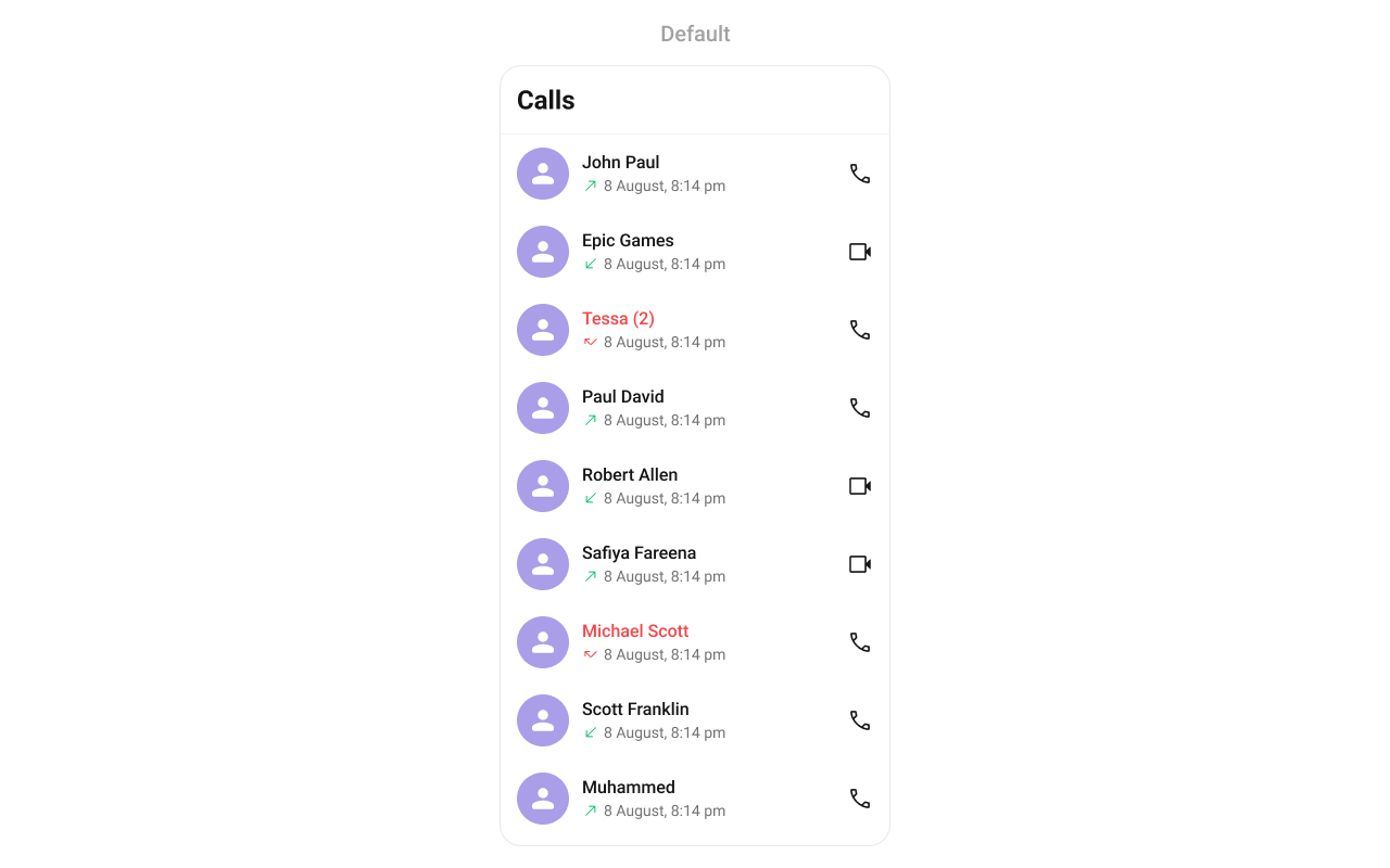
# Call Logs
## Overview
`CometChatCallLogs` is a [Component](/ui-kit/react-native/components-overview#components) that shows the list of Call Logs available. By default, names are shown for all listed users, along with their avatars if available.
 ## Usage
### Integration
`CometChatCallLogs` being a wrapper component, offers versatility in its integration. It can be seamlessly launched via button clicks or any user-triggered action, enhancing the overall user experience and facilitating smoother interactions within the application.
```tsx theme={null}
import { CometChatCallLogs } from "@cometchat/chat-uikit-react-native";
//code
return ;
```
### Actions
[Actions](/ui-kit/react-native/components-overview#actions) dictate how a component functions. They are divided into two types: Predefined and User-defined. You can override either type, allowing you to tailor the behavior of the component to fit your specific needs.
##### onItemPress
`onItemPress` is triggered when you click on a ListItem of the Call Logs component. By default it initiate a call to the participant associated with the respective ListItem. You can override this action using the following code snippet.
```tsx theme={null}
import { CometChatCallLogs } from "@cometchat/chat-uikit-react-native";
//code
const getItemPresshandler = (call: any) => {
//code
};
return (
);
```
***
##### onItemLongPress
Function executed when a callLog item is long-pressed, allowing additional actions like delete or select.
```tsx theme={null}
import { CometChatCallLogs } from "@cometchat/chat-uikit-react-native";
import { CometChat } from "@cometchat/chat-sdk-react-native";
//code
const onItemLongPressHandler = (i: any) => {
//handle long press
};
return ;
```
***
##### onCallIconPress
```tsx theme={null}
import { CometChatCallLogs } from "@cometchat/chat-uikit-react-native";
import { CometChat } from "@cometchat/chat-sdk-react-native";
//code
const getOnCallIconPressHandler = (call: any) => {
//handle call icon press
};
return (
);
```
***
##### onBack
`onBack` is triggered when you press the back button in the app bar. You can override this action using the following code snippet.
```tsx theme={null}
import { CometChatCallLogs } from "@cometchat/chat-uikit-react-native";
//code
const onBackHandler = () => {
//handle back
};
return ;
```
##### OnError
This action doesn't change the behavior of the component but rather listens for any errors that occur in the callLogs component.
```tsx theme={null}
import { CometChatCallLogs } from "@cometchat/chat-uikit-react-native";
import { CometChat } from "@cometchat/chat-sdk-react-native";
//code
const onErrorHandler = (e: CometChat.CometChatException) => {
//handle back
};
return ;
```
***
### Filters
**Filters** allow you to customize the data displayed in a list within a `Component`. You can filter the list based on your specific criteria, allowing for a more customized. Filters can be applied using `RequestBuilders` of Chat SDK.
##### CallLogRequestBuilder
The [CallLogRequestBuilder](/sdk/react-native/call-logs) enables you to filter and customize the Call Log based on available parameters in [CallLogRequestBuilder](/sdk/react-native/call-logs). This feature allows you to create more specific and targeted queries when fetching the call logs. The following are the parameters available in [CallLogRequestBuilder](/sdk/react-native/call-logs)
| Methods | Type | Description |
| -------------------- | ---------- | ------------------------------------------------------------ |
| **setLimit** | number | Specifies the number of call logs to fetch. |
| **setCallType** | String | Sets the type of calls to fetch (call or meet). |
| **setCallStatus** | callStatus | Sets the status of calls to fetch (initiated, ongoing, etc.) |
| **setHasRecording** | boolean | Sets whether to fetch calls that have recordings. |
| **setCallCategory** | string | Sets the category of calls to fetch (call or meet). |
| **setCallDirection** | string | Sets the direction of calls to fetch (incoming or outgoing) |
| **setUid** | string | Sets the UID of the user whose call logs to fetch. |
| **setGuid** | string | Sets the GUID of the user whose call logs to fetch. |
| **setAuthToken** | string | Sets the Auth token of the logged-in user. |
**Example**
In the example below, we're filtering Call Logs to show only canceled calls and setting the limit to five.
```tsx theme={null}
import {
CometChat,
CometChatCalls,
CallLogRequestBuilder,
} from "@cometchat/chat-sdk-react-native";
import { CometChatCallLogs } from "@cometchat/chat-uikit-react-native";
function App(): React.JSX.Element {
const [loggedInUser, setLoggedInUser] = useState();
useEffect(() => {
//code
CometChatUIKit.login({ uid: "uid" })
.then(async (user: CometChat.User) => {
setLoggedInUser(user);
})
.catch((error: any) => {
//handle error
});
}, []);
return (
<>
{loggedInUser && (
)}
);
}
```
***
### Events
[Events](/ui-kit/react-native/components-overview#events) are emitted by a `Component`. By using event you can extend existing functionality. Being global events, they can be applied in Multiple Locations and are capable of being Added or Removed.
The `CometChatCallLogs` component does not have any exposed events.
***
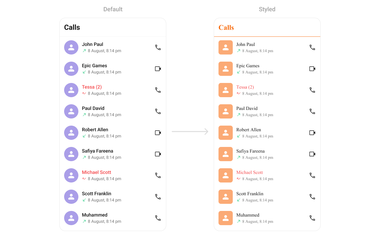
## Customization
To fit your app's design requirements, you can customize the appearance of the CallLog component. We provide exposed methods that allow you to modify the experience and behavior according to your specific needs.
### Style
Using Style you can customize the look and feel of the component in your app, These parameters typically control elements such as the color, size, shape, and fonts used within the component.
```tsx theme={null}
import { CometChatCallLogs } from "@cometchat/chat-uikit-react-native";
//code
return (
);
```
## Usage
### Integration
`CometChatCallLogs` being a wrapper component, offers versatility in its integration. It can be seamlessly launched via button clicks or any user-triggered action, enhancing the overall user experience and facilitating smoother interactions within the application.
```tsx theme={null}
import { CometChatCallLogs } from "@cometchat/chat-uikit-react-native";
//code
return ;
```
### Actions
[Actions](/ui-kit/react-native/components-overview#actions) dictate how a component functions. They are divided into two types: Predefined and User-defined. You can override either type, allowing you to tailor the behavior of the component to fit your specific needs.
##### onItemPress
`onItemPress` is triggered when you click on a ListItem of the Call Logs component. By default it initiate a call to the participant associated with the respective ListItem. You can override this action using the following code snippet.
```tsx theme={null}
import { CometChatCallLogs } from "@cometchat/chat-uikit-react-native";
//code
const getItemPresshandler = (call: any) => {
//code
};
return (
);
```
***
##### onItemLongPress
Function executed when a callLog item is long-pressed, allowing additional actions like delete or select.
```tsx theme={null}
import { CometChatCallLogs } from "@cometchat/chat-uikit-react-native";
import { CometChat } from "@cometchat/chat-sdk-react-native";
//code
const onItemLongPressHandler = (i: any) => {
//handle long press
};
return ;
```
***
##### onCallIconPress
```tsx theme={null}
import { CometChatCallLogs } from "@cometchat/chat-uikit-react-native";
import { CometChat } from "@cometchat/chat-sdk-react-native";
//code
const getOnCallIconPressHandler = (call: any) => {
//handle call icon press
};
return (
);
```
***
##### onBack
`onBack` is triggered when you press the back button in the app bar. You can override this action using the following code snippet.
```tsx theme={null}
import { CometChatCallLogs } from "@cometchat/chat-uikit-react-native";
//code
const onBackHandler = () => {
//handle back
};
return ;
```
##### OnError
This action doesn't change the behavior of the component but rather listens for any errors that occur in the callLogs component.
```tsx theme={null}
import { CometChatCallLogs } from "@cometchat/chat-uikit-react-native";
import { CometChat } from "@cometchat/chat-sdk-react-native";
//code
const onErrorHandler = (e: CometChat.CometChatException) => {
//handle back
};
return ;
```
***
### Filters
**Filters** allow you to customize the data displayed in a list within a `Component`. You can filter the list based on your specific criteria, allowing for a more customized. Filters can be applied using `RequestBuilders` of Chat SDK.
##### CallLogRequestBuilder
The [CallLogRequestBuilder](/sdk/react-native/call-logs) enables you to filter and customize the Call Log based on available parameters in [CallLogRequestBuilder](/sdk/react-native/call-logs). This feature allows you to create more specific and targeted queries when fetching the call logs. The following are the parameters available in [CallLogRequestBuilder](/sdk/react-native/call-logs)
| Methods | Type | Description |
| -------------------- | ---------- | ------------------------------------------------------------ |
| **setLimit** | number | Specifies the number of call logs to fetch. |
| **setCallType** | String | Sets the type of calls to fetch (call or meet). |
| **setCallStatus** | callStatus | Sets the status of calls to fetch (initiated, ongoing, etc.) |
| **setHasRecording** | boolean | Sets whether to fetch calls that have recordings. |
| **setCallCategory** | string | Sets the category of calls to fetch (call or meet). |
| **setCallDirection** | string | Sets the direction of calls to fetch (incoming or outgoing) |
| **setUid** | string | Sets the UID of the user whose call logs to fetch. |
| **setGuid** | string | Sets the GUID of the user whose call logs to fetch. |
| **setAuthToken** | string | Sets the Auth token of the logged-in user. |
**Example**
In the example below, we're filtering Call Logs to show only canceled calls and setting the limit to five.
```tsx theme={null}
import {
CometChat,
CometChatCalls,
CallLogRequestBuilder,
} from "@cometchat/chat-sdk-react-native";
import { CometChatCallLogs } from "@cometchat/chat-uikit-react-native";
function App(): React.JSX.Element {
const [loggedInUser, setLoggedInUser] = useState();
useEffect(() => {
//code
CometChatUIKit.login({ uid: "uid" })
.then(async (user: CometChat.User) => {
setLoggedInUser(user);
})
.catch((error: any) => {
//handle error
});
}, []);
return (
<>
{loggedInUser && (
)}
);
}
```
***
### Events
[Events](/ui-kit/react-native/components-overview#events) are emitted by a `Component`. By using event you can extend existing functionality. Being global events, they can be applied in Multiple Locations and are capable of being Added or Removed.
The `CometChatCallLogs` component does not have any exposed events.
***
## Customization
To fit your app's design requirements, you can customize the appearance of the CallLog component. We provide exposed methods that allow you to modify the experience and behavior according to your specific needs.
### Style
Using Style you can customize the look and feel of the component in your app, These parameters typically control elements such as the color, size, shape, and fonts used within the component.
```tsx theme={null}
import { CometChatCallLogs } from "@cometchat/chat-uikit-react-native";
//code
return (
);
```
 ***
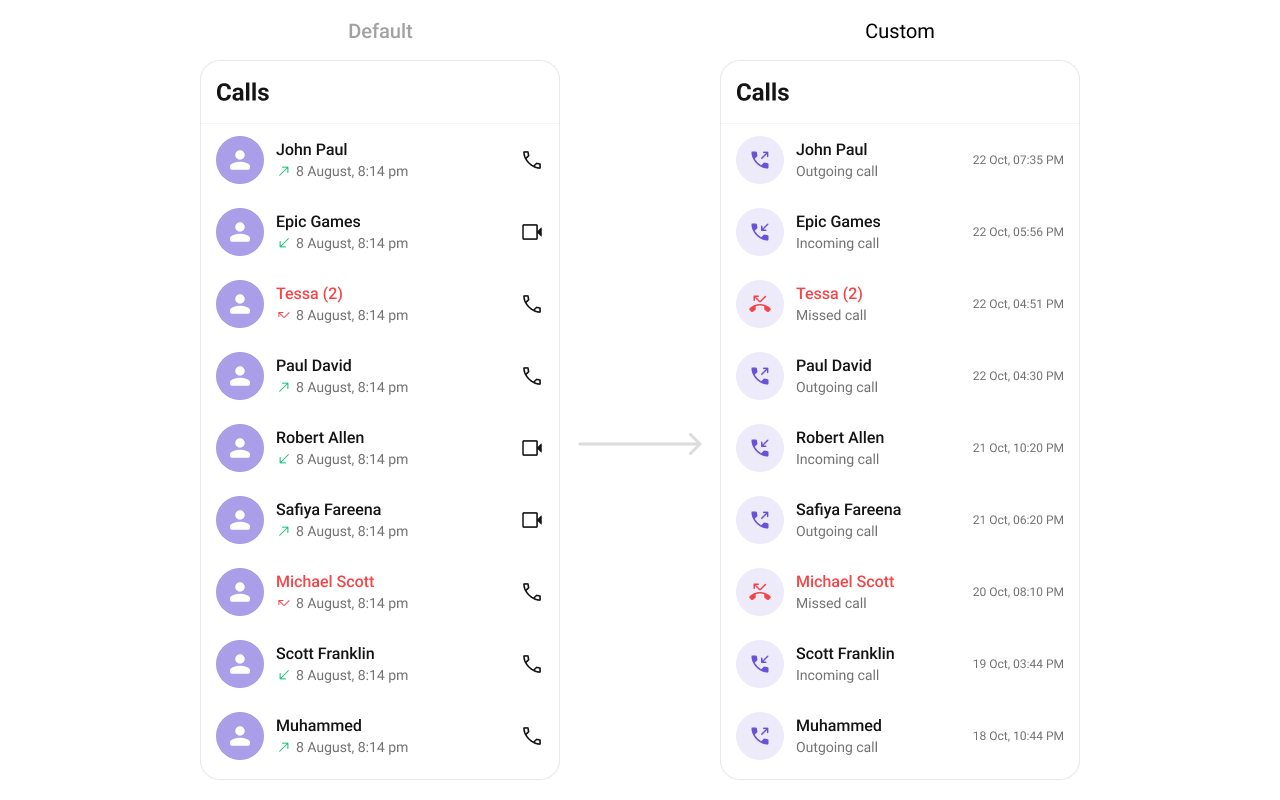
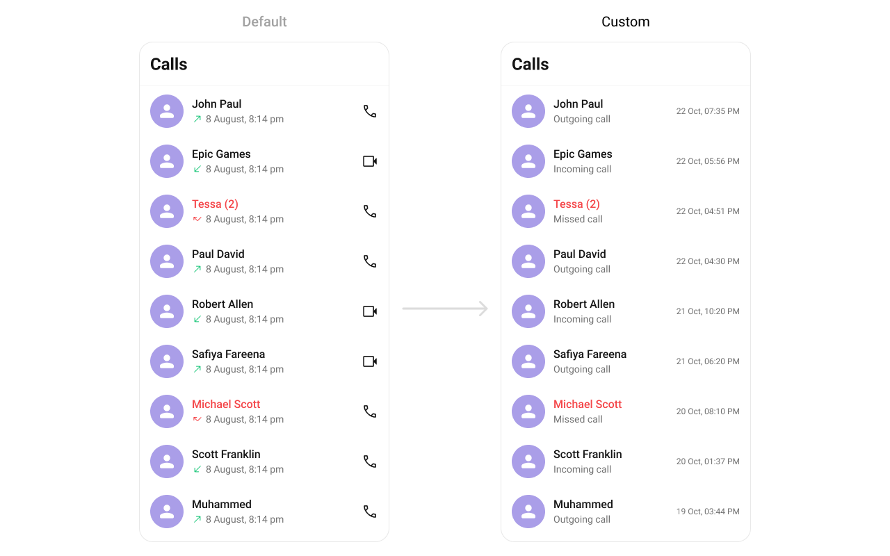
### Functionality
These are a set of small functional customizations that allow you to fine-tune the overall experience of the component. With these, you can change text, set custom icons, and toggle the visibility of UI elements.
| Property | Description | Code |
| ----------------------------- | ---------------------------------------------------- | ------------------------------------------------------------- |
| **datePattern** | Used to set custom date pattern | `datePattern?: DatePattern` |
| **hideBackButton** | Used to show/hide the back button | `hideBackButton?: boolean` |
| **hideError** | Used to hide errors | `hideError?: boolean` |
| **outgoingCallConfiguration** | Sets the configurations for outgoing call component. | `outgoingCallConfiguration={outgoingCallConfigurationObject}` |
| **hideHeader** | Used to toggle visibility of header | `hideHeader={true}` |
| **hideLoadingState** | Used to toggle visibility of Loading state | `hideLoadingState={true}` |
***
### Advanced
For advanced-level customization, you can set custom views to the component. This lets you tailor each aspect of the component to fit your exact needs and application aesthetics. You can create and define your views, layouts, and UI elements and then incorporate those into the component.
#### LoadingView
Allows setting a custom loading view when fetching call logs.
Use Cases:
* Display a spinner animation while loading.
* Show a "Fetching Call History..." message.
* Use a shimmer effect for better UI experience.
```tsx theme={null}
import { CometChatCallLogs } from "@cometchat/chat-uikit-react-native";
//code
const getLoadingView = () => {
//return jsx;
};
return ;
```
#### EmptyView
Defines a custom view when no call logs are available.
Use Cases:
* Show a friendly message like "No calls yet!".
* Offer quick actions like "Make a Call".
* Display an illustration/image.
```tsx theme={null}
import { CometChatCallLogs } from "@cometchat/chat-uikit-react-native";
//code
const getEmptyView = () => {
//return jsx;
};
return ;
```
***
#### ErrorView
Allows setting a custom error state view when fetching call logs fails.
Use Cases:
* Display a retry button.
* Show a network issue message.
* Provide a troubleshooting guide.
```tsx theme={null}
import { CometChatCallLogs } from "@cometchat/chat-uikit-react-native";
//code
const getErrorView = (e: CometChat.CometChatException) => {
//return jsx;
};
return ;
```
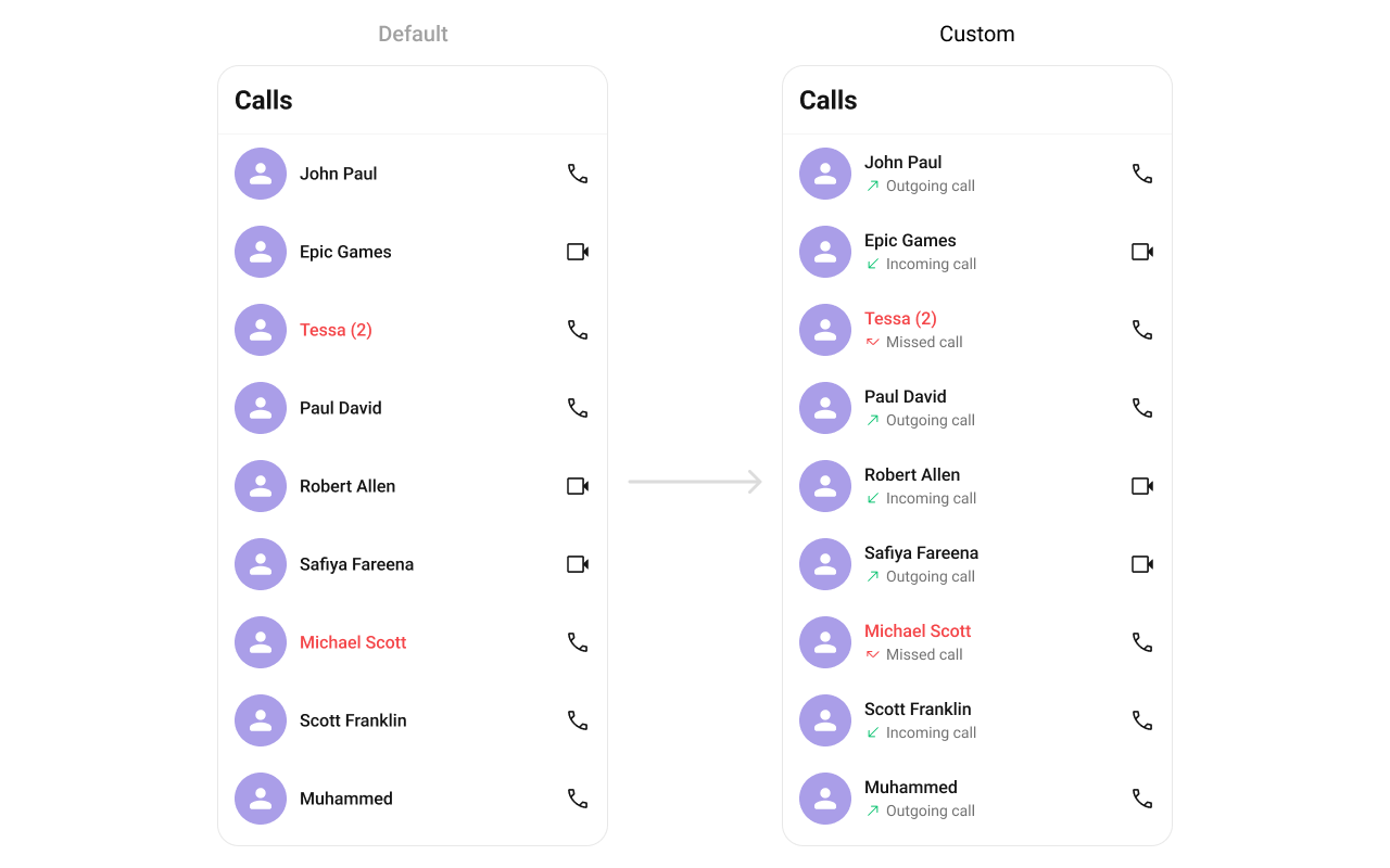
#### ItemView
Allows setting a custom layout for each call log item.
Use Cases:
* Customize the entire call log card.
* Display additional contact details.
* Use a two-column design for better readability.
```tsx theme={null}
import { CometChatCallLogs } from "@cometchat/chat-uikit-react-native";
//code
const getItemView = (call: any) => {
//return jsx;
};
return ;
```
***
### Functionality
These are a set of small functional customizations that allow you to fine-tune the overall experience of the component. With these, you can change text, set custom icons, and toggle the visibility of UI elements.
| Property | Description | Code |
| ----------------------------- | ---------------------------------------------------- | ------------------------------------------------------------- |
| **datePattern** | Used to set custom date pattern | `datePattern?: DatePattern` |
| **hideBackButton** | Used to show/hide the back button | `hideBackButton?: boolean` |
| **hideError** | Used to hide errors | `hideError?: boolean` |
| **outgoingCallConfiguration** | Sets the configurations for outgoing call component. | `outgoingCallConfiguration={outgoingCallConfigurationObject}` |
| **hideHeader** | Used to toggle visibility of header | `hideHeader={true}` |
| **hideLoadingState** | Used to toggle visibility of Loading state | `hideLoadingState={true}` |
***
### Advanced
For advanced-level customization, you can set custom views to the component. This lets you tailor each aspect of the component to fit your exact needs and application aesthetics. You can create and define your views, layouts, and UI elements and then incorporate those into the component.
#### LoadingView
Allows setting a custom loading view when fetching call logs.
Use Cases:
* Display a spinner animation while loading.
* Show a "Fetching Call History..." message.
* Use a shimmer effect for better UI experience.
```tsx theme={null}
import { CometChatCallLogs } from "@cometchat/chat-uikit-react-native";
//code
const getLoadingView = () => {
//return jsx;
};
return ;
```
#### EmptyView
Defines a custom view when no call logs are available.
Use Cases:
* Show a friendly message like "No calls yet!".
* Offer quick actions like "Make a Call".
* Display an illustration/image.
```tsx theme={null}
import { CometChatCallLogs } from "@cometchat/chat-uikit-react-native";
//code
const getEmptyView = () => {
//return jsx;
};
return ;
```
***
#### ErrorView
Allows setting a custom error state view when fetching call logs fails.
Use Cases:
* Display a retry button.
* Show a network issue message.
* Provide a troubleshooting guide.
```tsx theme={null}
import { CometChatCallLogs } from "@cometchat/chat-uikit-react-native";
//code
const getErrorView = (e: CometChat.CometChatException) => {
//return jsx;
};
return ;
```
#### ItemView
Allows setting a custom layout for each call log item.
Use Cases:
* Customize the entire call log card.
* Display additional contact details.
* Use a two-column design for better readability.
```tsx theme={null}
import { CometChatCallLogs } from "@cometchat/chat-uikit-react-native";
//code
const getItemView = (call: any) => {
//return jsx;
};
return ;
```
 #### TitleView
Allows setting a custom title view, typically used for the caller’s name or number.
Use Cases:
* Display caller’s full name.
* Show a business label for saved contacts.
* Use bold text for unknown numbers.
```tsx theme={null}
import { CometChatCallLogs } from "@cometchat/chat-uikit-react-native";
//code
const getTitleView = (call: any) => {
//return jsx;
};
return ;
```
#### LeadingView
Customizes the leading view, usually the caller’s avatar or profile picture.
Use Cases:
* Display a profile picture.
* Show a call type icon (missed, received, dialed).
* Indicate call status (e.g., missed calls in red).
```tsx theme={null}
import { CometChatCallLogs } from "@cometchat/chat-uikit-react-native";
//code
const getLeadingView = (call: any) => {
//return jsx;
};
return ;
```
#### SubtitleView
Enables customizing the subtitle view, usually used for additional call details.
Use Cases:
* Display call type (Missed, Received, Outgoing).
* Show network strength indicators.
* Include call duration in a more readable format.
```tsx theme={null}
import { CometChatCallLogs } from "@cometchat/chat-uikit-react-native";
//code
const getSubtitleView = (call: any) => {
//return jsx;
};
return ;
```
**Example**
#### TitleView
Allows setting a custom title view, typically used for the caller’s name or number.
Use Cases:
* Display caller’s full name.
* Show a business label for saved contacts.
* Use bold text for unknown numbers.
```tsx theme={null}
import { CometChatCallLogs } from "@cometchat/chat-uikit-react-native";
//code
const getTitleView = (call: any) => {
//return jsx;
};
return ;
```
#### LeadingView
Customizes the leading view, usually the caller’s avatar or profile picture.
Use Cases:
* Display a profile picture.
* Show a call type icon (missed, received, dialed).
* Indicate call status (e.g., missed calls in red).
```tsx theme={null}
import { CometChatCallLogs } from "@cometchat/chat-uikit-react-native";
//code
const getLeadingView = (call: any) => {
//return jsx;
};
return ;
```
#### SubtitleView
Enables customizing the subtitle view, usually used for additional call details.
Use Cases:
* Display call type (Missed, Received, Outgoing).
* Show network strength indicators.
* Include call duration in a more readable format.
```tsx theme={null}
import { CometChatCallLogs } from "@cometchat/chat-uikit-react-native";
//code
const getSubtitleView = (call: any) => {
//return jsx;
};
return ;
```
**Example**
 ***
#### TrailingView
Customizes the trailing section, typically for call duration or actions.
Use Cases:
* Display call duration.
* Add a "Call Again" button.
* Show call timestamps.
```tsx theme={null}
import { CometChatCallLogs } from "@cometchat/chat-uikit-react-native";
//code
const getTrailingView = (call: any) => {
//return jsx;
};
return ;
```
**Example**
***
#### TrailingView
Customizes the trailing section, typically for call duration or actions.
Use Cases:
* Display call duration.
* Add a "Call Again" button.
* Show call timestamps.
```tsx theme={null}
import { CometChatCallLogs } from "@cometchat/chat-uikit-react-native";
//code
const getTrailingView = (call: any) => {
//return jsx;
};
return ;
```
**Example**
 #### AppBarOptions
You can set Custom `AppBarOptions` to the `CometChatConversations` widget.
Use Cases:
* Filter Call Logs
```tsx theme={null}
import { CometChatCallLogs } from "@cometchat/chat-uikit-react-native";
//code
const getAuxiliaryAppBarOptions = (): JSX.Element => {
return (
{
/* code */
}}
>
);
};
return (
);
```
#### options
Defines the available actions users can perform on a call log entry, such as deleting, marking as spam, or calling back.
Use Cases:
* Provide quick call-back options.
* Allow users to block a number.
* Enable deleting multiple call logs.
```tsx theme={null}
import { CometChatCallLogs } from "@cometchat/chat-uikit-react-native";
//code
const setMyOptions = (call: CometChat.Call) => {
return [
//options
];
};
return (
);
```
#### addOptions
Adds custom actions to the existing call log options.
Use Cases:
* Add favorite/star call log option.
* Add favorite/star call log option.
* Provide an archive feature.
```tsx theme={null}
import { CometChatCallLogs } from "@cometchat/chat-uikit-react-native";
//code
const addOptions = (call: CometChat.Call) => {
return [
//options
];
};
return (
);
```
## Customization
Configurations offer the ability to customize the properties of each widget within a Composite Widget.
CometChatCallLogs has CometChatOutgoingCall widget. Hence, each of these widgets will have its individual \`Configuration\`\`.
* Configurations expose properties that are available in its individual widgets.
### Outgoing Call
You can customize the properties of the OutGoing Call by making use of the OutgoingCallConfiguration. You can accomplish this by employing the outgoingCallConfiguration props as demonstrated below:
```javascript theme={null}
import { CometChatCallLogs } from "@cometchat/chat-uikit-react-native";
//code
return (
{
return Outgoing Call;
},
style: {
containerStyle: {
backgroundColor: 'FFE4EBF5',
},
},
}}
/>
);
```
#### AppBarOptions
You can set Custom `AppBarOptions` to the `CometChatConversations` widget.
Use Cases:
* Filter Call Logs
```tsx theme={null}
import { CometChatCallLogs } from "@cometchat/chat-uikit-react-native";
//code
const getAuxiliaryAppBarOptions = (): JSX.Element => {
return (
{
/* code */
}}
>
);
};
return (
);
```
#### options
Defines the available actions users can perform on a call log entry, such as deleting, marking as spam, or calling back.
Use Cases:
* Provide quick call-back options.
* Allow users to block a number.
* Enable deleting multiple call logs.
```tsx theme={null}
import { CometChatCallLogs } from "@cometchat/chat-uikit-react-native";
//code
const setMyOptions = (call: CometChat.Call) => {
return [
//options
];
};
return (
);
```
#### addOptions
Adds custom actions to the existing call log options.
Use Cases:
* Add favorite/star call log option.
* Add favorite/star call log option.
* Provide an archive feature.
```tsx theme={null}
import { CometChatCallLogs } from "@cometchat/chat-uikit-react-native";
//code
const addOptions = (call: CometChat.Call) => {
return [
//options
];
};
return (
);
```
## Customization
Configurations offer the ability to customize the properties of each widget within a Composite Widget.
CometChatCallLogs has CometChatOutgoingCall widget. Hence, each of these widgets will have its individual \`Configuration\`\`.
* Configurations expose properties that are available in its individual widgets.
### Outgoing Call
You can customize the properties of the OutGoing Call by making use of the OutgoingCallConfiguration. You can accomplish this by employing the outgoingCallConfiguration props as demonstrated below:
```javascript theme={null}
import { CometChatCallLogs } from "@cometchat/chat-uikit-react-native";
//code
return (
{
return Outgoing Call;
},
style: {
containerStyle: {
backgroundColor: 'FFE4EBF5',
},
},
}}
/>
);
```