```ts theme={null}
import React from "react";
import { CometChat } from "@cometchat/chat-sdk-javascript";
import { CometChatConversations } from "@cometchat/chat-uikit-react";
// Custom title view component
const customTitleView = (conversation: CometChat.Conversation) => {
let user =
conversation.getConversationType() == "user"
? (conversation.getConversationWith() as CometChat.User)
: undefined;
return (
{user
? conversation.getConversationWith().getName() + " • "
: conversation.getConversationWith().getName()}
{user ? (
{user.getStatusMessage()}
) : null}
);
};
;
```
 ## Usage
### Integration
## Usage
### Integration

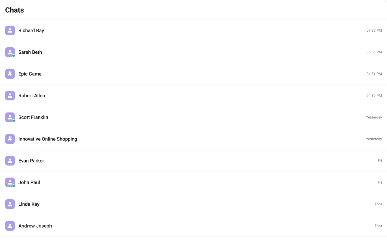
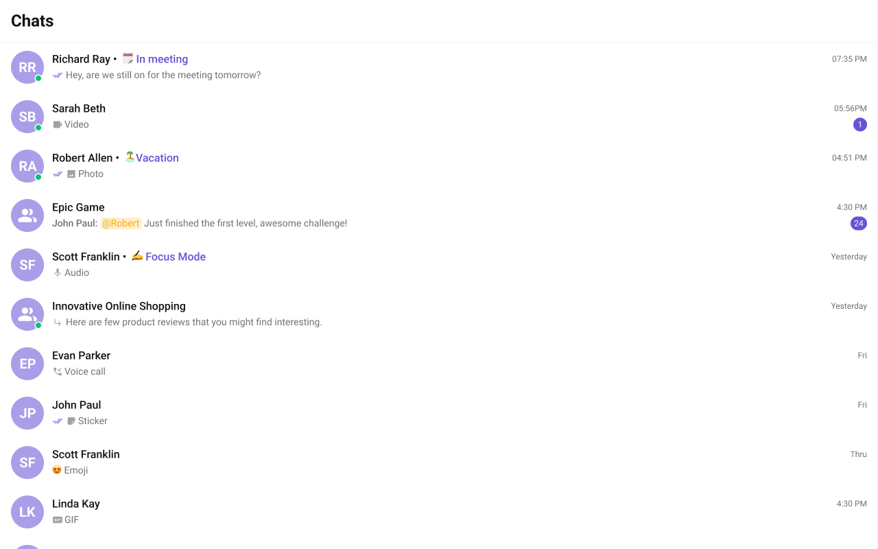
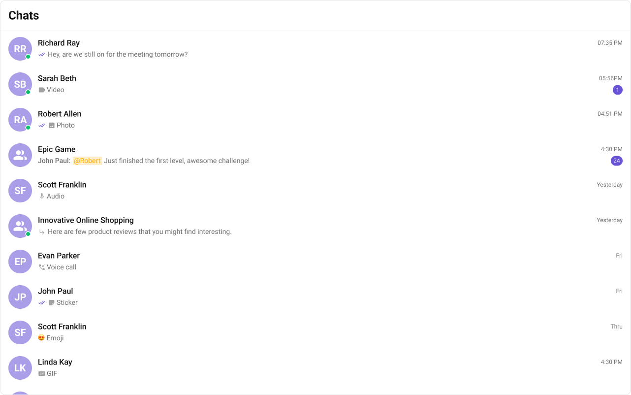
 The customized chat interface is displayed below.
 Use the following code to achieve the customization shown above.
 Use the following code to achieve the customization shown above.
 Use the following code to achieve the customization shown above.
 Use the following code to achieve the customization shown above.
 Use the following code to achieve the customization shown above.
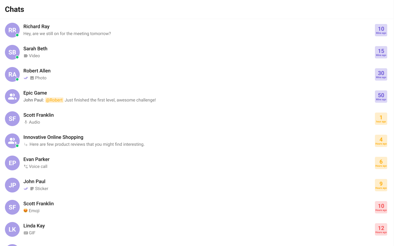
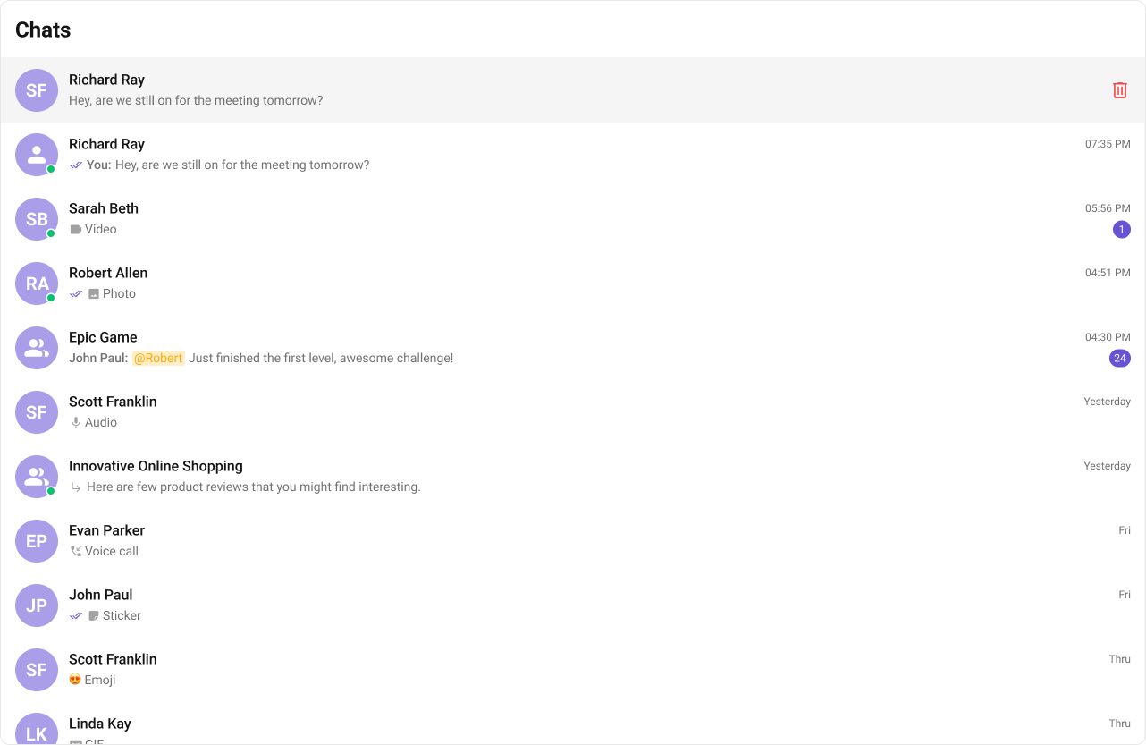
 The customized chat interface is displayed below.
 Use the following code to achieve the customization shown above.
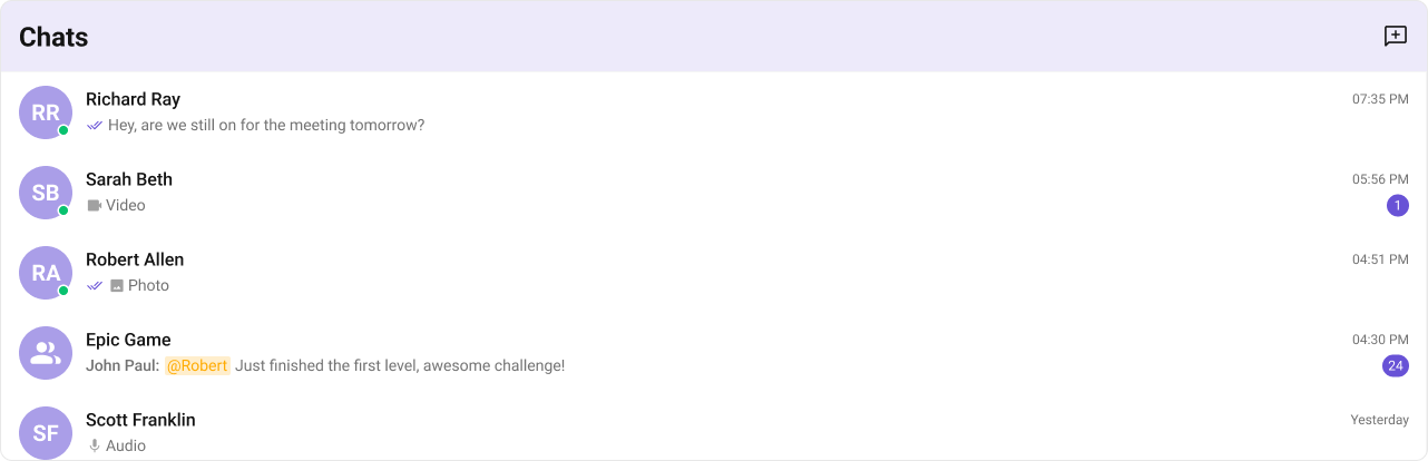
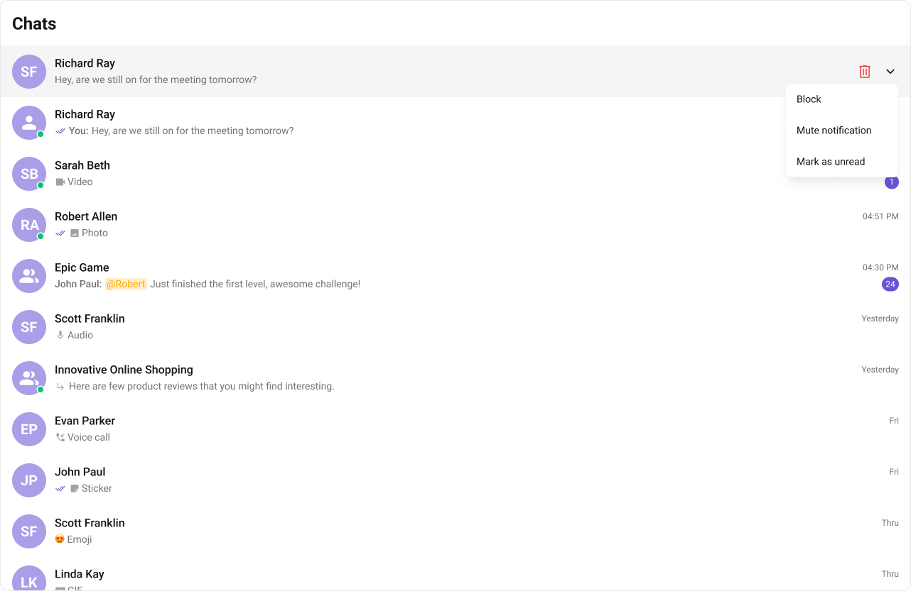
 The customized chat interface is displayed below.
 Use the following code to achieve the customization shown above.