 The Groups component is composed of the following BaseComponents:
| Components | Description |
| ----------------- | ------------------------------------------------------------------------------------------------------------------------- |
| CometChatList | A reusable container component having title, search box, customisable background and a list view. |
| CometChatListItem | A component that renders data obtained from a Group object on a Tile having a title, subtitle, leading and trailing view. |
***
## Usage
### Integration
The following code snippet illustrates how you can directly incorporate the Groups component into your Application.
The Groups component is composed of the following BaseComponents:
| Components | Description |
| ----------------- | ------------------------------------------------------------------------------------------------------------------------- |
| CometChatList | A reusable container component having title, search box, customisable background and a list view. |
| CometChatListItem | A component that renders data obtained from a Group object on a Tile having a title, subtitle, leading and trailing view. |
***
## Usage
### Integration
The following code snippet illustrates how you can directly incorporate the Groups component into your Application.
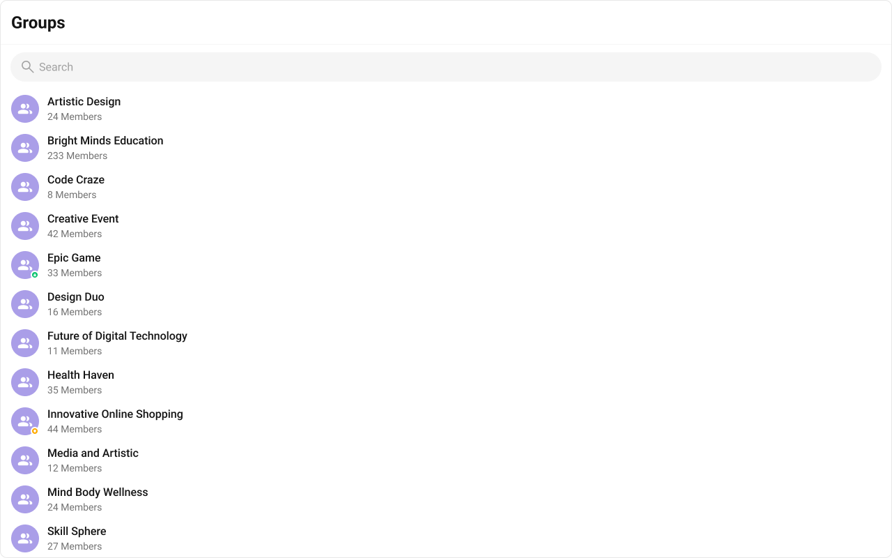
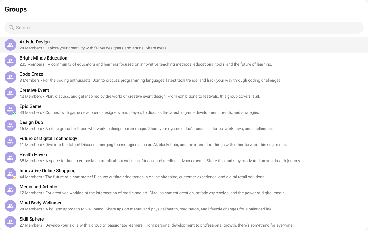
 The customized chat interface is displayed below.
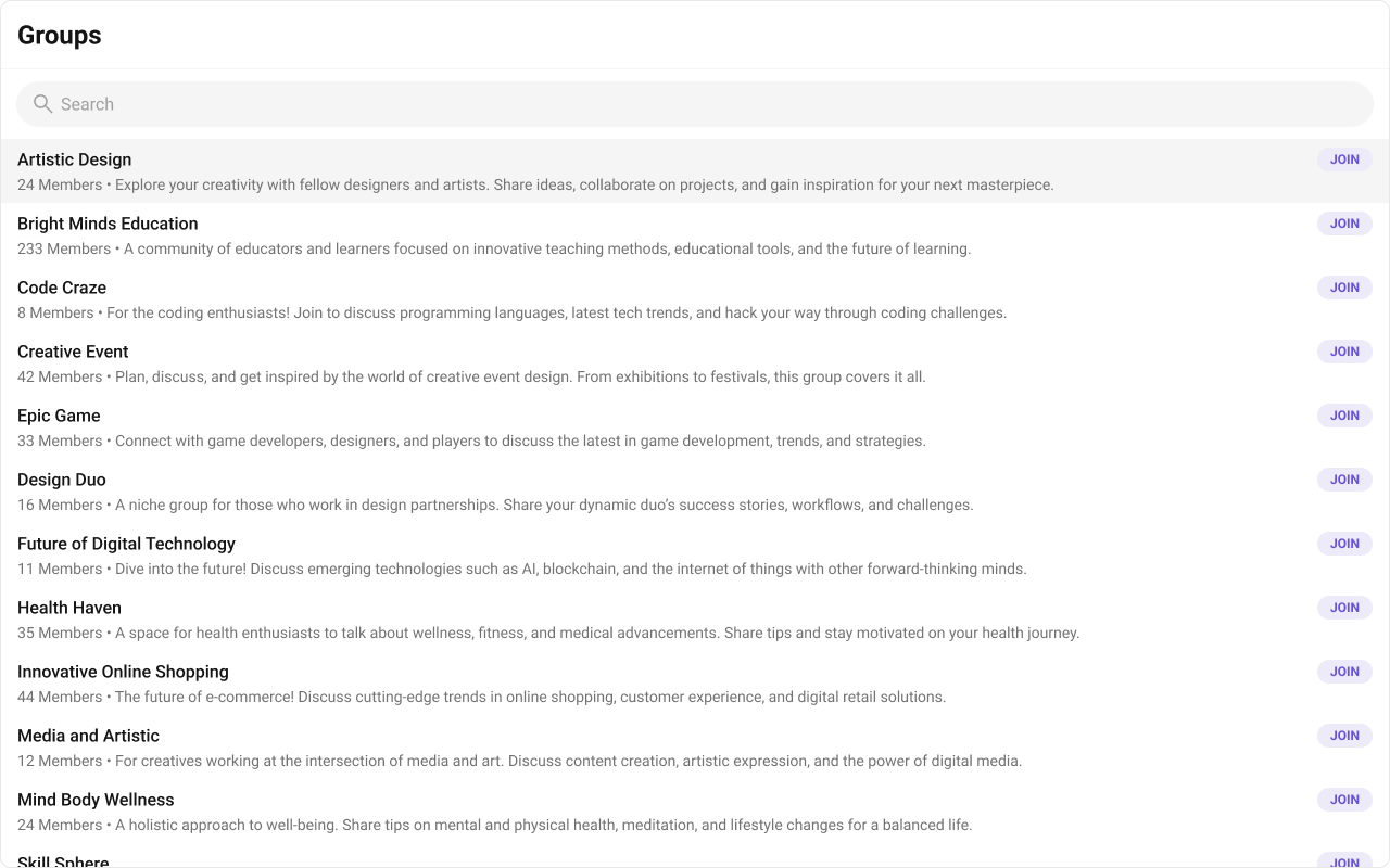 Use the following code to achieve the customization shown above.
{group.getName()}
JOIN
{group.getMembersCount()} Members • {group.getDescription()}
{group.getName()}
JOIN
{group.getMembersCount()} Members • {group.getDescription()}
 Use the following code to achieve the customization shown above.
{group.getName()}
 {group.getType()}
;
}
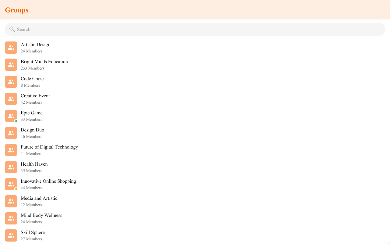
 The customized chat interface is displayed below.
 Use the following code to achieve the customization shown above.
{group.getMembersCount()} Members • {group.getDescription()}
);
};
return
{group.getMembersCount()} Members • {group.getDescription()}
);
};
return 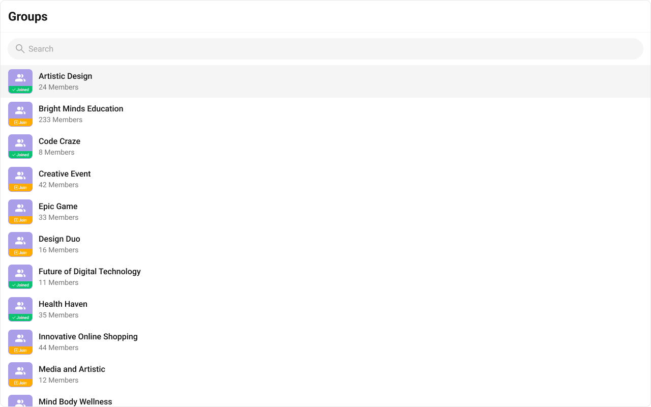 Use the following code to achieve the customization shown above.
 Use the following code to achieve the customization shown above.
{group.getHasJoined() ? "JOINED" : "+ JOIN"}
}
 Use the following code to achieve the customization shown above.
 Use the following code to achieve the customization shown above.