 ## Usage
### Integration
The following code snippet illustrates how you can directly incorporate the MessageComposer component into your app.
## Usage
### Integration
The following code snippet illustrates how you can directly incorporate the MessageComposer component into your app.

 The customized chat interface is displayed below.
 Use the following code to achieve the customization shown above.
 The customized chat interface is displayed below.
 Use the following code to achieve the customization shown above.
The customized chat interface is displayed below.
Use the following code to achieve the customization shown above.
The customized chat interface is displayed below.
 Use the following code to achieve the customization shown above.
The customized chat interface is displayed below.
Use the following code to achieve the customization shown above.
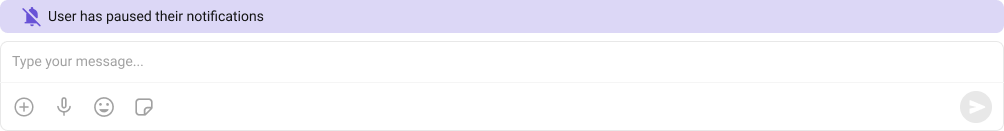
The customized chat interface is displayed below.
 Use the following code to achieve the customization shown above.